This site uses cookies to improve your experience. To help us insure we adhere to various privacy regulations, please select your country/region of residence. If you do not select a country, we will assume you are from the United States. Select your Cookie Settings or view our Privacy Policy and Terms of Use.
Cookie Settings
Cookies and similar technologies are used on this website for proper function of the website, for tracking performance analytics and for marketing purposes. We and some of our third-party providers may use cookie data for various purposes. Please review the cookie settings below and choose your preference.
Used for the proper function of the website
Used for monitoring website traffic and interactions
Cookie Settings
Cookies and similar technologies are used on this website for proper function of the website, for tracking performance analytics and for marketing purposes. We and some of our third-party providers may use cookie data for various purposes. Please review the cookie settings below and choose your preference.
Strictly Necessary: Used for the proper function of the website
Performance/Analytics: Used for monitoring website traffic and interactions
The latest versions of our graph and timeline datavisualization SDKs – KeyLines , ReGraph , and KronoGraph – introduce features that improve performance, aesthetics, and usability. FREE: Start your trial today Visualize your data! Request full access to our SDKs, demos and live-coding playgrounds.
Interactive datavisualization tools keep fraud management specialists in control throughout, combining the best of machine processing and human cognition. If you’d like to learn more, our AI + Graph Visualization white paper has more examples of how datavisualization and AI technologies work together.
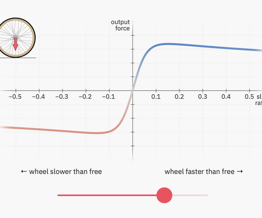
Bartosz Ciechanowski breaks it down in a visual essay filled with interactive demos. It makes me wonder about a datavisualization equivalent to explain a complex dataset. The structure of Ciechanowski’s essays are straightforward with the interactives doing a lot of the heavy-lifting for every concept.
AI-powered automation speeds things up, and machine learning improves foresight, but datavisualization is key to an analyst’s control over their supply chain. In this blog post, you’ll find out how to transform your supply chain processes by integrating graph and timeline visualization with the latest AI-led supply chain tools.
The result is a powerful application that shows every aspect of your data in one visualization. The Integration Playground showcase demo from KronoGraph Customize multiple views of your data The new Integration Playground showcase combines a KronoGraph timeline with a graph and table view.
The talk below will provide a high-level overview of embeddings, discuss best practices around embedding generation and usage, build two systems (semantic text search and reverse image search), and see how we can put our application into production using Milvus. Link to embed: [link] Step 5: Discover the Key Challenges in Building LLM Applications (..)
This post looks at some of the open source datavisualization tools our customers tell us theyve tried before upgrading to our fully-supported toolkits for their analysis apps. Teams working on datavisualization applications always aim to build the best product they can. js) GraphViz Viz.js
In this blog post, Ill show how effective log datavisualization improves your enterprise observability workflows. Youll see how KronoGraph, our timeline visualization SDK , can work alongside your log table, or replace it entirely. With KronoGraph log datavisualization, observing log sources becomes instantaneous.
Data Science Dojo vs Thinkful Data Science Dojo As an ideal choice for beginners with no prerequisites, Data Science Dojo’s Bootcamp is a great choice. It is a one-week bootcamp that covers the fundamentals of data science.
Good user experience (UX) design is the foundation of a successful datavisualization experience. Accelerated designs, from concept to code The datavisualization design kit is packed with features that help you craft sophisticated graph and timeline visualizations quickly.
Artificial intelligence is changing the way organizations think about data analysis. AI and datavisualization can do a lot of the heavy lifting for analysts and investigators working with connected data – helping them detect, understand and even predict risks and threats.
In this post, we explore geospatial data: what it is, what it’s for, and why map datavisualization is used by every business that’s serious about analyzing connected data. Digital mapping in the 1960s paved the way for geospatial datavisualization.
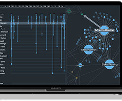
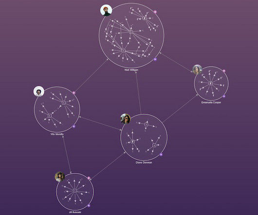
We’ve blogged before about the benefits of graph visualization SDKs over open source graph libraries. There are other datavisualization options available too, such as off-the-shelf apps and popular diagramming tools. 40,000 nodes and links visualized using KeyLines Does it tick the right boxes for your C-suite executives?
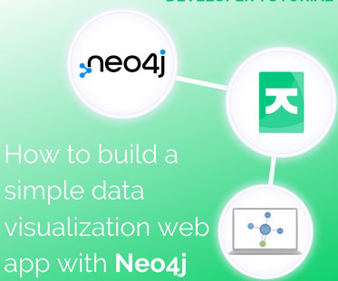
In this tutorial for JavaScript developers, I’ll demonstrate how to integrate our graph visualization SDKs with Neo4j to create a powerful datavisualization web app. FREE: Start your KeyLines trial today Visualize your data! Request full access to our KeyLines SDK, demos and live-coding playground.
We’ve recently explored the huge impact of AI in fraud detection – in this post, we’ll look at eight other trends driving demand for better datavisualization in the financial services sector. To stay ahead, you need to understand data, quickly. FREE: Start your trial today Visualize your data!
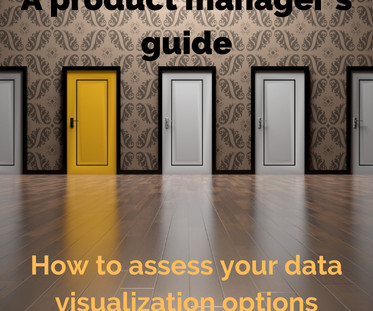
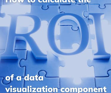
How do you measure the value of adding datavisualization to your web app? If you choose to build a visualization component using a datavisualization library, what is that investment worth? You’ll be able to justify whether or not datavisualization is a sound investment that’ll reap rewards.
10 Essential LLMs Topics to Know, LLMOps and MLOps, and Trending Open-Source DataVisualization Tools 10 Essential Topics to Master LLMs and Generative AI In this blog, we’ll explore ten key aspects of building generative AI applications, including large language model basics, fine-tuning, and core NLP competencies. Learn more here!
Now that we have more control over formatting and color coding, our visualizations pack in so much more insight without overwhelming our users. Designers have unlimited control over the styling of their visualization components, which means that users can enjoy a consistent and reliable experience, extracting maximum value from their data.
To create a compelling visualization, you need to provide users with the correct amount of detail to answer the questions they’re asking right now. We’ve blogged before about ways to reduce the volume of data through back-end data management and front-end interactions – see five steps to tackle big graph datavisualization.
Explore the top 10 machine learning demos and discover cutting-edge techniques that will take your skills to the next level. Case studies highlighting its effectiveness Scikit-learn has been used in a variety of successful data analysis projects. It has a wide range of datavisualization tools.
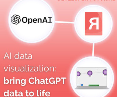
This AI datavisualization tutorial shows how to integrate ReGraph, our React graph visualization toolkit , with OpenAI’s ChatGPT. Whichever camp you’re in, here’s a quick and easy guide to bringing the power of AI to your users through graph visualization. That means color, font icons, sizes, and even filters.
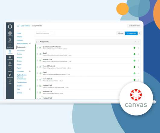
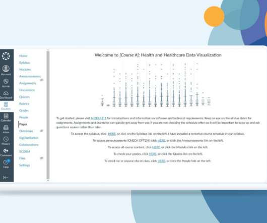
That work continues with the release of Data Literacy One for the world’s fastest-growing learning management system. Interactive guided demos in the Canvas course help students learn Tableau. Tableau Academic programs help instructors teach data literacy by providing free software and learning resources for students and teachers.
That work continues with the release of Data Literacy One for the world’s fastest-growing learning management system. Interactive guided demos in the Canvas course help students learn Tableau. Tableau Academic programs help instructors teach data literacy by providing free software and learning resources for students and teachers.
Senior Data Skills Curriculum Strategy Manager, Tableau. According to the National Institutes of Health (NIH), “Datavisualization is becoming an increasingly common method of presenting large and complex data sets, but the principles of visual communication are not widely understood or practiced.” Bronwen Boyd.
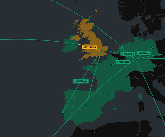
They integrate network and observations data with geospatial information to create seamless user experiences that reveal patterns across time and space. See MapWeave in action Join us on March 26, 2025 , to explore MapWeaves geospatial visualization, see live demos, and discover ways to get involved.
Senior Data Skills Curriculum Strategy Manager, Tableau. According to the National Institutes of Health (NIH), “Datavisualization is becoming an increasingly common method of presenting large and complex data sets, but the principles of visual communication are not widely understood or practiced.” Bronwen Boyd.
Finally, Tuesday is the first day of the AI Expo and Demo Hall , where you can connect with our conference partners and check out the latest developments and research from leading tech companies. This will also be the last day to connect with our partners in the AI Expo and Demo Hall.
Lecture slides, homework assignments, discussion board activities, Tableau demos, and test banks are included—instructors need only tailor the content to their class, as they like. Students will learn how to critically analyze data through theoretical and practical exercises.
Must-Use DataVisualization Datasets, AI Frameworks for Software Engineering, DynGAN, and 50% Off ODSC West 12 Must-Use Datasets for DataVisualization in 2024 Need to practice making sense of your data?
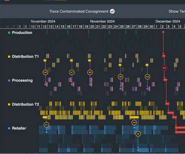
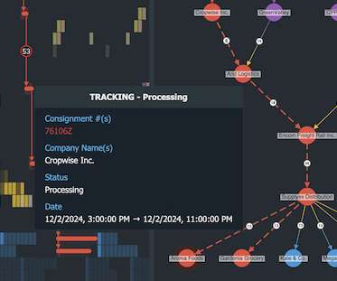
The latest update to KronoGraph, our timeline visualization toolkit , includes a new demo which showcases the powerful benefits that datavisualization brings to supply chain management. The demo uses fictitious data that’s based on the mass recall of contaminated spinach in 2006 in the USA.
She has all the content ready, but she needs to draft a guided tutorial with a full list of prerequisites the workshop attendees will need to set up the environment and replicate her demo on their own. For the sake of simplicity, let’s suppose her workshop demo includes only one Python notebook like this.
Our latest demo shows how KronoGraph 2.0, our time-based visual analytics toolkit , can support a reliable management tool with supply chain network visualization at its heart. This KronoGraph showcase demo was inspired by a state-wide recall of contaminated spinach in America , in 2006. Getting started is easy.
This crime datavisualization is from one of our KronoGraph showcase demos. Visualize your own time-stamped data with KronoGraph KronoGraph 3.0 If you’d like a guided demo, get in touch with a member of our team and we’ll be happy to show you how it works.
Increased styling flexibility: choose how to sort nodes at each level KeyLines users can try the new sorting option in the updated Display Hierarchies demo, while ReGraph users can check out the Hierarchies story. demo enhancements For those of you working with KeyLines’ React component, there’s a new, improved React Integration demo.
Machine learning practitioners are often working with data at the beginning and during the full stack of things, so they see a lot of workflow/pipeline development, data wrangling, and data preparation. What percentage of machine learning models developed in your organization get deployed to a production environment?
They are being increasingly challenged to improve efficiency and cost savings, embrace automation, and engage in data-driven decision making that helps their organization stand out from the competition.
This symbiotic fusion of data analysis and natural language generation underscores AI’s role as a versatile partner in unraveling the layers of information that drive informed decisions. Suppose you have a dataset and require a visual representation that’s both insightful and easily transferable to other programs.
Get ready to tell the story of your complex data – our latest major releases mark a big leap forward in the evolution of datavisualization. KeyLines, ReGraph and KronoGraph charts now support an annotations layer, so users can showcase the narratives in their data to anyone, in any format. and KronoGraph 3.0
In a sea of events, pick out the ones that matter with customizable animation KronoGraph users can see more examples of ping animations in action in our new “Ping Animations” story and updated “Detection and Response” demo. FREE: Start your KronoGraph trial today Visualize your data!
Use the new LabelAreaWidth API to customize your display Try the new behavior for yourself in our “Phone Calls” and “Terror” showcase demos on the KronoGraph SDK site. FREE: Start your KronoGraph trial today Visualize your data! Request full access to our KronoGraph SDK, demos and live-coding playground.
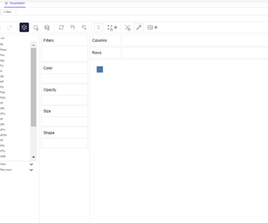
In this article we will walk through a demo of the PyGWalker package in Python. For this we will use NBA stats from the below web page: Continue reading on MLearning.ai »
Cut costs by consolidating data warehouse investments. Think of Tableau as your datavisualization and business intelligence layer on top of Genie—allowing you to see, understand, and act on your live customer data. To take a closer look, check out the Genie and Tableau demo. Let’s get into the nuts and bolts.
Cut costs by consolidating data warehouse investments. Think of Tableau as your datavisualization and business intelligence layer on top of Genie—allowing you to see, understand, and act on your live customer data. To take a closer look, check out the Genie and Tableau demo. Let’s get into the nuts and bolts.
Additionally, Day 2 marks the first day of the AI Expo and Demo Hall, where you can connect one-on-one with our industry-leading partners and see their products and services demoed live. Virtual attendees will also have the opportunity to connect with our partners at the virtual AI Expo and Demo Hall.
We organize all of the trending information in your field so you don't have to. Join 17,000+ users and stay up to date on the latest articles your peers are reading.
You know about us, now we want to get to know you!
Let's personalize your content
Let's get even more personalized
We recognize your account from another site in our network, please click 'Send Email' below to continue with verifying your account and setting a password.


Let's personalize your content