This site uses cookies to improve your experience. To help us insure we adhere to various privacy regulations, please select your country/region of residence. If you do not select a country, we will assume you are from the United States. Select your Cookie Settings or view our Privacy Policy and Terms of Use.
Cookie Settings
Cookies and similar technologies are used on this website for proper function of the website, for tracking performance analytics and for marketing purposes. We and some of our third-party providers may use cookie data for various purposes. Please review the cookie settings below and choose your preference.
Used for the proper function of the website
Used for monitoring website traffic and interactions
Cookie Settings
Cookies and similar technologies are used on this website for proper function of the website, for tracking performance analytics and for marketing purposes. We and some of our third-party providers may use cookie data for various purposes. Please review the cookie settings below and choose your preference.
Strictly Necessary: Used for the proper function of the website
Performance/Analytics: Used for monitoring website traffic and interactions
The World Happiness Report rates happiness on six indicators: positive emotions, […] The post Analysing World Happiness Report (2020-2022) appeared first on Analytics Vidhya. In line with the latest World Happiness Report, it is evident that being happy has become a worldwide priority.
My methods of using GPT-4 to optimize my datavisual workflow For the past 6 months, I have been a heavy daily GPT-4 user. I know it makes me sound like an addict, but I have found many good reasons and many excellent use cases where this tool is an invaluable resource for improving my data workflow.
Working with data is a necessity for most jobs, and analytical skills can be a huge differentiator for success across all kinds of work—whether corporate, nonprofit, or academic. Without closing the data skills gap, these challenges would continue into their professional lives. This course covers: The meaning of data literacy.
Exploratory DataAnalysis Next, we will create visualizations to uncover some of the most important information in our data. The graph also shows that the transaction data exhibits seasonality, where around December and January, the monthly transactions usually drop. It is […]
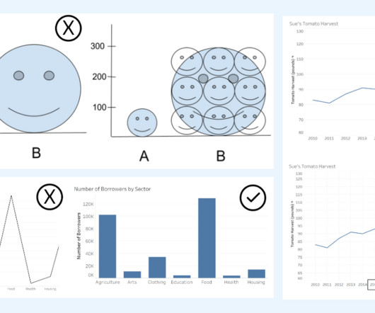
Alberto Cairo, datavisualization expert and author of How Charts Lie Whether you are reading a social post, news article or business report, it’s important to know and evaluate the source of the data and charts that you view. DataVisualization expert and author Kathy Rowell says that we should always ask “Compared to What?”,
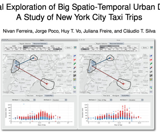
Silva , have been honored with one of these awards for their groundbreaking paper on urban datavisualization. Freire and Silva’s awarded paper, titled “ Visual Exploration of Big Spatio-Temporal Urban Data: A Study of New York City Taxi Trips ,” co-authored with Nivan Ferreira, Jorge Poco, Huy T.
Image by Author Tools The following tools were used to assist the dataanalysis process: Tableau: Used to create the visualizations. JupyterHub: Used to wrangle, clean, and prepare the dataset for visualization. Read individual CSV files and combine them on race ID, constructor ID, driver ID, circuit ID, and status ID.
He received the Ulf Grenander Prize from the American Mathematical Society in 2021, the IEEE John von Neumann Medal in 2020, the IJCAI Research Excellence Award in 2016, the David E. His research interests bridge the computational, statistical, cognitive, biological, and social sciences.
Working with data is a necessity for most jobs, and analytical skills can be a huge differentiator for success across all kinds of work—whether corporate, nonprofit, or academic. Without closing the data skills gap, these challenges would continue into their professional lives. This course covers: The meaning of data literacy.
Summary: The blog delves into the 2024 Data Analyst career landscape, focusing on critical skills like Data Visualisation and statistical analysis. It identifies emerging roles, such as AI Ethicist and Healthcare Data Analyst, reflecting the diverse applications of DataAnalysis.
This post presents an analysis of Berlin online real estate listings, investigating a controversial law capping rents in the state, which went into effect on February 23. Are current landlords already respecting the new rent cap?
DataRobot Visual AI. In 2020, our team launched DataRobot Visual AI. We embedded best practices and various deep learning models to support image data. Submit Data. After Exploratory DataAnalysis is completed, you can look at your data. Configure Settings You Need.
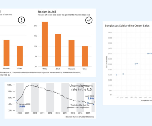
The key is to think critically and take time to evaluate the interpretations of data portrayed in charts. DataVisualization expert and author Kathy Rowell says that we should always ask “Compared to What?” Is the interpretation appropriate for the dataanalysis shown? Image from How Charts Lie by Alberto Cairo.
Dataanalysis and data communication are fundamental to the way people and businesses understand concepts, make decisions, and create solutions. Anyone who communicates with data needs to be mindful of the impact of the stories they tell. Kristin Adderson. November 29, 2021 - 5:26pm. December 13, 2021.
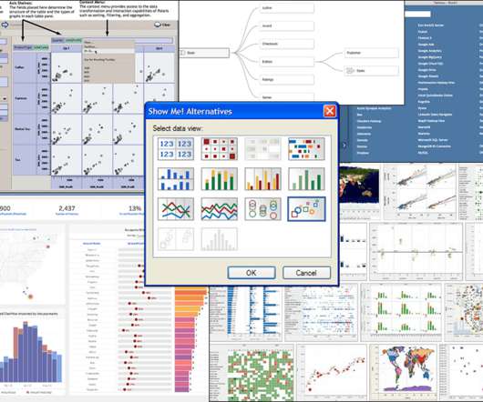
April 2018), which focused on users who do understand joins and curating federated data sources. May 2020) shifted sheets to a multiple-table data model, where the sheet’s fields allow the computer to write much more efficient queries to the data sources. Relationships in Tableau 2020.2 (May Beginning in Tableau 2020.2,
Dataanalysis and data communication are fundamental to the way people and businesses understand concepts, make decisions, and create solutions. . Anyone who communicates with data needs to be mindful of the impact of the stories they tell. Kristin Adderson. November 29, 2021 - 5:26pm. December 13, 2021.
April 2018), which focused on users who do understand joins and curating federated data sources. May 2020) shifted sheets to a multiple-table data model, where the sheet’s fields allow the computer to write much more efficient queries to the data sources. Relationships in Tableau 2020.2 (May Beginning in Tableau 2020.2,
Presenters and participants had the opportunity to hear about and evaluate the pros and cons of different back end technologies and data formats for different uses such as web-mapping, datavisualization, and the sharing of meta-data. Earth observation data cubes for Brazil: Requirements, methodology and products.
We have released 5 big releases this year, and this is the 6th, the last drop in 2020! ? The main things are Performance, Prediction, Summary View’s Correlation Mode, Text Data Wrangling UI, and Summarize Table. The main things are Performance, Prediction, Summary View’s Correlation Mode, Text Data Wrangling UI, and Summarize Table.
In this blog post, I summarize several of the key takeaways from this research paper and share my thoughts on how its findings can help us build the next generation of datavisualization tools for data science. . What is data science? It turns out data science is different things to different people.
In this blog post, I summarize several of the key takeaways from this research paper and share my thoughts on how its findings can help us build the next generation of datavisualization tools for data science. . What is data science? It turns out data science is different things to different people.
We organize all of the trending information in your field so you don't have to. Join 17,000+ users and stay up to date on the latest articles your peers are reading.
You know about us, now we want to get to know you!
Let's personalize your content
Let's get even more personalized
We recognize your account from another site in our network, please click 'Send Email' below to continue with verifying your account and setting a password.


Let's personalize your content