This site uses cookies to improve your experience. To help us insure we adhere to various privacy regulations, please select your country/region of residence. If you do not select a country, we will assume you are from the United States. Select your Cookie Settings or view our Privacy Policy and Terms of Use.
Cookie Settings
Cookies and similar technologies are used on this website for proper function of the website, for tracking performance analytics and for marketing purposes. We and some of our third-party providers may use cookie data for various purposes. Please review the cookie settings below and choose your preference.
Used for the proper function of the website
Used for monitoring website traffic and interactions
Cookie Settings
Cookies and similar technologies are used on this website for proper function of the website, for tracking performance analytics and for marketing purposes. We and some of our third-party providers may use cookie data for various purposes. Please review the cookie settings below and choose your preference.
Strictly Necessary: Used for the proper function of the website
Performance/Analytics: Used for monitoring website traffic and interactions
Efficient decision-making is the result of combining information, analysis, and effectiveness. That’s why businesses of all types and sizes are embracing datavisualization, albeit often with a simplified approach.
Introduction As the availability and importance of information as a robust asset increases in the modern global economy, it becomes essential to represent the information appropriately, especially to audiences with a non-technical background.
Introduction PowerBI has emerged as a formidable tool within data science, enabling businesses to formulate informed decisions rooted in data-driven insights.
Introduction Imagine you and your team are sitting with a huge set of data coming from different sources. It may not be easy to incorporate, sort and analyze such information for presentation purposes to be meaningful. It is at this juncture that PowerBI Semantic Models are useful. appeared first on Analytics Vidhya.
Introduction to DataVisualization The amount of data has changed in the digital age, becoming both a challenge and an opportunity. Datavisualization has become an efficient method for communicating insights and making sense of complex information.
Datavisualization is the art of presenting complex information in a way that is easy to understand and analyze. With the explosion of data in today’s business world, the ability to create compelling datavisualizations has become a critical skill for anyone working with data.
Data is an essential component of any business, and it is the role of a data analyst to make sense of it all. PowerBI is a powerfuldatavisualization tool that helps them turn raw data into meaningful insights and actionable decisions. Check out this course and learn PowerBI today!
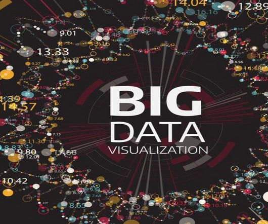
Summary: Big Datavisualization involves representing large datasets graphically to reveal patterns, trends, and insights that are not easily discernible from raw data. quintillion bytes of data daily, the need for effective visualization techniques has never been greater. As we generate approximately 2.5
Summary: DataVisualization with PowerBI enhances decision-making by transforming raw data into compelling visuals. Learn PowerBI and other essential tools with Pickl.AIs free course, which is available with certification and a job guarantee. Each type of visual serves a different purpose.
Datavisualization is the perfect solution to get over the headache. Datavisualization is the art and science of representing data in a visual format, such as charts, graphs, maps, and infographics. As a designer and developer, you know the power of datavisualization to increase user conversion rates.
Data exploration serves as the gateway to understanding the wealth of information hidden within datasets. Through careful examination of data, organizations can identify trends, detect anomalies, and derive strategic advantages. Pattern recognition: By generating visual plots, analysts can discover patterns within the data.
Synapse Data Science: Synapse Data Science empowers data scientists to work directly with secured and governed sales data prepared by engineering teams, allowing for the efficient development of predictive models. Right-click it and select Set Alert.
Explore, analyze, and visualizedata using PowerBI Desktop to make data-driven business decisions. Check out our Introduction to PowerBI cohort. This insight informs personalized marketing strategies and improves customer engagement. Improvise your models today with plots in data science!
Employing an analytical system in a data-driven business can help it to discover useful trends, information, conclusions and elevated decision making. PowerBI proves to be the best tool for analysis and visualization of data. Cloud-based PowerBI technology is a forerunner for corporate executives.
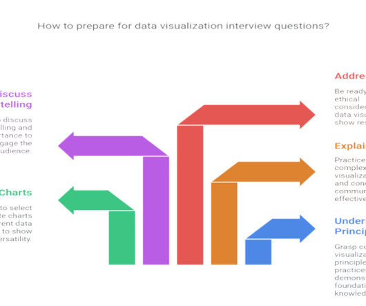
Summary : Prepare for your datavisualization interview with our guide to the top questions and answers. Introduction Datavisualization is no longer just a niche skill; it’s a fundamental component of Data Analysis , business intelligence, and data science. Preparing for these questions is crucial.
Data analysis is an essential process in today’s world of business and science. It involves extracting insights from large sets of data to make informed decisions. One of the most common ways to represent a data analysis is through code. However, is code the best way to represent a data analysis?
Front-end BI application A user-friendly front-end BI application is vital for self-service analytics. Popular tools like Tableau, ThoughtSpot, and Microsoft PowerBI enable users to interact with their data easily. Data preparation Data preparation plays a critical role in the self-service analytics process.
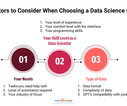
Specialized Industry Knowledge The University of California, Berkeley notes that remote data scientists often work with clients across diverse industries. Whether it’s finance, healthcare, or tech, each sector has unique data requirements.
How to Optimize PowerBI and Snowflake for Advanced Analytics Spencer Baucke May 25, 2023 The world of business intelligence and data modernization has never been more competitive than it is today. Table of Contents Why Discuss Snowflake & PowerBI?
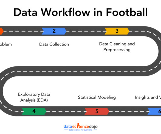
This is where a data workflow is essential, allowing you to turn your raw data into actionable insights. In this article, well explore how that workflow covering aspects from data collection to datavisualizations can tackle the real-world challenges. You may combine event data (e.g.,
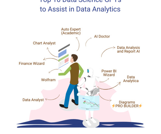
Data Analyst Data Analyst is a featured GPT in the store that specializes in data analysis and visualization. You can upload your data files to this GPT that it can then analyze. Other than the advanced data analysis, it can also deal with image conversions.
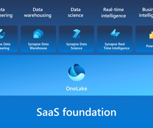
Microsoft Fabric combines multiple elements into a single platform – Image courtesy of Microsoft The contribution of PowerBI The integration of Microsoft PowerBI and Microsoft Fabric offers a powerful combination for organizations seeking comprehensive data analytics and insights.
Summary: PowerBI dashboards transform complex data into actionable insights, enabling organizations to make informed decisions quickly. By using powerbi dashboard examples, businesses can can apply effective design principles to enhance collaboration and operational efficiency.
Instead, open source BI software offers a range of powerful tools and features that can be customized and integrated seamlessly into existing workflows, making it easier than ever for businesses to unlock valuable insights and drive informed decision-making. BIDW: What makes business intelligence and data warehouses inseparable?
Summary: This blog dives into the most promising PowerBI projects, exploring advanced datavisualization, AI integration, IoT & blockchain analytics, and emerging technologies. Discover best practices for successful implementation and propel your organization towards data-driven success.
Augmented analytics is revolutionizing how organizations interact with their data. By harnessing the power of machine learning (ML) and natural language processing (NLP), businesses can streamline their data analysis processes and make more informed decisions.
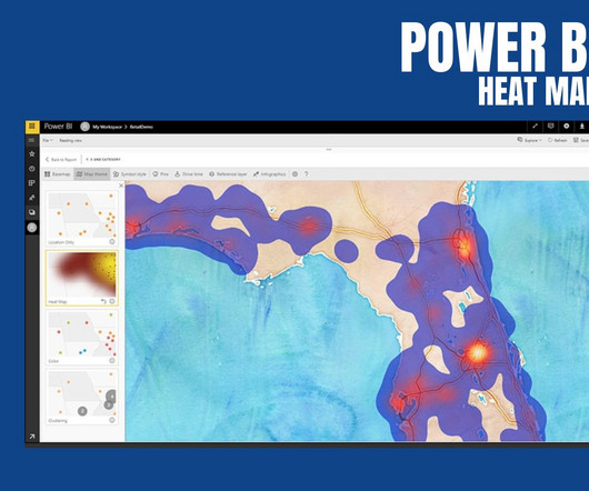
PowerBI Heatmap: Heatmap in PowerBI refers to the type of custom visualisation that businesses analysts utilise for showcasing the relationship between two variables on a map in different colour patches. It offers a wide range of features that make it a popular choice for data professionals, analysts, and organizations.
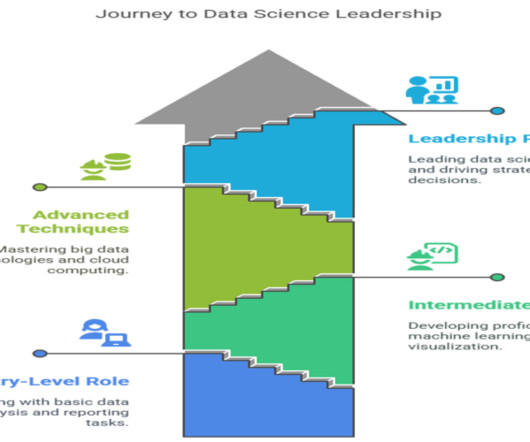
Data scientists play a crucial role in today’s data-driven world, where extracting meaningful insights from vast amounts of information is key to organizational success. As the demand for data expertise continues to grow, understanding the multifaceted role of a data scientist becomes increasingly relevant.
In the contemporary business landscape, decisions increasingly rely on data-informed insights. Consequently, the tools we employ to process and visualize this data play a critical role. Among these tools, KNIME and PowerBI have emerged as key players, catering to the demands of this evolving landscape.
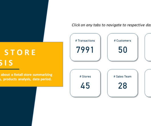
Store Analysis PowerBI Dashboard Example Tausif Kazi July 21, 2023 View Dashboard in PowerBI The Store Analysis PowerBI Dashboard provides insights into a Retail Store, summarizing Sales, Products, Customers, etc. Who is This Dashboard For?
Store Analysis PowerBI Dashboard Example Tausif Kazi July 21, 2023 View Dashboard in PowerBI The Store Analysis PowerBI Dashboard provides insights into a Retail Store, summarizing Sales, Products, Customers, etc. Who is This Dashboard For?
In the digital era, datavisualization stands as an indispensable tool in the realm of business intelligence. It represents the graphical display of data and information, transforming complex datasets into intuitive and understandable visuals. Extraneous elements can distract from the data you’re presenting.
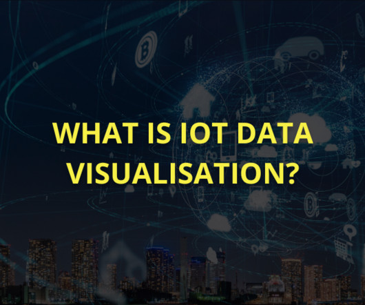
Summary: IoT datavisualization converts raw sensor data into interactive visuals, enabling businesses to monitor trends, detect anomalies, and improve efficiency. Introduction The Internet of Things (IoT) connects billions of devices, generating massive real-time data streams. What is IoT Visualization?
At this point, PowerBI has extended itself beyond the definition of just a datavisualization tool and truly is a robust business intelligence platform. One of the more powerful elements of PowerBI is the ability to distribute reporting to end users for self-service analytics through a PowerBI Workspace App.
Data fidelity, the degree to which data can be trusted to be accurate and reliable, is a critical factor in the success of any data-driven business. Companies are collecting and analyzing vast amounts of data to gain insights into customer behavior, identify trends, and make informed decisions.
How descriptive analytics works Descriptive analytics utilizes statistical techniques to interpret and summarize data. By applying various methods, organizations can make findings accessible to stakeholders, ensuring that key insights lead to informed decision-making.
Summary: Datavisualization is the art of transforming complex data sets into easily understandable visuals like charts, graphs, and maps. By presenting informationvisually, datavisualization allows us to communicate insights clearly and effectively to a wider audience.
Data quality issues are common in Indian datasets, so cleaning and preprocessing are critical. Exploratory Data Analysis (EDA): Identifying trends, patterns, and anomalies using statistical tools to understand data characteristics and inform modeling strategies. Data Manipulation: Pandas, NumPy, dplyr.
In the world of datavisualization , the ability to produce material that can speak to your audience, regardless of their technical expertise, is an ever-important factor to consider. Tableau Public Tableau Public , a powerfuldatavisualization software, empowers users to create interactive and shareable dashboards with ease.
It makes them more versatile as they are not limited to handling textual information, but can process multimodal forms of data. Other data science tasks include data preprocessing, visualization, and statistical analysis. You can upload your data files to this GPT that it can then analyze.
It makes them more versatile as they are not limited to handling textual information, but can process multimodal forms of data. Other data science tasks include data preprocessing, visualization, and statistical analysis. You can upload your data files to this GPT that it can then analyze.
Data fidelity, the degree to which data can be trusted to be accurate and reliable, is a critical factor in the success of any data-driven business. Companies are collecting and analyzing vast amounts of data to gain insights into customer behavior, identify trends, and make informed decisions.
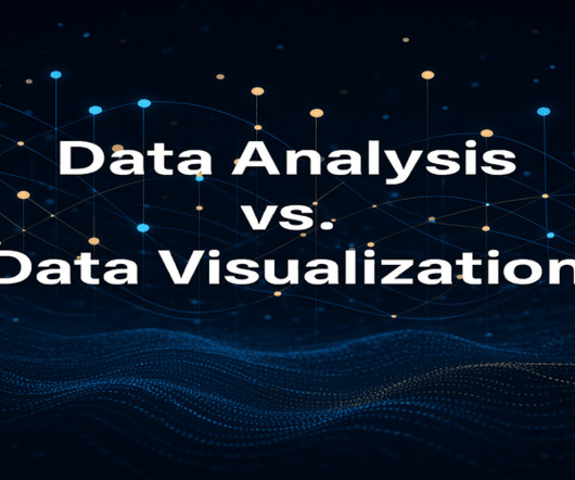
Summary: Data Analysis focuses on extracting meaningful insights from raw data using statistical and analytical methods, while datavisualization transforms these insights into visual formats like graphs and charts for better comprehension. But raw data, in its unprocessed state, is often just noise.
R: A powerful tool for statistical analysis and datavisualization, R is particularly useful for exploratory data analysis and research-focused AI applications. Data Privacy: Protecting sensitive information and adhering to regulations like GDPR to maintain user trust.
We organize all of the trending information in your field so you don't have to. Join 17,000+ users and stay up to date on the latest articles your peers are reading.
You know about us, now we want to get to know you!
Let's personalize your content
Let's get even more personalized
We recognize your account from another site in our network, please click 'Send Email' below to continue with verifying your account and setting a password.


Let's personalize your content