This site uses cookies to improve your experience. To help us insure we adhere to various privacy regulations, please select your country/region of residence. If you do not select a country, we will assume you are from the United States. Select your Cookie Settings or view our Privacy Policy and Terms of Use.
Cookie Settings
Cookies and similar technologies are used on this website for proper function of the website, for tracking performance analytics and for marketing purposes. We and some of our third-party providers may use cookie data for various purposes. Please review the cookie settings below and choose your preference.
Used for the proper function of the website
Used for monitoring website traffic and interactions
Cookie Settings
Cookies and similar technologies are used on this website for proper function of the website, for tracking performance analytics and for marketing purposes. We and some of our third-party providers may use cookie data for various purposes. Please review the cookie settings below and choose your preference.
Strictly Necessary: Used for the proper function of the website
Performance/Analytics: Used for monitoring website traffic and interactions
By Nate Rosidi , KDnuggets Market Trends & SQL Content Specialist on June 11, 2025 in Language Models Image by Author | Canva If you work in a data-related field, you should update yourself regularly. Data scientists use different tools for tasks like datavisualization, data modeling, and even warehouse systems.
But what if you could have a conversation with your documents and images? PopAI makes that a […] The post Talk to Your Documents and Images: A Guide to PopAI’s Features appeared first on Analytics Vidhya.
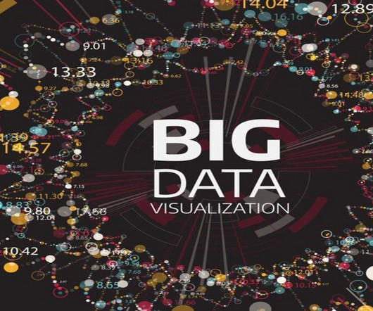
Summary: Big Datavisualization involves representing large datasets graphically to reveal patterns, trends, and insights that are not easily discernible from raw data. quintillion bytes of data daily, the need for effective visualization techniques has never been greater. As we generate approximately 2.5
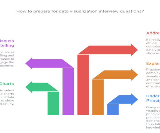
Summary : Prepare for your datavisualization interview with our guide to the top questions and answers. Introduction Datavisualization is no longer just a niche skill; it’s a fundamental component of Data Analysis , business intelligence, and data science. Preparing for these questions is crucial.
If you’re already using Mapbox for datavisualization but need to reveal the hidden connections and relationships in location-based data, our geospatial visualization SDK could be exactly what you’re missing. More on that can be found on Vite’s documentation. env’ file, which you can import into your application.
Image from KDnuggets post on Python Data Science Libraries (Created by the author) Pythons interactive development environment makes a significant difference in data work. Jupyter notebooks (and Jupyter alternatives) allow you to mix code, visualizations, and documentation in a single interface.
Research papers and engineering documents often contain a wealth of information in the form of mathematical formulas, charts, and graphs. Navigating these unstructured documents to find relevant information can be a tedious and time-consuming task, especially when dealing with large volumes of data.
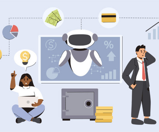
The biggest problems are: A lack of explainability – AI systems can be opaque to fraud teams who need to explain recommendations to customers and stakeholders, document them for compliance, or harness them in prevention activity. The post Enterprise fraud management, AI and datavisualization appeared first on Cambridge Intelligence.
Introduction Generative AI in forensic science involves applying artificial intelligence techniques to generate data, images, or other forensic evidence-related information. Forensic science has long relied on meticulous examination of […] The post Advancing Forensic Science with Generative AI appeared first on Analytics Vidhya.
Matplotlib is a great tool for datavisualization and is widely used in data analysis, scientific computing, and machine learning. It includes functions for opening and closing network connections, sending and receiving data, and parsing URLs. BeautifulSoup is commonly used for web scraping and data extraction.
This enables sales teams to interact with our internal sales enablement collateral, including sales plays and first-call decks, as well as customer references, customer- and field-facing incentive programs, and content on the AWS website, including blog posts and service documentation.
Matplotlib is a great tool for datavisualization and is widely used in data analysis, scientific computing, and machine learning. Seaborn Seaborn is a Python datavisualization library based on matplotlib that provides a high-level interface for creating attractive and informative statistical graphics.
Some essential research tools include search engines like Google Scholar, JSTOR, and PubMed, reference management software like Zotero, Mendeley, and EndNote, statistical analysis tools like SPSS, R, and Stata, writing tools like Microsoft Word and Grammarly, and datavisualization tools like Tableau and Excel.
To effectively convey complex information, organizations increasingly rely on visualdocumentation through diagrams, charts, and technical illustrations. A supported data source to connect, such as an S3 bucket containing your public documents. Access to an Amazon Bedrock LLM in the required AWS Region.
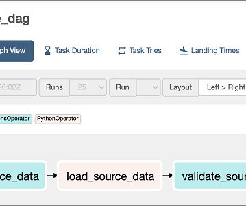
Intelligent Document Processing with AWS, Mastering DataVisualization, GPT-4 Turbo, and ODSC West Keynote Recaps Intelligent Document Processing with AWS AI Services and Amazon Bedrock In this article, we briefly discuss the various phases of IDP and how generative AI is being utilized to augment existing IDP workloads or develop new IDP workloads.
Financial reporting: OLAP supports the generation of detailed financial documents and forecasts. Sales forecasting: Companies can predict future sales based on historical data trends. Microsoft Power BI: Known for its intuitive interface and powerful visualization capabilities.
You can finally understand what you’re looking at and what the data is saying. The format can be classified by size, but you can choose to organize data horizontally or vertically/by column. It doesn’t matter if you use graphs or charts, you need to get better at datavisualization. A document is susceptible to change.
This post looks at some of the open source datavisualization tools our customers tell us theyve tried before upgrading to our fully-supported toolkits for their analysis apps. Teams working on datavisualization applications always aim to build the best product they can. js) GraphViz Viz.js
Data-Driven Decision Making With AI’s capability to analyze large sets of data, project managers can now make more informed decisions. AI tools can provide advanced analytics and datavisualizations, contributing to a more data-driven approach to project management.
Here are some of the key types of cloud analytics: Descriptive analytics: This type focuses on summarizing historical data to provide insights into what has happened in the past. It helps organizations understand trends, patterns, and anomalies in their data. Poor data integration can lead to inaccurate insights.
Akeshav writes a newsletter on Substack and needs help with research and datavisualization. It also discusses challenges and future directions, emphasizing the need for diverse datasets, improved interpretability, and feedback loops to enhance model performance and address complex document types. Meme of the week!
The increasingly common use of artificial intelligence (AI) is lightening the work burden of product managers (PMs), automating some of the manual, labor-intensive tasks that seem to correspond to a bygone age, such as analyzing data, conducting user research, processing feedback, maintaining accurate documentation, and managing tasks.
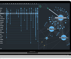
We’ve blogged before about the benefits of graph visualization SDKs over open source graph libraries. There are other datavisualization options available too, such as off-the-shelf apps and popular diagramming tools. 40,000 nodes and links visualized using KeyLines Does it tick the right boxes for your C-suite executives?
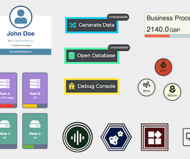
Select a network node of interest to display additional details in the timeline and table Reusable, fully-documented code You can access the full code behind the dashboard, with comments throughout to help you understand every line. FREE: Start your KronoGraph trial today Visualize your data!
Image by me with Midjourney When I was a beginner learning datavisualization, I used to have a rule — never, ever visit the Matplotlib documentation. Use Matplotlib like never before This member-only story is on us. Upgrade to access all of Medium. Nothing good ever came out of there.
While machine learning frameworks and platforms like PyTorch, TensorFlow, and scikit-learn can perform data exploration well, it’s not their primary intent. There are also plenty of datavisualization libraries available that can handle exploration like Plotly, matplotlib, D3, Apache ECharts, Bokeh, etc.
Several stages of analysis are needed to find insights and make the right decisions related to data, one of which is datavisualization. Datavisualization is an essential part of the data analysis process, as it helps to make sense of large and complex data sets. Matplotlib anatomy and terminology 2.
Applications of clustering in various fields Clustering techniques find applications in many fields, helping to simplify and analyze data in multiple ways. Here are some noteworthy applications: Datavisualization: Clustering enhances the ability to visualize complex datasets, making it easier to identify natural groupings and trends.
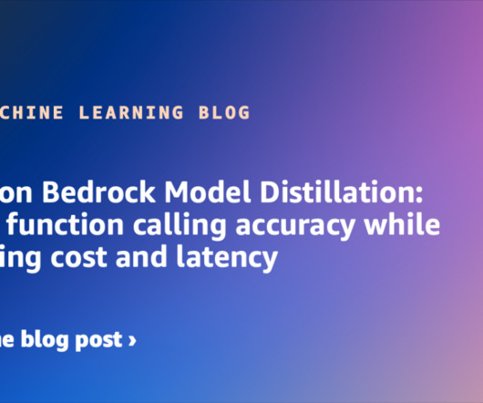
We recommend referring to the Submit a model distillation job in Amazon Bedrock in the official AWS documentation for the most up-to-date and comprehensive information. For the most current list of supported models, refer to the Amazon Bedrock documentation. v2 as a teacher model for Claude Haiku distillation Metas Llama 3.3
This means it can analyze and discuss various visual inputs such as screenshots, photos, documents, or charts provided by users. Desktop vision functionality : The desktop application can analyze visual information presented on the screen, such as graphs or documents, providing feedback and insights in real-time.
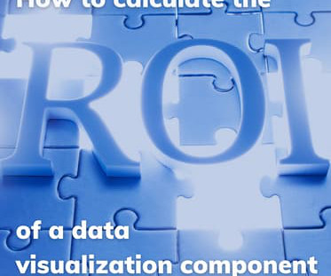
How do you measure the value of adding datavisualization to your web app? If you choose to build a visualization component using a datavisualization library, what is that investment worth? You’ll be able to justify whether or not datavisualization is a sound investment that’ll reap rewards.
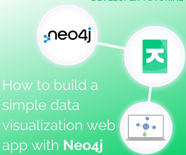
In this tutorial for JavaScript developers, I’ll demonstrate how to integrate our graph visualization SDKs with Neo4j to create a powerful datavisualization web app. FREE: Start your KeyLines trial today Visualize your data! Right – let’s start building our datavisualization web app!
Document understanding Fine-tuning is particularly effective for extracting structured information from document images. This includes tasks like form field extraction, table data retrieval, and identifying key elements in invoices, receipts, or technical diagrams. When working with documents, note that Meta Llama 3.2
Now that we have more control over formatting and color coding, our visualizations pack in so much more insight without overwhelming our users. Designers have unlimited control over the styling of their visualization components, which means that users can enjoy a consistent and reliable experience, extracting maximum value from their data.
It has a wide range of machine 6: Tableau Tableau is a datavisualization software platform that can be used to create interactive dashboards and reports. It is a powerful tool that can be used to explore and understand data, and it can also be used to communicate insights to others.
Returns a list of LangChain Document objects. """ """ # Initialize embeddings embeddings = OpenAIEmbeddings(openai_api_key=OPENAI_API_KEY) # Build the vector store directly from the documents # This will create the necessary nodes and relationships in Neo4j # and store the vector embeddings. ") # 3.
Data scientists are using NLP to make these assistants smarter and more helpful. Enhanced DataVisualization: AI-powered datavisualization tools are enabling data scientists to create interactive and dynamic visualizations that facilitate better communication of insights and findings.
Datavisualization: DataVisualization in Python is a project that introduces users to techniques for visually representing data sets. With the help of Python’s data manipulation and visualization libraries, learners can create informative and visually appealing charts, graphs, and plots.
Datavisualization tools like Tableau and Power BI can be applied to inform decisions. You document existing workflows, analyse potential improvements, and ensure every recommendation resonates with stakeholders objectives. Q3: Why is documentation essential for a Business Analyst? Who Is a Business Analyst?
For high-volume applicationslike global customer support or large-scale document analysisthese cost differences are disruptive. It excels at tasks such as document analysis and deep datavisualization. Up to 128K tokens ~63 ~0.49 GPT-4o Mini ~$0.15 ~$0.60 Up to 128K tokens ~90 ~0.43 Nova Micro ~$0.035 ~$0.14
AI in Word: Smarter Document Creation and Editing One of the most significant innovations in Microsoft 365s AI integration can be seen in Word. Traditionally, Word was known for its word processing features, but with AI, it is transforming into a smarter, more helpful tool for document creation and editing.
Numerous spatial data formats, including shapefiles, GeoJSON, GeoTIFF, and NetCDF, can be read and written by these programs. DataVisualization — R is primarily used by GIS professionals for statistical analysis and data plotting by utilizing packages such as ggplot2.
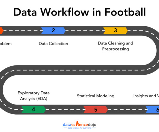
This is where a data workflow is essential, allowing you to turn your raw data into actionable insights. In this article, well explore how that workflow covering aspects from data collection to datavisualizations can tackle the real-world challenges.
It can do lots of things, like helping with documents and computer coding. ChatGPT Team is packed with features that cater to diverse business needs, enhancing productivity and efficiency: Document Analysis : It enables teams to upload and analyze documents, providing insights and answers to relevant queries.
We organize all of the trending information in your field so you don't have to. Join 17,000+ users and stay up to date on the latest articles your peers are reading.
You know about us, now we want to get to know you!
Let's personalize your content
Let's get even more personalized
We recognize your account from another site in our network, please click 'Send Email' below to continue with verifying your account and setting a password.


Let's personalize your content