This site uses cookies to improve your experience. To help us insure we adhere to various privacy regulations, please select your country/region of residence. If you do not select a country, we will assume you are from the United States. Select your Cookie Settings or view our Privacy Policy and Terms of Use.
Cookie Settings
Cookies and similar technologies are used on this website for proper function of the website, for tracking performance analytics and for marketing purposes. We and some of our third-party providers may use cookie data for various purposes. Please review the cookie settings below and choose your preference.
Used for the proper function of the website
Used for monitoring website traffic and interactions
Cookie Settings
Cookies and similar technologies are used on this website for proper function of the website, for tracking performance analytics and for marketing purposes. We and some of our third-party providers may use cookie data for various purposes. Please review the cookie settings below and choose your preference.
Strictly Necessary: Used for the proper function of the website
Performance/Analytics: Used for monitoring website traffic and interactions
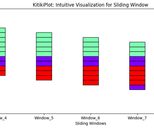
Designed with simplicity and versatility, it integrates seamlessly with Python’s data ecosystem while offering visually […] The post KitikiPlot: Your New Go-To for Time-Series DataVisualization appeared first on Analytics Vidhya.
Leveraging datavisualization, banks can significantly enhance their fraud detection capabilities. I spoke with Atmajitsinh Gohil, author of R DataVisualization Cookbook , about the technologies transforming the fight against financial fraud.
Summary: Big Datavisualization involves representing large datasets graphically to reveal patterns, trends, and insights that are not easily discernible from raw data. quintillion bytes of data daily, the need for effective visualization techniques has never been greater. As we generate approximately 2.5
Datavisualization is an essential tool in the modern landscape of information management, turning complex data into accessible visuals that can facilitate clearer understanding. With the exponential growth of data, the need to effectively interpret vast amounts of information has never been more critical.
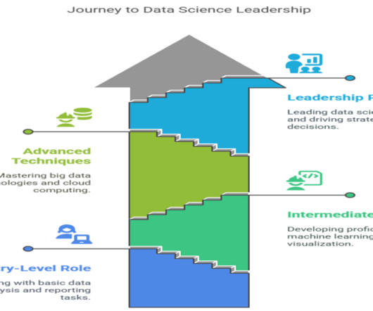
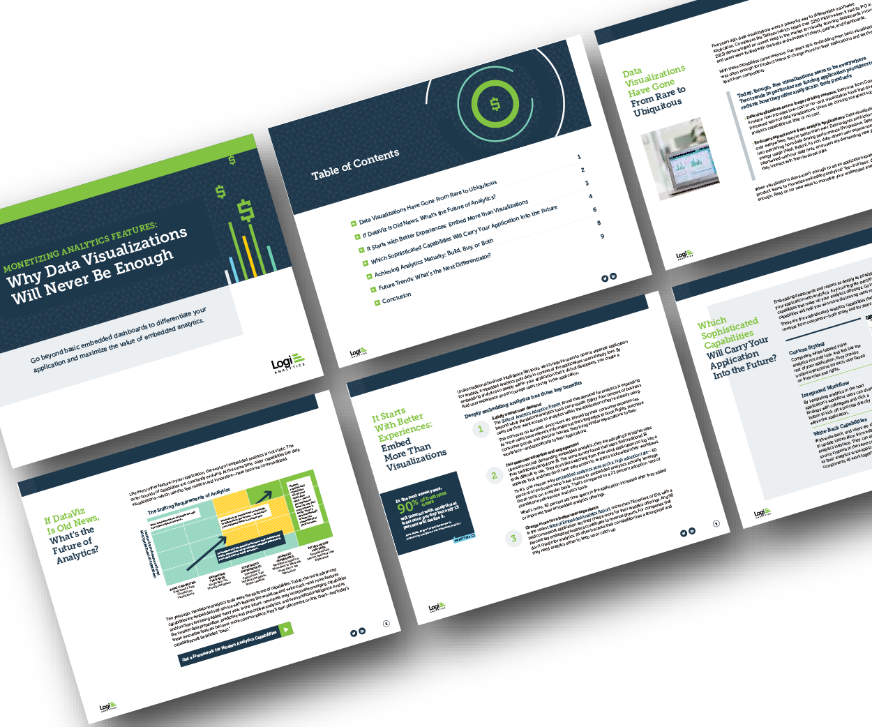
Think your customers will pay more for datavisualizations in your application? But today, dashboards and visualizations have become commonplace. Which analytics features are replacing visualizations as “the next big thing”. Five years ago they may have. Proven approaches to achieving analytics maturity.
Imagine transforming your dataset into an interactive web application without any frontend expertise for datavisualization. Getting useful insights, especially from a huge dataset, is a tall order.
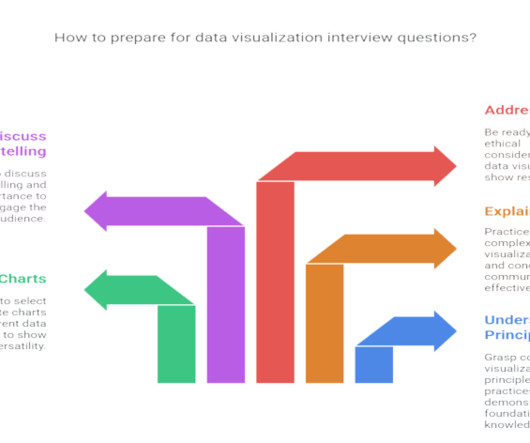
Summary : Prepare for your datavisualization interview with our guide to the top questions and answers. Introduction Datavisualization is no longer just a niche skill; it’s a fundamental component of Data Analysis , business intelligence, and data science. Preparing for these questions is crucial.
Python has become the lingua franca for scientific computing and datavisualization, thanks in large part to its rich ecosystem of libraries. One such tool that has been a favourite among researchers and practitioners alike is PyLab.
Industries utilizing data exploration Data exploration is integral to numerous industries, where its applications can be transformative: Software development: In this field, data exploration is vital for analyzing performance metrics, enabling developers to optimize software applications.
Storytelling is more than just datavisualization. Storytelling provides an organized approach for conveying data insights through visuals and narrative. Data-driven storytelling could be used to influence user actions, and ensure they understand what data matters the most.
Their role is crucial in understanding the underlying data structures and how to leverage them for insights. Key Skills Proficiency in SQL is essential, along with experience in datavisualization tools such as Tableau or Power BI.
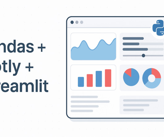
More On This Topic Forget Streamlit: Create an Interactive Data Science Dashboard in… SQL Group By and Partition By Scenarios: When and How to Combine… Visual ChatGPT: Microsoft Combine ChatGPT and VFMs Plotly Express for DataVisualization Cheat Sheet Building Agentic Application Using Streamlit and Langchain LangChain + Streamlit + (..)
Sompo Asia’s approach to agile data analytics and its impact on business intelligence. Steps towards enhancing datavisualization literacy in organizations. Updates on TigerGraph Cloud’s machine learning capabilities and datavisualization tools.
Think your customers will pay more for datavisualizations in your application? But today, dashboards and visualizations have become table stakes. Five years ago, they may have. Turning analytics into a source of revenue means integrating advanced features in unique, hard-to-steal ways.
Can it do decent quantitative analysis from a datavisualization? For me, one of the most useful GPT-4 tools is the ability to analyze and interpret image data. But how good it this tool now with charting data and with map images? This member-only story is on us. Upgrade to access all of Medium.
This article explores 20 diverse Power BI dashboard examples, showcasing how data can be transformed into actionable insights. From sales and marketing to HR and social media, these dashboards offer inspiration for your datavisualization projects.
Even in simple analytical projects, we often use Scikit-learn to convert categorical features into numerical ones, normalize the data, and more. Matplotlib: Visualizing Statistical Insights Matplotlib is the standard Python library for datavisualization. Learn more: [link] 7.
Enhanced decision-making: Facilitate data-driven business choices and personalized marketing strategies. Datavisualization: Offers current representations of data compared to static historical views. Risk reduction: Predictive capabilities reduce reliance on historical trends.
The complexity of financial data, the need for real-time insight, and the demand for user-friendly visualizations can seem daunting when it comes to analytics - but there is an easier way. Together, we can overcome these hurdles and empower your users with the data they need to drive success.
If you’re already using Mapbox for datavisualization but need to reveal the hidden connections and relationships in location-based data, our geospatial visualization SDK could be exactly what you’re missing. That’s easily solved using MapWeave’s advanced geospatial visualization features.
This powerful visualization tool finds applications across diverse fields, from website analytics to retail analysis, helping industries make informed decisions. Heat maps are a powerful datavisualization tool that visually represent complex datasets, making it easier to interpret and analyze information.
In this post, we dive into how we integrated Amazon Q in QuickSight to transform natural language requests like “Show me how many items were returned in the US over the past 6 months” into meaningful datavisualizations. Users can view datavisualizations without leaving the conversation flow.
In fact, 90% of the worlds data has been created in just the past two years, underscoring the rapid pace of data generation. However, the explosion of data has […] The post Mastering DataVisualizations for Better Understanding appeared first on DATAVERSITY.
The complexity of healthcare data, the need for real-time analytics, and the demand for user-friendly interfaces can often seem overwhelming. But with Logi Symphony, these challenges become opportunities. With Logi Symphony, you’re not just overcoming obstacles, you’re driving innovation in healthcare.
api_key = "api-key-here" st.set_page_config(page_title="Agentic Data Explorer", layout="wide") st.title("Chat With Your Data — Agent + Visual Insights") uploaded_file = st.file_uploader("Upload your CSV or Excel file", type=["csv", "xlsx"]) if uploaded_file: # Read file if uploaded_file.name.endswith(".csv"): value_counts().head(15)
Their importance lies in their ability to convert complex data sets into actionable insights, enabling teams to adapt and strategize effectively. By displaying real-time datavisualizations, they enable teams to track KPIs relevant to their objectives and identify areas needing improvement.
Can it do decent quantitative analysis from a datavisualization? For me, one of the most useful GPT-4 tools is the ability to analyze and interpret image data. But how good it this tool now with charting data and with map images? This member-only story is on us. Upgrade to access all of Medium.
DataVisualization & Analytics Explore creative and technical approaches to visualizing complex datasets, designing dashboards, and communicating insights effectively. Ideal for anyone focused on translating data into impactful visuals and stories. Expect deep-dive sessions and practical case studies.
Logi Symphony offers a powerful and user-friendly solution, allowing you to seamlessly embed self-service analytics, generative AI, datavisualization, and pixel-perfect reporting directly into your applications. Traditional BI tools can be cumbersome and difficult to integrate - but it doesn't have to be this way.
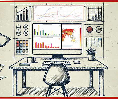
By Shamima Sultana on June 19, 2025 in Data Science Image by Editor | Midjourney While Python-based tools like Streamlit are popular for creating data dashboards, Excel remains one of the most accessible and powerful platforms for building interactive datavisualizations.
By providing a single, unified platform for data storage, management, and analysis, Snowflake connects organizations to leading software vendors specializing in analytics, machine learning, datavisualization, and more.
By Nate Rosidi , KDnuggets Market Trends & SQL Content Specialist on June 11, 2025 in Language Models Image by Author | Canva If you work in a data-related field, you should update yourself regularly. Data scientists use different tools for tasks like datavisualization, data modeling, and even warehouse systems.
No-fuss prompting for error-free Python Streamlit data viz code How easy is it to create datavisuals with GPT-4 and the Python Streamlit library? A little bit of fancy footwork with a good dataset and we can rattle off chart after chart (even maps) giving us in-depth analysis and stories for our data set.
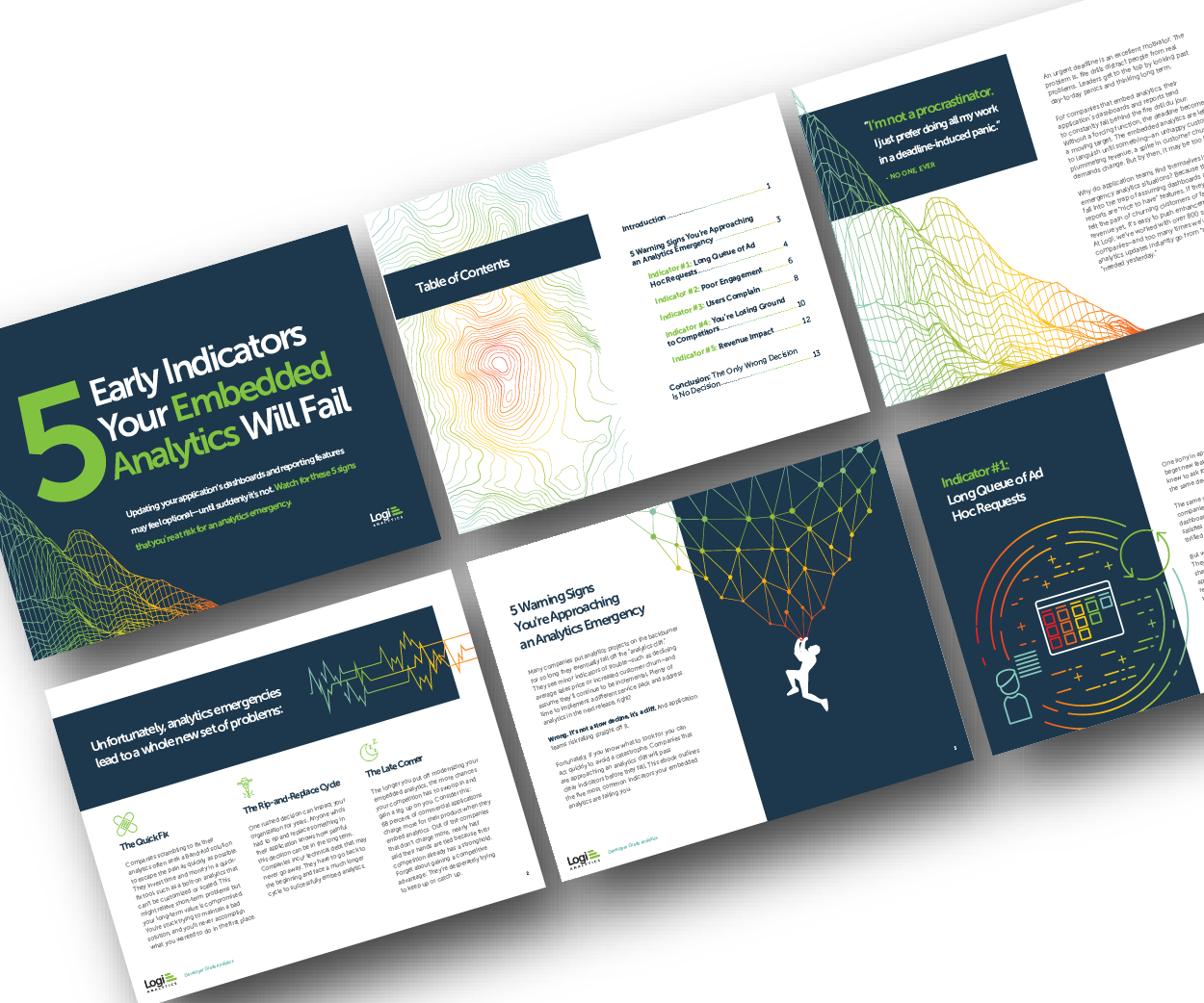
Why do some embedded analytics projects succeed while others fail? We surveyed 500+ application teams embedding analytics to find out which analytics features actually move the needle. Read the 6th annual State of Embedded Analytics Report to discover new best practices. Brought to you by Logi Analytics.
An infographic is a visual representation of information and data designed to make complex information accessible and engaging. It combines datavisualization techniques with creative design elements to elucidate patterns and insights quickly and clearly, allowing audiences to understand crucial information efficiently.
Big Data Technologies: Familiarity with Hadoop, Apache Spark, and cloud platforms like AWS, Azure, and Google Cloud is increasingly important as Indian companies scale data operations. DataVisualization: Ability to create intuitive visualizations using Matplotlib, Seaborn, Tableau, or Power BI to convey insights clearly.
Data scientists try multiple models, evaluate their performance, and fine-tune some parameters to get better accuracy. DataVisualization and Interpretation To make the data understandable to stakeholders, visualizations are created in the form of charts, graphs, and dashboards.
Python works best for: Exploratory data analysis and prototyping Machine learning model development Complex ETL with business logic Statistical analysis and research Datavisualization and reporting Go: Built for Scale and Speed Go takes a different approach to data processing, focusing on performance and reliability from the start.
Many application teams leave embedded analytics to languish until something—an unhappy customer, plummeting revenue, a spike in customer churn—demands change. But by then, it may be too late. In this White Paper, Logi Analytics has identified 5 tell-tale signs your project is moving from “nice to have” to “needed yesterday.".
Whether they track individuals’ credit scores, loan activity, or purchasing patterns, the background of historical data will make outliers stand out. Another useful detection tool is datavisualization. Information is often more digestible in a graph or chart than in a spreadsheet — especially when big data is involved.
Benefits of analytics databases Utilizing analytics databases offers several notable benefits for organizations: Real-time data response: These systems can handle continuous data streams from various sources, enabling real-time analytics.
Shittu Olumide is a software engineer and technical writer passionate about leveraging cutting-edge technologies to craft compelling narratives, with a keen eye for detail and a knack for simplifying complex concepts. You can also find Shittu on Twitter.
Microsoft Power BI: Known for its intuitive interface and powerful visualization capabilities. Tableau: Renowned for its datavisualization and intuitive user interface, making data analysis accessible. Oracle OLAP: Offers extensive analytical features integrated with Oracle databases.
Think your customers will pay more for datavisualizations in your application? But today, dashboards and visualizations have become table stakes. Five years ago they may have. Discover which features will differentiate your application and maximize the ROI of your embedded analytics. Brought to you by Logi Analytics.
We organize all of the trending information in your field so you don't have to. Join 17,000+ users and stay up to date on the latest articles your peers are reading.
You know about us, now we want to get to know you!
Let's personalize your content
Let's get even more personalized
We recognize your account from another site in our network, please click 'Send Email' below to continue with verifying your account and setting a password.


Let's personalize your content