Remove Data Analysis Remove Data Visualization Remove Power BI Remove Python
article thumbnail

Transform your data into insights: The data analyst’s guide to Power BI

Data Science Dojo

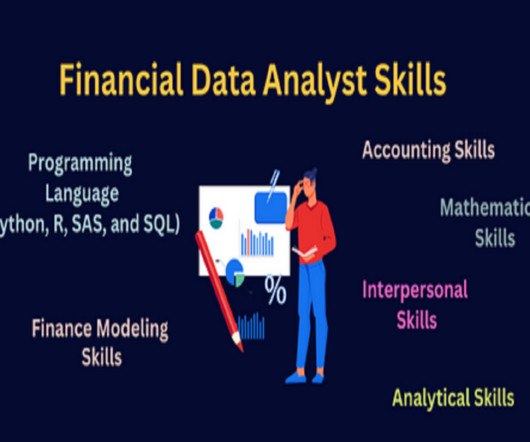
Data is an essential component of any business, and it is the role of a data analyst to make sense of it all. Power BI is a powerful data visualization tool that helps them turn raw data into meaningful insights and actionable decisions.

Power BI 221
article thumbnail

Business analytics 101: Transforming data into actionable insights with data visualization

Data Science Dojo

Data visualization is the art of presenting complex information in a way that is easy to understand and analyze. With the explosion of data in today’s business world, the ability to create compelling data visualizations has become a critical skill for anyone working with data.

professionals

Sign Up for our Newsletter

This site is protected by reCAPTCHA and the Google Privacy Policy and Terms of Service apply.

article thumbnail

Data Visualization: Advanced Techniques for Insightful Analytics

Pickl AI

Summary: Data visualization is the art of transforming complex data sets into easily understandable visuals like charts, graphs, and maps. By presenting information visually, data visualization allows us to communicate insights clearly and effectively to a wider audience.

article thumbnail

Guide For Data Analysis: From Data Extraction to Dashboard

Analytics Vidhya

The post Guide For Data Analysis: From Data Extraction to Dashboard appeared first on Analytics Vidhya. Unlike hackathons, where we are supposed to come up with a theme-oriented project within the stipulated time, blogathons are different. Blogathons are competitions that are conducted for over a month […].

article thumbnail

Power BI Tip: Create a bar chart with a total bar.

Mlearning.ai

When you’re making bar charts or column charts in Power BI (a tool for showing data visually), sometimes you want to add a special bar. So, in simpler terms, this message talks about adding a total bar to your charts in Power BI. Please clap and follow me for more data science articles.

article thumbnail

Stay ahead of the curve with these 12 powerful GitHub repositories for learning data science, analytics, and engineering

Data Science Dojo

This blog lists down-trending data science, analytics, and engineering GitHub repositories that can help you with learning data science to build your own portfolio.  What is GitHub? GitHub is a powerful platform for data scientists, data analysts, data engineers, Python and R developers, and more.

article thumbnail

5 Free Data Visualization Tools to Showcase Your Data in 2024

ODSC - Open Data Science

In the world of data visualization , the ability to produce material that can speak to your audience, regardless of their technical expertise, is an ever-important factor to consider. Tableau Public Tableau Public , a powerful data visualization software, empowers users to create interactive and shareable dashboards with ease.