article thumbnail

Integrating Python in Power BI: Get the best of both worlds

Analytics Vidhya

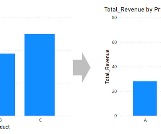
Overview A demonstration of statistical analytics by Integrating Python within Power BI Share the findings using dashboards and reports Introduction Power BI is. The post Integrating Python in Power BI: Get the best of both worlds appeared first on Analytics Vidhya.

Power BI 400
article thumbnail

Microsoft’s Power BI Interview Questions

Analytics Vidhya

Introduction Microsoft’s Power BI is one of its rapidly growing corporate analytics services. This self-service business intelligence tool is the latest and greatest in the data-driven industry. It eased the workaround for attaining data from several sources and consolidating it into one management […].

Power BI 349
professionals

Sign Up for our Newsletter

This site is protected by reCAPTCHA and the Google Privacy Policy and Terms of Service apply.

article thumbnail

Transform your data into insights: The data analyst’s guide to Power BI

Data Science Dojo

Data is an essential component of any business, and it is the role of a data analyst to make sense of it all. Power BI is a powerful data visualization tool that helps them turn raw data into meaningful insights and actionable decisions.

Power BI 221
article thumbnail

Leveraging KNIME and Power BI: Integrating Power BI in KNIME

phData

Consequently, the tools we employ to process and visualize this data play a critical role. Among these tools, KNIME and Power BI have emerged as key players, catering to the demands of this evolving landscape. In this blog, we will focus on integrating Power BI within KNIME for enhanced data analytics.

article thumbnail

Power BI Tip: Create a bar chart with a total bar.

Mlearning.ai

When you’re making bar charts or column charts in Power BI (a tool for showing data visually), sometimes you want to add a special bar. So, in simpler terms, this message talks about adding a total bar to your charts in Power BI. Please clap and follow me for more data science articles.

article thumbnail

5 Free Data Visualization Tools to Showcase Your Data in 2024

ODSC - Open Data Science

In the world of data visualization , the ability to produce material that can speak to your audience, regardless of their technical expertise, is an ever-important factor to consider. Tableau Public Tableau Public , a powerful data visualization software, empowers users to create interactive and shareable dashboards with ease.

article thumbnail

Stay ahead of the curve with these 12 powerful GitHub repositories for learning data science, analytics, and engineering

Data Science Dojo

This blog lists down-trending data science, analytics, and engineering GitHub repositories that can help you with learning data science to build your own portfolio.  What is GitHub? GitHub is a powerful platform for data scientists, data analysts, data engineers, Python and R developers, and more.