This site uses cookies to improve your experience. To help us insure we adhere to various privacy regulations, please select your country/region of residence. If you do not select a country, we will assume you are from the United States. Select your Cookie Settings or view our Privacy Policy and Terms of Use.
Cookie Settings
Cookies and similar technologies are used on this website for proper function of the website, for tracking performance analytics and for marketing purposes. We and some of our third-party providers may use cookie data for various purposes. Please review the cookie settings below and choose your preference.
Used for the proper function of the website
Used for monitoring website traffic and interactions
Cookie Settings
Cookies and similar technologies are used on this website for proper function of the website, for tracking performance analytics and for marketing purposes. We and some of our third-party providers may use cookie data for various purposes. Please review the cookie settings below and choose your preference.
Strictly Necessary: Used for the proper function of the website
Performance/Analytics: Used for monitoring website traffic and interactions
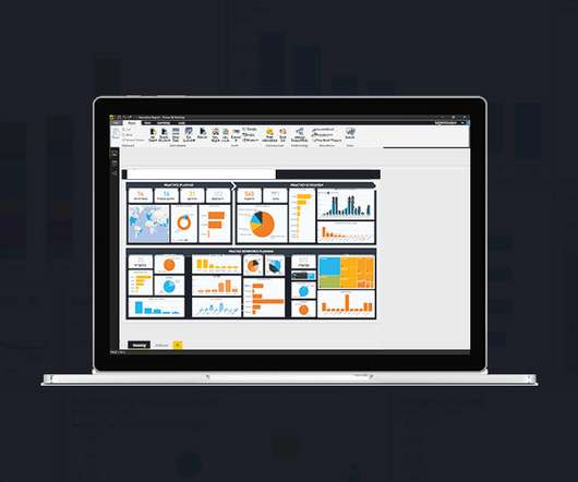
This article explores 20 diverse PowerBI dashboard examples, showcasing how data can be transformed into actionable insights. Importance of Dashboards Dashboards […] The post 20 Examples of Interactive PowerBI Dashboards appeared first on Analytics Vidhya.
This article was published as a part of the Data Science Blogathon. Introduction Microsoft’s PowerBI is one of its rapidly growing corporate analytics services. The post Microsoft’s PowerBI Interview Questions appeared first on Analytics Vidhya.
This article was published as a part of the Data Science Blogathon. What is PowerBI? Microsoft‘s business analytics product, PowerBI, delivers interactive data visualization BI capabilities that allow users to see and share data and insights throughout their organisation.
This article was published as a part of the Data Science Blogathon. Table of contents Introduction What is Microsoft PowerBI? The post Getting started with Microsoft PowerBI appeared first on Analytics Vidhya.
This article was published as a part of the Data Science Blogathon. Introduction BI tools, including software services, apps, and data connectors, make up the Microsoft PowerBI portfolio. The post Understand the Workings of PowerBI appeared first on Analytics Vidhya.
This article was published as a part of the Data Science Blogathon. Introduction In this article, we will explore one of Microsoft’s proprietary products, “PowerBI”, in-depth. The post Building your First PowerBI Report from Scratch appeared first on Analytics Vidhya. And […].
This article was published as a part of the Data Science Blogathon. Image 1 Introduction In this guide, we explore new BI Technology known as Microsoft PowerBI and let us learn some basics of it before we deep dive. The post A Comprehensive Guide on PowerBI appeared first on Analytics Vidhya.
ArticleVideos This article was published as a part of the Data Science Blogathon. The post Design Thinking in PowerBI appeared first on Analytics Vidhya. An Illustration using the Business Model Canvas Design Thinking is a.
Introduction PowerBI uses a set of functions, operators, and constants called DAX to perform dynamic computations and analysis. One can enhance their PowerBI competency by using DAX features that help in data modeling and reporting. This article examines the top DAX features that any PowerBI user should know.
This article was published as a part of the Data Science Blogathon. Introduction If you’re new to PowerBI Desktop, this post is for you. The post Complete Introduction to DAX in PowerBI appeared first on Analytics Vidhya. We’ll review some abstract concepts, give […].
This article was published as a part of the Data Science Blogathon. Introduction to PowerBI By interpreting raw data into visual representations such as images, diagrams, videos, graphs, and more, PowerBi Custom Visualization allows you to gain insights from your data.
This article was published as a part of the Data Science Blogathon. Introduction PowerBI is one of the most popular data visualization and analytics software product developed by Microsoft. The post Top 10 PowerBI Interview Questions in 2022 appeared first on Analytics Vidhya. Source: [link] […].
This article was published as a part of the Data Science Blogathon. Introduction to PowerBI In today’s data-driven age, a large amount of data gets generated daily from various sources such as supply chain and logistics, emails and multi-media, e-commerce websites, healthcare, transaction processing systems, etc.
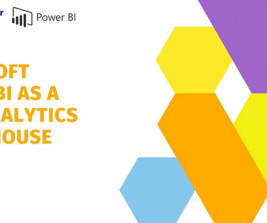
ArticleVideo Book This article was published as a part of the Data Science Blogathon. Microsoft PowerBI is a collection of apps, software services, The post Rise of Microsoft PowerBI as a Data Analytics powerhouse appeared first on Analytics Vidhya.
PowerBI is an influential tool, shaping raw data into informative visuals and reports. With a user-friendly interface and formidable functionalities, PowerBI is an invaluable platform for individuals to refine their skills through hands-on projects.
This article was published as a part of the Data Science Blogathon. Introduction on PowerBI As part of our discussion, we will discuss the features of PowerBI, its benefits, and a detailed description of how to use it for presenting data using an example and creating reports.
This article was published as a part of the Data Science Blogathon. Introduction The following is an in-depth article explaining DAX which stands for Data Analysis Expression. DAX is the language developed by Microsoft to interact with data in a variety of their platforms, such as PowerBI, PowerPivot, and SSAS tabular models.
In this article, I’ll walk you through 5 advanced yet practical error handling patterns that can make your code cleaner, more reliable, and easier to debug. But is that really enough as our codebase grows more complex? I believe not. Relying solely on try-except can lead to repetitive, cluttered, and hard-to-maintain code.
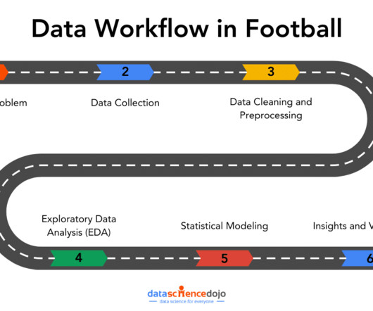
In this article, well explore how that workflow covering aspects from data collection to data visualizations can tackle the real-world challenges. In PowerBI, you can merge these sources through data transformation, while in Python, libraries like pandas are used to integrate and join different datasets.
This article was published as a part of the Data Science Blogathon Introduction I have been associated with Analytics Vidya from the 3rd edition of Blogathon. Unlike hackathons, where we are supposed to come up with a theme-oriented project within the stipulated time, blogathons are different.
With the shift towards cloud-based solutions, migrating SQL Server Reporting Services (SSRS) reports to the PowerBI service has become a popular choice for organizations looking to unlock the full potential of their data. Step 1 Open PowerBI Desktop and then click on Get Data to connect to SQL Server. phData can help!
In this article, we tried to find out the answer to this question and analyze the timeline to see whether it is too early to do this or too late. BI Dashboards Everywhere After 2018, a new shift happened. Tools like Tableau and PowerBI do data analysis by just clicking, and they offer amazing visualizations at once, called dashboards.
This could include writing a report or article that describes the findings and conclusions of the analysis. Check out this course and learn PowerBI today! Narrative: Instead of representing data through code or visualizations, a narrative format can be used to tell a story about the data.
Join now Ready to get started? Get a Demo DATA + AI SUMMIT Data + AI Summit Happening Now Watch the free livestream of the keynotes! The Future of Databricks One This is just the beginning for Databricks One.
The Datamarts capability opens endless possibilities for organizations to achieve their data analytics goals on the PowerBI platform. Before we look into the PowerBI Datamarts, let us take a step back and understand the meaning of a Datamart. What is PowerBI Datamarts?
ArticleVideo Book This article was published as a part of the Data Science Blogathon Introduction Natural Language Processing (NLP) is a subpart of Artificial Intelligence. The post Interesting NLP Use Cases Every Data Science Enthusiast should know! appeared first on Analytics Vidhya.
As PowerBI developers, we should be familiar with functionalities within PowerBI that allow for the implementation of various levels of data security; the most common example may be Row-Level Security (RLS). Perhaps this is because it is not a native feature readily available within PowerBI.
Summary: PowerBI is a business analytics tool transforming data into actionable insights. Key features include AI-powered analytics, extensive data connectivity, customisation options, and robust data modelling. Why PowerBI? PowerBI Desktop : A Windows application used for creating reports.
Summary: PowerBI is a leading data analytics platform offering advanced features like real-time analytics and collaborative capabilities. Understanding its significance is vital for aspiring PowerBI developers. Mastering PowerBI can significantly enhance career prospects, given its prevalence in the industry.
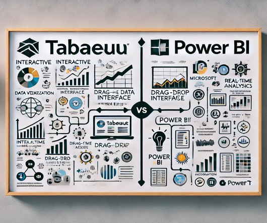
Summary: PowerBI alternatives like Tableau, Qlik Sense, and Zoho Analytics provide businesses with tailored Data Analysis and Visualisation solutions. Introduction PowerBI has become one of the most popular business intelligence (BI) tools, offering powerful Data Visualisation, reporting, and decision-making features.
In this article, we’ll explore the art of data visualization and how it can be used to tell compelling stories with business analytics. Tableau Tableau is a powerful data visualization tool that allows users to connect to a wide range of data sources and create interactive dashboards and visualizations.
This article will explore the key features and benefits, identify the ideal users for this solution, and guide you on when and how to […] The post Introduction of Microsoft Fabric appeared first on Analytics Vidhya. Enter Microsoft Fabric, a cutting-edge solution designed to revolutionize how we interact with technology.
In the […] The post Empowering PowerBI with the Semantic Layer appeared first on DATAVERSITY. However, a survey conducted by New Vantage Partners reveals that only a mere 26.5% of companies have effectively achieved this transformative goal.
Summary: Data Visualisation is crucial to ensure effective representation of insights tableau vs powerbi are two popular tools for this. This article compares Tableau and PowerBI, examining their features, pricing, and suitability for different organisations. What is PowerBI? billion in 2023.
ArticleVideo Book This article was published as a part of the Data Science Blogathon. This article helps in understanding the importance of data. The post Guide to Data Visualization and Insights appeared first on Analytics Vidhya.
The problem may occur when you want to import an Excel file in SharePoint to PowerBI. After that, paste the copied path in the URL in PowerBI. If this article is helpful, please clap and follow me for more data science articles. The articles that might you might interested in. You should see the .xlsx?web=1
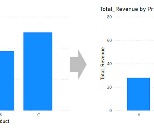
When you’re making bar charts or column charts in PowerBI (a tool for showing data visually), sometimes you want to add a special bar. So, in simpler terms, this message talks about adding a total bar to your charts in PowerBI. Hope this article is useful for you. was originally published in MLearning.ai
Microsoft PowerBI with Copilot Microsoft PowerBI has integrated genAI through its Copilot feature , transforming how users interact with data. The Copilot in PowerBI allows users to generate reports, visualizations, and insights using natural language queries, making advanced analytics accessible to a broader audience.
ArticleVideo Book This article was published as a part of the Data Science Blogathon. Visualization is the human being’s vehicle to the future – good, The post Power of Visualization and Getting Started with PowerBI appeared first on Analytics Vidhya.
ArticleVideo Book This article was published as a part of the Data Science Blogathon 1. INTRODUCTION Data visualization is one of the important aspects of. The post Embed PowerBI report in Jupyter Notebook using “powerbiclient” appeared first on Analytics Vidhya.
As a designer and developer, you know the power of data visualization to increase user conversion rates. In this article, we’ll explore the best practices for developing websites and mobile apps that effectively leverage data visualization to improve user engagement and conversion rates.
Introduction Power Query is a powerful data transformation and manipulation tool in PowerBI that allows users to extract, transform, and load data from various sources. It provides a user-friendly interface for performing complex data transformations without the need for coding.
Here are additional guides from our expansive article library that you may find useful on AI skills. Media Credit: Tina Huang Share Tweet Pin Email Filed Under: AI , Guides Latest Geeky Gadgets Deals Disclosure: Some of our articles include affiliate links. Every Essential AI Skill You Need to Know Watch this video on YouTube.
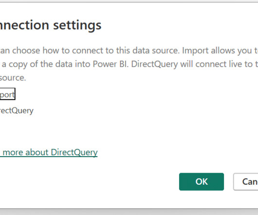
This article was originally written by Spencer Baucke and updated by Dave Ovitt. When connecting to data in PowerBI, you need to choose whether you want to use Import or Direct Query mode to connect to your data. Using the Import method, PowerBI captures and caches a snapshot of your data in PowerBI.
We organize all of the trending information in your field so you don't have to. Join 17,000+ users and stay up to date on the latest articles your peers are reading.
You know about us, now we want to get to know you!
Let's personalize your content
Let's get even more personalized
We recognize your account from another site in our network, please click 'Send Email' below to continue with verifying your account and setting a password.


Let's personalize your content