This site uses cookies to improve your experience. To help us insure we adhere to various privacy regulations, please select your country/region of residence. If you do not select a country, we will assume you are from the United States. Select your Cookie Settings or view our Privacy Policy and Terms of Use.
Cookie Settings
Cookies and similar technologies are used on this website for proper function of the website, for tracking performance analytics and for marketing purposes. We and some of our third-party providers may use cookie data for various purposes. Please review the cookie settings below and choose your preference.
Used for the proper function of the website
Used for monitoring website traffic and interactions
Cookie Settings
Cookies and similar technologies are used on this website for proper function of the website, for tracking performance analytics and for marketing purposes. We and some of our third-party providers may use cookie data for various purposes. Please review the cookie settings below and choose your preference.
Strictly Necessary: Used for the proper function of the website
Performance/Analytics: Used for monitoring website traffic and interactions
This article was published as a part of the Data Science Blogathon Overview Tableau is a well-known datavisualization tool widely used in the industry and adopted by major firms like Nike, Coca-Cola, Skype, TCS, Accenture, and various other plethoras of companies both large and small.
This article was published as a part of the Data Science Blogathon. There has been a debate in the industry between R and Tableau. Let us see this in today’s article. Source – Author What is DataVisualization? Datavisualization is an interdisciplinary field that uses visual elements […].
This article was published as a part of the Data Science Blogathon This article covers all the basic to intermediate concepts and features of Tableau from scratch. This is the perfect article for you if you are an absolute beginner in Tableau.
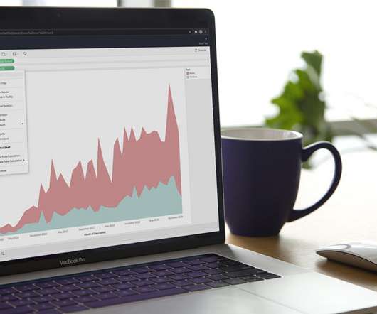
Introduction Tableau is a powerful datavisualization tool that allows users to analyze and present data interactively and meaningfully. It helps businesses make data-driven decisions by providing easy-to-understand insights and visualizations.
Introduction In the world of data analytics, where every piece of information holds untapped potential, the ability to transform raw data into actionable insights is a game-changer. Tableau, a dynamic and versatile datavisualization tool, has revolutionized how organizations harness the power of their data.
This article was published as a part of the Data Science Blogathon. Introduction With this Tableau tutorial, you’ll learn how to visualizedata and derive valuable insights from raw data, making dashboards, reports, tables, and more. Tableau is a […]. Tableau is a […].
This article was published as a part of the Data Science Blogathon. Introduction to Tableau Tips! Creating a chart or visual in Tableau is. The post 5 Tableau Tips for Designing a Tidy and Impactful Visualization appeared first on Analytics Vidhya.
This article was published as a part of the Data Science Blogathon. Introduction There have been many articles online showing how to connect R. The post Integrate R, Tableau and Excel appeared first on Analytics Vidhya.
This article was published as a part of the Data Science Blogathon. Introduction Tableau is a datavisualization tool created in Salesforce that allows users to connect to any database, like SQL or MongoDB, and interact freely.
Datavisualization is the art of presenting complex information in a way that is easy to understand and analyze. With the explosion of data in today’s business world, the ability to create compelling datavisualizations has become a critical skill for anyone working with data.
ArticleVideo Book Note: If you are more interested in learning concepts in an Audio-Visual format, we have this entire article explained in the video. The post Create Dual Axis Charts in Tableau appeared first on Analytics Vidhya.
ArticleVideo Book This article was published as a part of the Data Science Blogathon. Introduction Tableau is a powerful DataVisualization software, and much. The post Building a Covid-19 Vaccination Dashboard in Tableau appeared first on Analytics Vidhya.
ArticleVideo Book This article was published as a part of the Data Science Blogathon. Introduction Datavisualization is the practice of translating data into. The post Top 10 DataVisualization Tools appeared first on Analytics Vidhya.
This article was published as a part of the Data Science Blogathon. Introduction on Tableau Hi and welcome to this article. Visualization has become a necessary skill that eases the process of communicating with people outside your domain.
ArticleVideo Book This article was published as a part of the Data Science Blogathon. Introduction DataVisualization is a graphical way to represent data by. The post Make Your TableauVisuals More Effective – Tips And Tricks appeared first on Analytics Vidhya.
ArticleVideo Book This article was published as a part of the Data Science Blogathon. Can you tell a story using data? The post From Scratch to a Story – Introduction to Tableau (Part 1) appeared first on Analytics Vidhya. Let us look.
Datavisualization is the perfect solution to get over the headache. Datavisualization is the art and science of representing data in a visual format, such as charts, graphs, maps, and infographics. As a designer and developer, you know the power of datavisualization to increase user conversion rates.
Can this be the end of manual data analytics, or enhance the existing workflow? In this article, we tried to find out the answer to this question and analyze the timeline to see whether it is too early to do this or too late. The past of Data Analytics Data Analytics was not as easy or fast as it is today.
ArticleVideo Book This article was published as a part of the Data Science Blogathon. Introduction Visual analytics can tell the users the story of data. The post Data Preparation for Analysis : Towards Creating your Tableau Dashboard?—?Part Part 1 appeared first on Analytics Vidhya.
Python, R, and SQL: These are the most popular programming languages for data science. Libraries and Tools: Libraries like Pandas, NumPy, Scikit-learn, Matplotlib, Seaborn, and Tableau are like specialized tools for data analysis, visualization, and machine learning.
Some essential research tools include search engines like Google Scholar, JSTOR, and PubMed, reference management software like Zotero, Mendeley, and EndNote, statistical analysis tools like SPSS, R, and Stata, writing tools like Microsoft Word and Grammarly, and datavisualization tools like Tableau and Excel.
Editor's note: This article originally appeared in Tableau Public. When you want to explore, create, and share datavisualizations, we're happy to share that you can start creating vizzes directly from a browser on Tableau Public with the web authoring beta. Kristin Adderson. May 13, 2021 - 3:14pm. May 13, 2021.
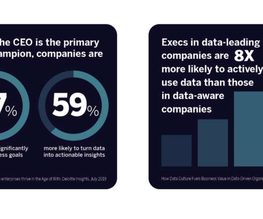
As a result, many prioritized and elevated the focus on data skills to nurture and strengthen their organizational behaviors, processes, and mindsets to become data-leading instead of data-lagging. . Learn the data skills that are in demand . Employers are looking for data skills; in fact they’re hungry for them.
As a result, many prioritized and elevated the focus on data skills to nurture and strengthen their organizational behaviors, processes, and mindsets to become data-leading instead of data-lagging. . Learn the data skills that are in demand . Employers are looking for data skills; in fact they’re hungry for them.
Python, R, and SQL: These are the most popular programming languages for data science. Libraries and Tools: Libraries like Pandas, NumPy, Scikit-learn, Matplotlib, Seaborn, and Tableau are like specialized tools for data analysis, visualization, and machine learning.
This article was published as a part of the Data Science Blogathon. Overview In this article, I will share my thoughts on the below. The post Interpreting P-Value and R Squared Score on Real-Time Data – Statistical Data Exploration appeared first on Analytics Vidhya.
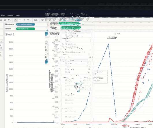
This article was published as a part of the Data Science Blogathon Introduction After months of research, development, and clinical trials vaccines for Covid-19 were released to the public. Since then vaccination drives are being run by medical associations and governments across the globe. Countries like UK […].
Summary: IoT datavisualization converts raw sensor data into interactive visuals, enabling businesses to monitor trends, detect anomalies, and improve efficiency. Introduction The Internet of Things (IoT) connects billions of devices, generating massive real-time data streams. What is IoT Visualization?
In this article, I’ll go through sections of code and describe the starter package you need to ace LangChain. These books can provide valuable insights and knowledge for a data scientist's professional development.2. DataVisualization Tool: Datavisualization is an important aspect of data science.
Summary: Datavisualization is the art of transforming complex data sets into easily understandable visuals like charts, graphs, and maps. By presenting information visually, datavisualization allows us to communicate insights clearly and effectively to a wider audience.
In the world of datavisualization , the ability to produce material that can speak to your audience, regardless of their technical expertise, is an ever-important factor to consider. Tableau Public Tableau Public , a powerful datavisualization software, empowers users to create interactive and shareable dashboards with ease.
Summary: Data Blending in Tableau is helpful in deriving multiple sources to gain comprehensive insights. Through intuitive drag-and-drop functionality, Tableau enables users to blend disparate datasets effortlessly, facilitating holistic data exploration. What is Data Blending in tableau with an example?
To me, Tableau is the only kind of tool that allows me to do data science as an artist. However, there will be no fun if everyone does the same visualization with Tableau. This article is one episode of my series “Make Your Dashboard Stand Out” which provides you with some brilliant but not default visualization ideas.
Be sure to check out his talk, “ A Practical Introduction to DataVisualization for Data Scientists ,” there! There are many ways to create visualizations, between chart choosers, chart wizards, GUI-based tools of various flavors, and of course, many libraries if you’re looking to use code.
Editor's note: This article originally appeared in Tableau Public. When you want to explore, create, and share datavisualizations, we're happy to share that you can start creating vizzes directly from a browser on Tableau Public with the web authoring beta. Kristin Adderson. May 13, 2021 - 3:14pm. May 13, 2021.
There are many well-known libraries and platforms for data analysis such as Pandas and Tableau, in addition to analytical databases like ClickHouse, MariaDB, Apache Druid, Apache Pinot, Google BigQuery, Amazon RedShift, etc. Datavisualization can help here by visualizing your datasets.
In a previous blog , I went over how you can create multiple select parameters in Tableau. Step 1: Create a DataVisualization to Apply the Parameter on Connect to Sample Super Store data Drag [Longitude] onto columns Drag [Latitude] onto rows Drag [Profit] onto the colors mark Drag [State] field onto details mark.
Editor's note: This article originally appeared in Forbes , by Larissa Amoroso, Sr. Director, Tableau Community. In the journey to become data-driven, even data-leading, organizations traditionally viewed technology as the golden ticket. As Tableau Lead Solution Engineer Candra McRae says: “Having data is one thing.
Data scientists try multiple models, evaluate their performance, and fine-tune some parameters to get better accuracy. DataVisualization and Interpretation To make the data understandable to stakeholders, visualizations are created in the form of charts, graphs, and dashboards.
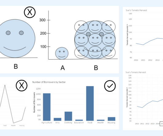
Alyssa Jenson November 14, 2023 - 6:59pm Sue Kraemer Senior Data Skills Curriculum Strategy Manager, Tableau Charts are all around us. In today’s world, the ability to swiftly make decisions and act on data is crucial. There are different chart types appropriate for the type of data being presented.
Editor's note: This article originally appeared in Forbes , by Larissa Amoroso, Sr. Director, Tableau Community . In the journey to become data-driven, even data-leading, organizations traditionally viewed technology as the golden ticket. As Tableau Lead Solution Engineer Candra McRae says: “Having data is one thing.
Editor's note: This article originally appeared in Forbes. Organizations that rely on data analysis to make decisions have a significant competitive advantage in overcoming challenges and planning for the future. In addition, forums moderated by data specialists can become indispensable roundups of solutions. Forbes BrandVoice.
Senior Evangelist, Tableau. Editor's note: This article originally appeared in Forbes , by Ashley Howard Neville, Tableau . How to help solve the data skills gap. We decided to identify the concepts from the formal training that were needed to give a good background to data and Tableau,” Smith said. “We
Senior Evangelist, Tableau. Editor's note: This article originally appeared in Forbes , by Ashley Howard Neville, Tableau . How to help solve the data skills gap. We decided to identify the concepts from the formal training that were needed to give a good background to data and Tableau,” Smith said. “We
We organize all of the trending information in your field so you don't have to. Join 17,000+ users and stay up to date on the latest articles your peers are reading.
You know about us, now we want to get to know you!
Let's personalize your content
Let's get even more personalized
We recognize your account from another site in our network, please click 'Send Email' below to continue with verifying your account and setting a password.


Let's personalize your content