This site uses cookies to improve your experience. To help us insure we adhere to various privacy regulations, please select your country/region of residence. If you do not select a country, we will assume you are from the United States. Select your Cookie Settings or view our Privacy Policy and Terms of Use.
Cookie Settings
Cookies and similar technologies are used on this website for proper function of the website, for tracking performance analytics and for marketing purposes. We and some of our third-party providers may use cookie data for various purposes. Please review the cookie settings below and choose your preference.
Used for the proper function of the website
Used for monitoring website traffic and interactions
Cookie Settings
Cookies and similar technologies are used on this website for proper function of the website, for tracking performance analytics and for marketing purposes. We and some of our third-party providers may use cookie data for various purposes. Please review the cookie settings below and choose your preference.
Strictly Necessary: Used for the proper function of the website
Performance/Analytics: Used for monitoring website traffic and interactions
This article explores 20 diverse PowerBI dashboard examples, showcasing how data can be transformed into actionable insights. From sales and marketing to HR and social media, these dashboards offer inspiration for your datavisualization projects.
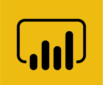
This article was published as a part of the Data Science Blogathon. What is PowerBI? Microsoft‘s business analytics product, PowerBI, delivers interactive datavisualizationBI capabilities that allow users to see and share data and insights throughout their organisation.
This article was published as a part of the Data Science Blogathon. Introduction BI tools, including software services, apps, and data connectors, make up the Microsoft PowerBI portfolio. Data from many sources are combined into a single dataset in this cloud-based platform.
This article was published as a part of the Data Science Blogathon. Introduction Microsoft’s PowerBI is one of its rapidly growing corporate analytics services. This self-service business intelligence tool is the latest and greatest in the data-driven industry.
This article was published as a part of the Data Science Blogathon. Table of contents Introduction What is Microsoft PowerBI? The post Getting started with Microsoft PowerBI appeared first on Analytics Vidhya.
This article was published as a part of the Data Science Blogathon. Introduction In this article, we will explore one of Microsoft’s proprietary products, “PowerBI”, in-depth. The post Building your First PowerBI Report from Scratch appeared first on Analytics Vidhya. And […].
This article was published as a part of the Data Science Blogathon. Introduction PowerBI is one of the most popular datavisualization and analytics software product developed by Microsoft. The post Top 10 PowerBI Interview Questions in 2022 appeared first on Analytics Vidhya.
This article was published as a part of the Data Science Blogathon. Image 1 Introduction In this guide, we explore new BI Technology known as Microsoft PowerBI and let us learn some basics of it before we deep dive. The post A Comprehensive Guide on PowerBI appeared first on Analytics Vidhya.
This article was published as a part of the Data Science Blogathon. Introduction to PowerBI By interpreting raw data into visual representations such as images, diagrams, videos, graphs, and more, PowerBi Custom Visualization allows you to gain insights from your data.
This article was published as a part of the Data Science Blogathon. Introduction to PowerBI In today’s data-driven age, a large amount of data gets generated daily from various sources such as supply chain and logistics, emails and multi-media, e-commerce websites, healthcare, transaction processing systems, etc.
ArticleVideo Book This article was published as a part of the Data Science Blogathon. Microsoft PowerBI is a collection of apps, software services, The post Rise of Microsoft PowerBI as a Data Analytics powerhouse appeared first on Analytics Vidhya.
This article was published as a part of the Data Science Blogathon. Introduction on PowerBI As part of our discussion, we will discuss the features of PowerBI, its benefits, and a detailed description of how to use it for presenting data using an example and creating reports.
Datavisualization is the art of presenting complex information in a way that is easy to understand and analyze. With the explosion of data in today’s business world, the ability to create compelling datavisualizations has become a critical skill for anyone working with data.
ArticleVideo Book This article was published as a part of the Data Science Blogathon. This article helps in understanding the importance of data. The post Guide to DataVisualization and Insights appeared first on Analytics Vidhya.
This article was published as a part of the Data Science Blogathon. Introduction The following is an in-depth article explaining DAX which stands for Data Analysis Expression. It is designed to […].
Datavisualization is the perfect solution to get over the headache. Datavisualization is the art and science of representing data in a visual format, such as charts, graphs, maps, and infographics. As a designer and developer, you know the power of datavisualization to increase user conversion rates.
Can this be the end of manual data analytics, or enhance the existing workflow? In this article, we tried to find out the answer to this question and analyze the timeline to see whether it is too early to do this or too late. The past of Data Analytics Data Analytics was not as easy or fast as it is today. value_counts().head(15)
ArticleVideo Book This article was published as a part of the Data Science Blogathon 1. INTRODUCTION Datavisualization is one of the important aspects of. The post Embed PowerBI report in Jupyter Notebook using “powerbiclient” appeared first on Analytics Vidhya.
Furthermore, code is a powerful tool for datavisualization, enabling analysts to create interactive and dynamic visualizations that can be easily shared and understood. Narrative: Instead of representing data through code or visualizations, a narrative format can be used to tell a story about the data.
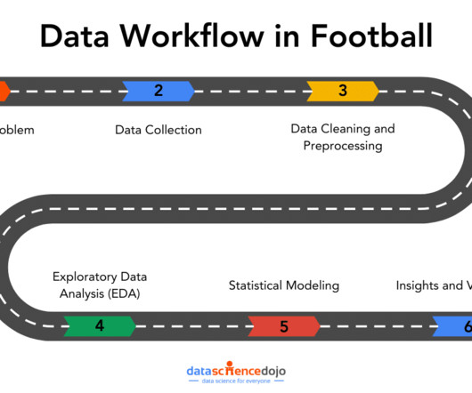
The coaching team is now counting on you to find a data-driven solution. This is where a data workflow is essential, allowing you to turn your raw data into actionable insights. In this article, well explore how that workflow covering aspects from data collection to datavisualizations can tackle the real-world challenges.
This article was published as a part of the Data Science Blogathon Introduction I have been associated with Analytics Vidya from the 3rd edition of Blogathon. Unlike hackathons, where we are supposed to come up with a theme-oriented project within the stipulated time, blogathons are different.
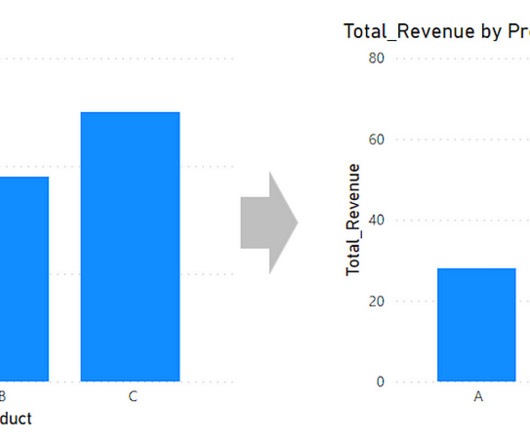
When you’re making bar charts or column charts in PowerBI (a tool for showing datavisually), sometimes you want to add a special bar. So, in simpler terms, this message talks about adding a total bar to your charts in PowerBI. Hope this article is useful for you.
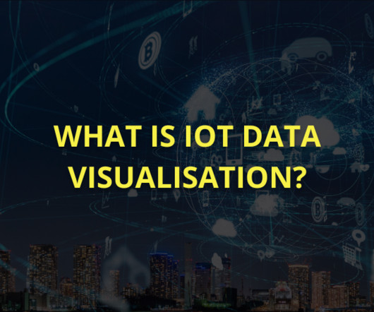
Summary: IoT datavisualization converts raw sensor data into interactive visuals, enabling businesses to monitor trends, detect anomalies, and improve efficiency. Introduction The Internet of Things (IoT) connects billions of devices, generating massive real-time data streams. What is IoT Visualization?
In the digital era, datavisualization stands as an indispensable tool in the realm of business intelligence. It represents the graphical display of data and information, transforming complex datasets into intuitive and understandable visuals.
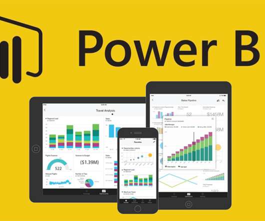
ArticleVideo Book This article was published as a part of the Data Science Blogathon. Visualization is the human being’s vehicle to the future – good, The post Power of Visualization and Getting Started with PowerBI appeared first on Analytics Vidhya.
Summary: Datavisualization is the art of transforming complex data sets into easily understandable visuals like charts, graphs, and maps. By presenting information visually, datavisualization allows us to communicate insights clearly and effectively to a wider audience.
In the world of datavisualization , the ability to produce material that can speak to your audience, regardless of their technical expertise, is an ever-important factor to consider. Tableau Public Tableau Public , a powerfuldatavisualization software, empowers users to create interactive and shareable dashboards with ease.
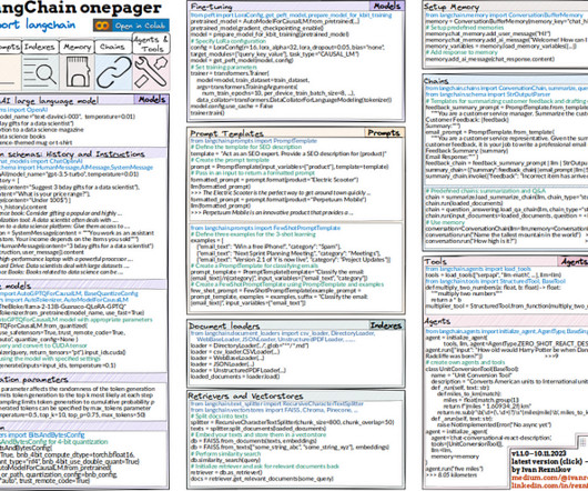
In this article, I’ll go through sections of code and describe the starter package you need to ace LangChain. These books can provide valuable insights and knowledge for a data scientist's professional development.2. DataVisualization Tool: Datavisualization is an important aspect of data science.
Data scientists try multiple models, evaluate their performance, and fine-tune some parameters to get better accuracy. DataVisualization and Interpretation To make the data understandable to stakeholders, visualizations are created in the form of charts, graphs, and dashboards.
R: A powerful tool for statistical analysis and datavisualization, R is particularly useful for exploratory data analysis and research-focused AI applications. Here are additional guides from our expansive article library that you may find useful on AI skills. Learn about our Disclosure Policy.
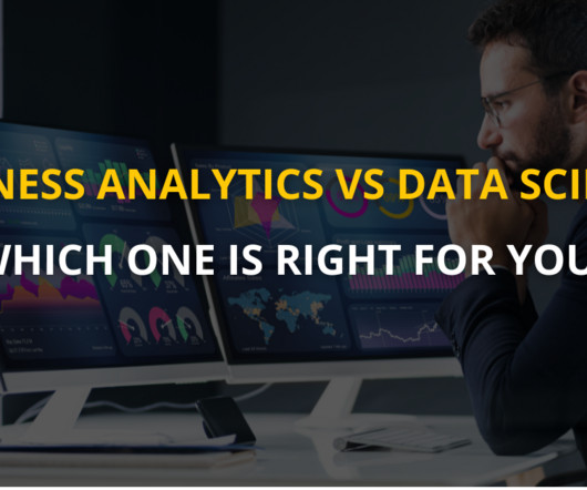
With data science and analytics reshaping industries, understanding the distinction between Business Analytics and Data Science is crucial for anyone navigating a career in this field. According to the US Bureau of Labor Statistics, jobs requiring data science skills will grow by 27.9%
The article will also demonstrate the impact of a skilled Business Analyst in driving organizational success. Datavisualization tools like Tableau and PowerBI can be applied to inform decisions. They are also vital in defining requirements, and ensuring seamless collaboration among stakeholders.
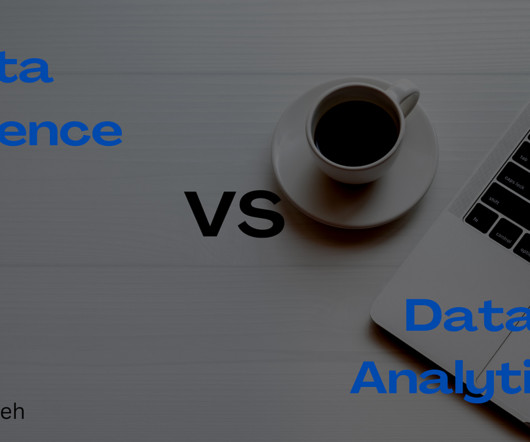
This article will serve as an ultimate guide to choosing between Data Science and Data Analytics. At the end of this article, you will fully understand what it entails to be a data scientist or data analyst. Before going into the main purpose of this article, what is data?
This can be applied to datavisualization tools such as PowerBI and others. At ODSC West, you’ll have ample opportunities to network, train through workshops and the bootcamp, and learn about the latest trends and movements in data science from those who are pioneering them.
These tools provide scalability and ease of use, making them ideal for enterprises that require robust data processing capabilities. DataVisualization and Business Intelligence Tableau Tableau has revolutionized datavisualization, offering a user-friendly platform for creating interactive dashboards and reports.
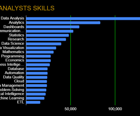
As you’ll see below, however, a growing number of data analytics platforms, skills, and frameworks have altered the traditional view of what a data analyst is. Data Presentation: Communication Skills, DataVisualization Any good data analyst can go beyond just number crunching.
The project I did to land my business intelligence internship — CAR BRAND SEARCH ETL PROCESS WITH PYTHON, POSTGRESQL & POWERBI 1. The article will be presented in 5 sections, which will be described as follows: Section 1: Brief description that acts as the motivating foundation of this research. using Anconda Environment.
The capacity to translate business needs into technical specifications is also part of this skillset, requiring a keen interest for detail and a methodical approach to handle data-related problems actively. In this article, let’s understand an explanation of how to enhance problem-solving skills as a data engineer.
Proficient in programming languages like Python or R, data manipulation libraries like Pandas, and machine learning frameworks like TensorFlow and Scikit-learn, data scientists uncover patterns and trends through statistical analysis and datavisualization. DataVisualization: Matplotlib, Seaborn, Tableau, etc.
Because they are the most likely to communicate data insights, they’ll also need to know SQL, and visualization tools such as PowerBI and Tableau as well. Machine Learning Engineer Machine learning engineers will use data much differently than business analysts or data analysts. Check it out here !
In Tableau, Data Blending is facilitated through intuitive functionalities, such as drag-and-drop interfaces and dynamic linking mechanisms. Understanding the nuances of Data Blending in Tableau is crucial for extracting meaningful insights. What is Data Blending in tableau with an example? What is Data Blending in PowerBI?
BI involves using data mining, reporting, and querying techniques to identify key business metrics and KPIs that can help companies make informed decisions. A career path in BI can be a lucrative and rewarding choice for those with interest in data analysis and problem-solving.
BI involves using data mining, reporting, and querying techniques to identify key business metrics and KPIs that can help companies make informed decisions. A career path in BI can be a lucrative and rewarding choice for those with interest in data analysis and problem-solving.
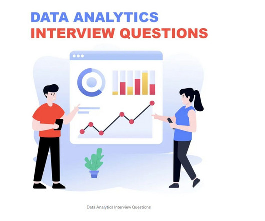
This comprehensive blog outlines vital aspects of Data Analyst interviews, offering insights into technical, behavioural, and industry-specific questions. It covers essential topics such as SQL queries, datavisualization, statistical analysis, machine learning concepts, and data manipulation techniques.
We organize all of the trending information in your field so you don't have to. Join 17,000+ users and stay up to date on the latest articles your peers are reading.
You know about us, now we want to get to know you!
Let's personalize your content
Let's get even more personalized
We recognize your account from another site in our network, please click 'Send Email' below to continue with verifying your account and setting a password.


Let's personalize your content