This site uses cookies to improve your experience. To help us insure we adhere to various privacy regulations, please select your country/region of residence. If you do not select a country, we will assume you are from the United States. Select your Cookie Settings or view our Privacy Policy and Terms of Use.
Cookie Settings
Cookies and similar technologies are used on this website for proper function of the website, for tracking performance analytics and for marketing purposes. We and some of our third-party providers may use cookie data for various purposes. Please review the cookie settings below and choose your preference.
Used for the proper function of the website
Used for monitoring website traffic and interactions
Cookie Settings
Cookies and similar technologies are used on this website for proper function of the website, for tracking performance analytics and for marketing purposes. We and some of our third-party providers may use cookie data for various purposes. Please review the cookie settings below and choose your preference.
Strictly Necessary: Used for the proper function of the website
Performance/Analytics: Used for monitoring website traffic and interactions
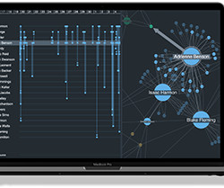
We’ve blogged before about the benefits of graph visualization SDKs over open source graph libraries. There are other datavisualization options available too, such as off-the-shelf apps and popular diagramming tools. 40,000 nodes and links visualized using KeyLines Does it tick the right boxes for your C-suite executives?
A number of companies have written detailed articles on the utilization of datavisualization with graphics. However, big data can be effective in more rudimentary designs as well. There are a lot of effective ways to use big data to make better designs.
The challenge to understand hidden relationships and uncover actionable insights from data is universal, across countless datavisualization use cases. In this blog post, we focus on seven of the most popular: Why visualizedata as a graph? Datavisualization makes it easy for us to identify trends and outliers.
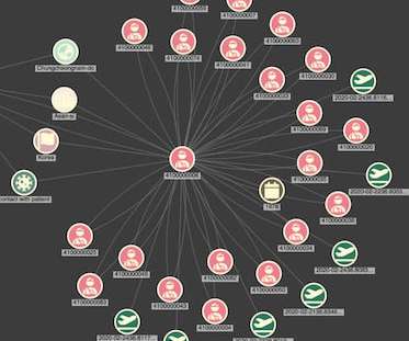
A basic visualization created in TigerGraph GraphStudio Once I’ve loaded each CSV file, We have a working graph database, a REST interface and a basic visualization. For more advanced analysis of your TigerGraph data, applications built using our powerful datavisualization toolkits provide the ideal solution.
It looks at the role datavisualization plays to detect, investigate and prevent misinformation and disinformation, and keep digital spaces safe. Each platform uses social media algorithms to drive personalized news feeds and content recommendations, which can present falsehoods as facts. Lies and falsehoods are nothing new.
Although AI technologies have improved the speed and accuracy of intelligence operations, getting better at detecting threat, spotting anomalies and even recommending courses of action, those alerts and recommendations are worthless without datavisualization to make them explainable and understandable to the human decision-maker.
We organize all of the trending information in your field so you don't have to. Join 17,000+ users and stay up to date on the latest articles your peers are reading.
You know about us, now we want to get to know you!
Let's personalize your content
Let's get even more personalized
We recognize your account from another site in our network, please click 'Send Email' below to continue with verifying your account and setting a password.


Let's personalize your content