This site uses cookies to improve your experience. To help us insure we adhere to various privacy regulations, please select your country/region of residence. If you do not select a country, we will assume you are from the United States. Select your Cookie Settings or view our Privacy Policy and Terms of Use.
Cookie Settings
Cookies and similar technologies are used on this website for proper function of the website, for tracking performance analytics and for marketing purposes. We and some of our third-party providers may use cookie data for various purposes. Please review the cookie settings below and choose your preference.
Used for the proper function of the website
Used for monitoring website traffic and interactions
Cookie Settings
Cookies and similar technologies are used on this website for proper function of the website, for tracking performance analytics and for marketing purposes. We and some of our third-party providers may use cookie data for various purposes. Please review the cookie settings below and choose your preference.
Strictly Necessary: Used for the proper function of the website
Performance/Analytics: Used for monitoring website traffic and interactions
The post Using DataVisualization to Explore the Human Space Race! Since the dawn of civilization, we have mapped constellations, named planets after Gods and so on. We have seen signs and visions in celestial bodies. In the previous century, we finally had the technology to […]. appeared first on Analytics Vidhya.
Leveraging datavisualization, banks can significantly enhance their fraud detection capabilities. I spoke with Atmajitsinh Gohil, author of R DataVisualization Cookbook , about the technologies transforming the fight against financial fraud. “Fraudsters adapt very quickly.
The complexity of healthcare data, the need for real-time analytics, and the demand for user-friendly interfaces can often seem overwhelming. But with Logi Symphony, these challenges become opportunities. With Logi Symphony, you’re not just overcoming obstacles, you’re driving innovation in healthcare.
7 Tips To Produce Readable Data Science Code • 30 Resources for Mastering DataVisualization • 15 More Free Machine Learning and Deep Learning Books • Simple and Fast Data Streaming for Machine Learning Projects • The AI Education Gap and How to Close It.
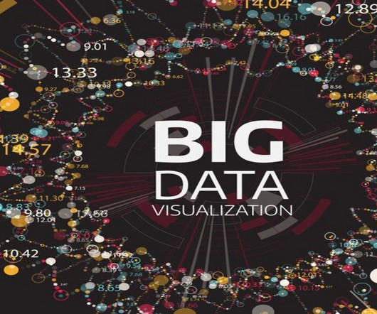
Summary: Big Datavisualization involves representing large datasets graphically to reveal patterns, trends, and insights that are not easily discernible from raw data. quintillion bytes of data daily, the need for effective visualization techniques has never been greater. As we generate approximately 2.5
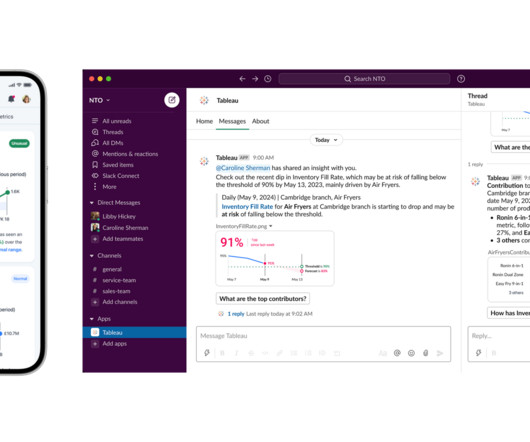
Introduction Tableau, a powerful datavisualization tool, can sometimes leave users with lingering questions. What’s the best way to display this data? Am I missing any key insights? Tableau tackles these issues head-on by leveraging artificial intelligence.
Blog Top Posts About Topics AI Career Advice Computer Vision Data Engineering Data Science Language Models Machine Learning MLOps NLP Programming Python SQL Datasets Events Resources Cheat Sheets Recommendations Tech Briefs Advertise Join Newsletter AI Agents in Analytics Workflows: Too Early or Already Behind?
Logi Symphony offers a powerful and user-friendly solution, allowing you to seamlessly embed self-service analytics, generative AI, datavisualization, and pixel-perfect reporting directly into your applications. Traditional BI tools can be cumbersome and difficult to integrate - but it doesn't have to be this way.
Introduction This article will introduce the readers to LIDA, an open-source python library for generating detailed datavisualizations and appealing infographics.
Datavisualization has become a major part of life for those looking to make use of the large swathes of data available in the modern world. As important as this data is, understanding and making use of that data is even more important. That’s where datavisualization comes in. Images add to your SEO.
DALL-E is an AI system from OpenAI that creates images from text. So of course someone entered “datavisualization in the style of insert-anything-here” for a wide array of inspiration. Tags: AI , DALL-E , OpenAI. You can enter very random things and get very real-looking output.
By Nate Rosidi , KDnuggets Market Trends & SQL Content Specialist on June 11, 2025 in Language Models Image by Author | Canva If you work in a data-related field, you should update yourself regularly. Data scientists use different tools for tasks like datavisualization, data modeling, and even warehouse systems.
Why do some embedded analytics projects succeed while others fail? We surveyed 500+ application teams embedding analytics to find out which analytics features actually move the needle. Read the 6th annual State of Embedded Analytics Report to discover new best practices. Brought to you by Logi Analytics.
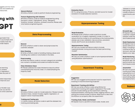
Machine Learning with ChatGPT Cheat Sheet • DataVisualization Best Practices & Resources for Effective Communication • ChatGLM-6B: A Lightweight, Open-Source ChatGPT Alternative • HuggingGPT: The Secret Weapon to Solve Complex AI Tasks • Automate Your Codebase with Promptr and GPT
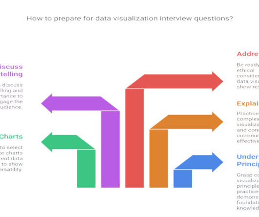
Summary : Prepare for your datavisualization interview with our guide to the top questions and answers. Introduction Datavisualization is no longer just a niche skill; it’s a fundamental component of Data Analysis , business intelligence, and data science. Preparing for these questions is crucial.
In todays data-driven world, every researcher and analyst requires the ability to yield prompt information from raw data and present it in visual form. Thats exactly what Microsofts new AI tool, Data Formulator, can help you with.
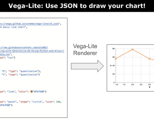
Last Updated on December 21, 2023 by Editorial Team Author(s): Angelica Lo Duca Originally published on Towards AI. A tutorial on how to start using Vega-Lite to draw charts.Image by Author Vega-lite is a concise JSON representation of a Vega visualization. Join thousands of data leaders on the AI newsletter.
The complexity of financial data, the need for real-time insight, and the demand for user-friendly visualizations can seem daunting when it comes to analytics - but there is an easier way. Together, we can overcome these hurdles and empower your users with the data they need to drive success.
Last Updated on April 14, 2025 by Editorial Team Author(s): John Loewen, PhD Originally published on Towards AI. No-fuss prompting for error-free Python Streamlit data viz code How easy is it to create datavisuals with GPT-4 and the Python Streamlit library? Join thousands of data leaders on the AI newsletter.
AutoGPT: Everything You Need To Know • DataVisualization Best Practices & Resources for Effective Communication • 8 Open-Source Alternative to ChatGPT and Bard • Baby AGI: The Birth of a Fully Autonomous AI • LangChain 101: Build Your Own GPT-Powered Applications
Author(s): John Loewen, PhD Originally published on Towards AI. This includes the full workflow of reading a dataset, cleaning it, filtering by year, and generating an interactive datavisualization using Plotly (for example, a choropleth map). Join thousands of data leaders on the AI newsletter.
Google Colab, Googles cloud-based notebook tool for coding, data science, and AI, is gaining a new AI agent tool, Data Science Agent, to help Colab users quickly clean data, visualize trends, and get insights on their uploaded data sets. First announced at Googles I/O developer conference early
Last Updated on December 18, 2024 by Editorial Team Author(s): John Loewen, PhD Originally published on Towards AI. Can it do decent quantitative analysis from a datavisualization? For me, one of the most useful GPT-4 tools is the ability to analyze and interpret image data. Published via Towards AI
Author(s): John Loewen, PhD Originally published on Towards AI. My methods of using GPT-4 to optimize my datavisual workflow For the past 6 months, I have been a heavy daily GPT-4 user. I am most often prompting this LLM for datavisualization code and on-the-fly-visuals because it does all these steps very efficiently.
Surging fraud volumes and sophisticated AI tools have changed the dynamics for anti-fraud teams. While it has always been a data-intensive process, enterprise fraud management today is more complex and more important than ever. An AI-powered fight back? Automation is nothing new in enterprise fraud management.
Data manipulation: You can use the plugin to perform data cleaning, transformation, and feature engineering tasks. Datavisualization: You can use the plugin to create interactive charts, maps, and other visualizations. Here’s an example of datavisualization through Code Interpreter.
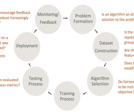
Introduction Ref: [link] AI-based systems are disrupting almost every industry and helping us to make crucial decisions that are impacting millions of lives. Hence it is extremely important to understand how these decisions are made by the AI system. AI researchers, professionals must be able […].
Research Data Scientist Description : Research Data Scientists are responsible for creating and testing experimental models and algorithms. According to Google AI, they work on projects that may not have immediate commercial applications but push the boundaries of AI research.
Introduction Generative AI in forensic science involves applying artificial intelligence techniques to generate data, images, or other forensic evidence-related information.
Last Updated on December 18, 2024 by Editorial Team Author(s): John Loewen, PhD Originally published on Towards AI. Can it do decent quantitative analysis from a datavisualization? For me, one of the most useful GPT-4 tools is the ability to analyze and interpret image data. Published via Towards AI
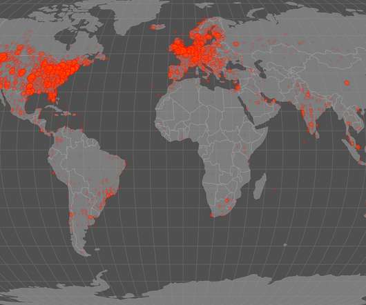
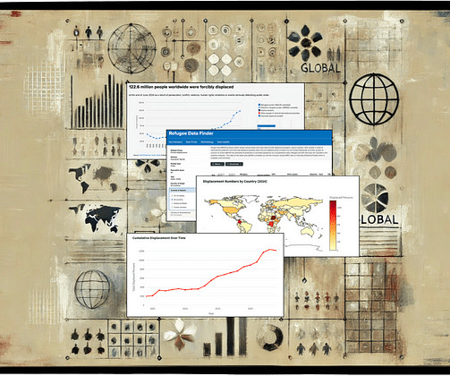
Last Updated on December 16, 2024 by Editorial Team Author(s): John Loewen, PhD Originally published on Towards AI. Visualizing alarming UNHCR displacement trends with Python This member-only story is on us. Join thousands of data leaders on the AI newsletter. Published via Towards AI
DataVisualization Think of datavisualization as creating a visual map of the data. DataVisualization Think of datavisualization as creating a visual map of the data. Ethical Frameworks: Establishing ethical guidelines for AI development and deployment.
Introduction In today’s data-driven world, machine learning is playing an increasingly prominent role in various industries. Explainable AI aims to make machine learning models more transparent to clients, patients, or loan applicants, helping build trust and social acceptance of these systems.
Agents in LangChain This video explains what LangChain agents are and how they can be used to build AI applications. LangChain agents are a type of artificial intelligence that can be used to build AI applications. How can LangChain agents be used to build AI applications? How is AI being used to improve patient care?
This is why conferences that revolve around Artificial Intelligence (AI) are great for developers, analysts and students who wish to work with AI (build or incorporate). The post Top AI and ML Conferences in 2022 appeared first on Analytics Vidhya.
Introduction Artificial intelligence (AI) is one of the fastest-growing areas of technology, and AI engineers are at the forefront of this revolution. These professionals are responsible for the design and development of AI systems, including machine learning algorithms, computer vision, natural language processing, and robotics.
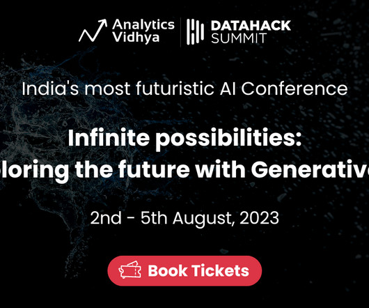
Embark on a journey of infinite possibilities at DataHack Summit 2023, India’s premier AI conference. DataHack Summit is back with a big bang as this year we’re taking the discussions around Generative AI to the next level because ‘GenAI is the Path to Gen-ius Solutions’.
This powerful visualization tool finds applications across diverse fields, from website analytics to retail analysis, helping industries make informed decisions. Heat maps are a powerful datavisualization tool that visually represent complex datasets, making it easier to interpret and analyze information.
Introduction In the modern day, where there is a colossal amount of data at our disposal, using ML models to make decisions has become crucial in sectors like healthcare, finance, marketing, etc. The post Explainable AI using OmniXAI appeared first on Analytics Vidhya. Many ML models are black boxes since it is difficult to […].
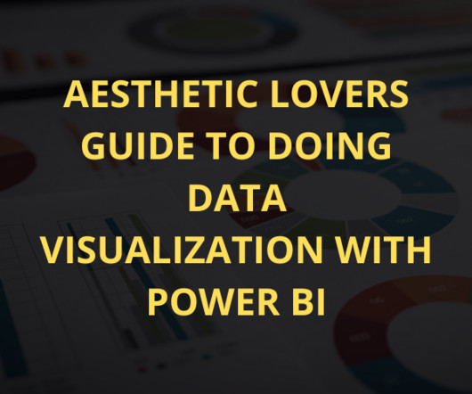
Summary: DataVisualization with Power BI enhances decision-making by transforming raw data into compelling visuals. DataVisualization with Power BI isnt just about charts and graphsits about making data look as good as it feels to understand. Well, youre in the right place!
Introduction Effective data management is crucial for organizations of all sizes and in all industries because it helps ensure the accuracy, security, and accessibility of data, which is essential for making good decisions and operating efficiently. This is important […] The post How is AI Improving the Data Management Systems?
We organize all of the trending information in your field so you don't have to. Join 17,000+ users and stay up to date on the latest articles your peers are reading.
You know about us, now we want to get to know you!
Let's personalize your content
Let's get even more personalized
We recognize your account from another site in our network, please click 'Send Email' below to continue with verifying your account and setting a password.


Let's personalize your content