This site uses cookies to improve your experience. To help us insure we adhere to various privacy regulations, please select your country/region of residence. If you do not select a country, we will assume you are from the United States. Select your Cookie Settings or view our Privacy Policy and Terms of Use.
Cookie Settings
Cookies and similar technologies are used on this website for proper function of the website, for tracking performance analytics and for marketing purposes. We and some of our third-party providers may use cookie data for various purposes. Please review the cookie settings below and choose your preference.
Used for the proper function of the website
Used for monitoring website traffic and interactions
Cookie Settings
Cookies and similar technologies are used on this website for proper function of the website, for tracking performance analytics and for marketing purposes. We and some of our third-party providers may use cookie data for various purposes. Please review the cookie settings below and choose your preference.
Strictly Necessary: Used for the proper function of the website
Performance/Analytics: Used for monitoring website traffic and interactions
Introduction As the availability and importance of information as a robust asset increases in the modern global economy, it becomes essential to represent the information appropriately, especially to audiences with a non-technical background.
Efficient decision-making is the result of combining information, analysis, and effectiveness. PowerBI and Tableau, popular and user-friendly data visualization tools, help businesses organize large datasets.
Introduction PowerBI has emerged as a formidable tool within data science, enabling businesses to formulate informed decisions rooted in data-driven insights. Developed by Microsoft, PowerBI Visualizations empower users to visually represent their data and disseminate insights seamlessly across organizational echelons.
It may not be easy to incorporate, sort and analyze such information for presentation purposes to be meaningful. It is at this juncture that PowerBI Semantic Models are useful. They also work in the capacity of […] The post What are PowerBI Semantic Models? appeared first on Analytics Vidhya.
In today’s fast-paced business landscape, making informed decisions is essential for the success of organizations. Both MS Excel and PowerBI offer impressive capabilities regarding data analysis and decision-making. This […] The post Excel vs PowerBI – Which is a Better for Decision Making?
PowerBI is an influential tool, shaping raw data into informative visuals and reports. With a user-friendly interface and formidable functionalities, PowerBI is an invaluable platform for individuals to refine their skills through hands-on projects.
PowerBI is a powerful data visualization tool that helps them turn raw data into meaningful insights and actionable decisions. In this blog, we will explore the role of data analysts and how they use PowerBI to extract insights from data and drive business success. Check out this course and learn PowerBI today!
Are you geared to create a sales dashboard on PowerBI and track key performance indicators to drive sales success? Creating a sales dashboard in PowerBI is a straightforward process that can help your sales team to track key performance indicators (KPIs) and make data-driven decisions. Excel, SQL Server, etc.).
Row-level security is a powerful data governance capability across many business intelligence platforms, and PowerBI is no exception. Learning how to implement row-level security is critical for any PowerBI developer hoping to add an extra layer of security to their reports and datasets. payroll or sales data).
Employing an analytical system in a data-driven business can help it to discover useful trends, information, conclusions and elevated decision making. PowerBI proves to be the best tool for analysis and visualization of data. Cloud-based PowerBI technology is a forerunner for corporate executives.
By forecasting sales performance, businesses can identify anomalies or trends, which are crucial for directing future sales strategies and making informed decisions. PowerBI: PowerBI, integrated within Microsoft Fabric, is a leading Business Intelligence tool that facilitates advanced data visualization and reporting.
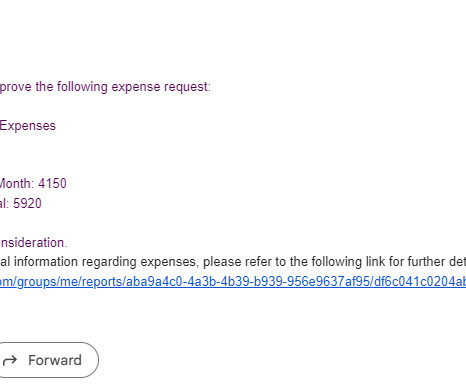
By integrating Power Automate workflows with your PowerBI report, you can develop robust business solutions and automate processes such as updating data, sending data driven alerts , requesting approvals, and more. In this blog, we will walk you through how to integrate Power Automate workflows with PowerBI.
Summary: Data Visualization with PowerBI enhances decision-making by transforming raw data into compelling visuals. Learn PowerBI and other essential tools with Pickl.AIs free course, which is available with certification and a job guarantee. In fact, PowerBI is leading the pack with a 13.42% market share.
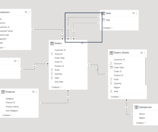
When thinking about PowerBI , the platform’s visuals and report side immediately come to mind. Data modeling in PowerBI has a major impact on the performance of reports and should be considered a substantial learning milestone for new PowerBI developers. Why Does Data Modeling Matter in PowerBI?
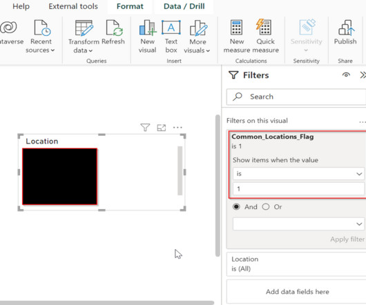
If you’ve spent any time working with PowerBI , you already know that it provides a great platform for visualizing and interacting with your data. Another tool for investigating your data is drilling through a visual to get more information regarding a summarized field or field entity. You’ll start by creating a new page.
How to Optimize PowerBI and Snowflake for Advanced Analytics Spencer Baucke May 25, 2023 The world of business intelligence and data modernization has never been more competitive than it is today. Table of Contents Why Discuss Snowflake & PowerBI?
Data visualization is the art of presenting complex information in a way that is easy to understand and analyze. It allows businesses to quickly and easily understand large amounts of complex information, identify patterns, and make data-driven decisions. Keep it simple Simplicity is key when it comes to data visualization.
Explore, analyze, and visualize data using PowerBI Desktop to make data-driven business decisions. Check out our Introduction to PowerBI cohort. This insight informs personalized marketing strategies and improves customer engagement. Improvise your models today with plots in data science!
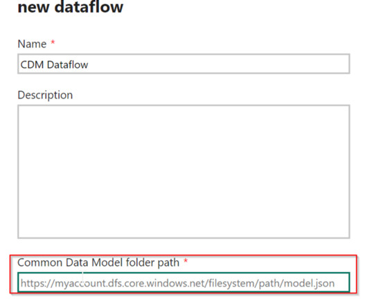
PowerBI Desktop enables the connection and retrieval of data from various sources, followed by data transformation using Power Query. To address this challenge, Microsoft introduced Dataflows within the PowerBI service. What are Dataflows in PowerBI?
In PowerBI, you can merge these sources through data transformation, while in Python, libraries like pandas are used to integrate and join different datasets. In PowerBI: You can use the Column Profile option to quickly view data completeness, data types, and patterns, helping you detect any inconsistencies early.
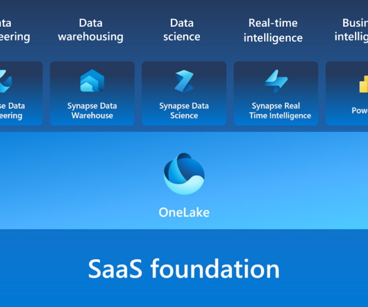
Microsoft Fabric combines multiple elements into a single platform – Image courtesy of Microsoft The contribution of PowerBI The integration of Microsoft PowerBI and Microsoft Fabric offers a powerful combination for organizations seeking comprehensive data analytics and insights.
It involves extracting insights from large sets of data to make informed decisions. This can make it difficult for stakeholders to understand the results of the analysis and make informed decisions. Check out this course and learn PowerBI today! One of the most common ways to represent a data analysis is through code.
In PowerBI , the measure is used to calculate aggregations and percentages or when you require a single value for a group of rows. Values are calculated based on the information derived from applied filters in the report or the fields used in visualizations. Contact phData’s PowerBI Experts Today!
Summary : Microsoft Fabric is an end-to-end Data Analytics platform designed for integration, processing, and advanced insights, while PowerBI excels in creating interactive visualisations and reports. Key Takeaways Microsoft Fabric is a full-scale data platform, while PowerBI focuses on visualising insights.
Summary: PowerBI dashboards transform complex data into actionable insights, enabling organizations to make informed decisions quickly. By using powerbi dashboard examples, businesses can can apply effective design principles to enhance collaboration and operational efficiency.
It helps in analysing data to provide valuable information. The end objective is to make an informed business decision. In this blog, we will unfold the benefits of PowerBI and key PowerBI features , along with other details. What is PowerBI? Here comes the role of PowerBI.
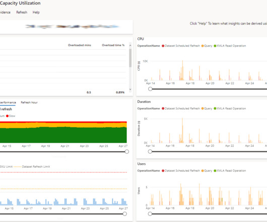
Organizations spend lots of money ensuring they have the right resources to support their PowerBI platform to ensure a good developer and end-user experience. This app equips PowerBI admins to be able to monitor their capacity’s resources and identify issues and areas for improvement.
Summary: PowerBI is a business intelligence tool that transforms raw data into actionable insights. PowerBI enhances decision-making by providing interactive dashboards and reports that are accessible to both technical and non-technical users. What Is PowerBI?
Summary: PowerBI is a business analytics tool transforming data into actionable insights. Key features include AI-powered analytics, extensive data connectivity, customisation options, and robust data modelling. Real-time analytics facilitates timely and informed decision-making. Why PowerBI?
Summary: In PowerBI, slicers and filters serve distinct purposes. Introduction In today’s data-driven world, businesses rely heavily on analytics to make informed decisions. Introduction In today’s data-driven world, businesses rely heavily on analytics to make informed decisions. What are Slicers in PowerBI?
By the end of this blog, you should have a decent working knowledge of how Field Parameters can make your life as a PowerBI developer much easier. How to Create a Field Parameter Now that we understand what Field Parameters are and why they are important, let’s run through a quick example of how to use them in PowerBI.
Summary: This blog dives into the most promising PowerBI projects, exploring advanced data visualization, AI integration, IoT & blockchain analytics, and emerging technologies. Introduction to PowerBI Project s The world of Data Analysis is constantly evolving, and PowerBI stands at the forefront of this transformation.
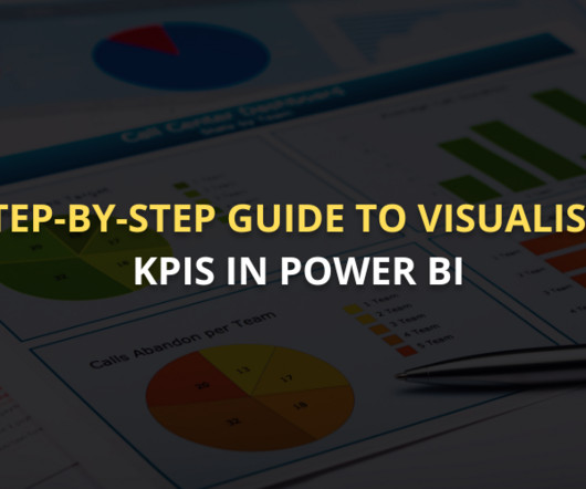
Summary: This guide covers visualising KPI in PowerBI, from setting up the tool and preparing data to selecting the right visuals and enhancing dashboards. KPIs help organisations track progress toward their goals, assess performance, and make informed decisions. Select the right visuals based on KPI types.
The Datamarts capability opens endless possibilities for organizations to achieve their data analytics goals on the PowerBI platform. Before we look into the PowerBI Datamarts, let us take a step back and understand the meaning of a Datamart. What is PowerBI Datamarts?
Data visualization has become an efficient method for communicating insights and making sense of complex information. Introduction to Data Visualization The amount of data has changed in the digital age, becoming both a challenge and an opportunity.
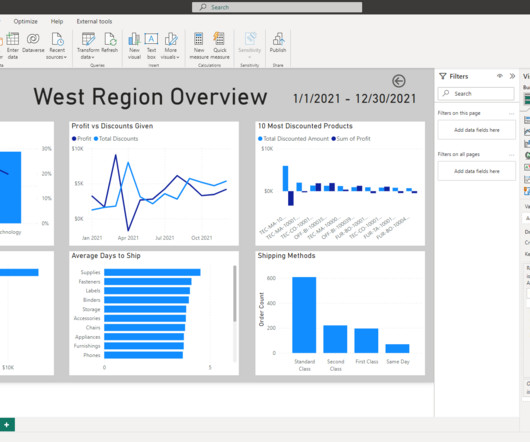
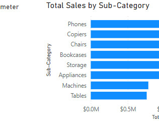
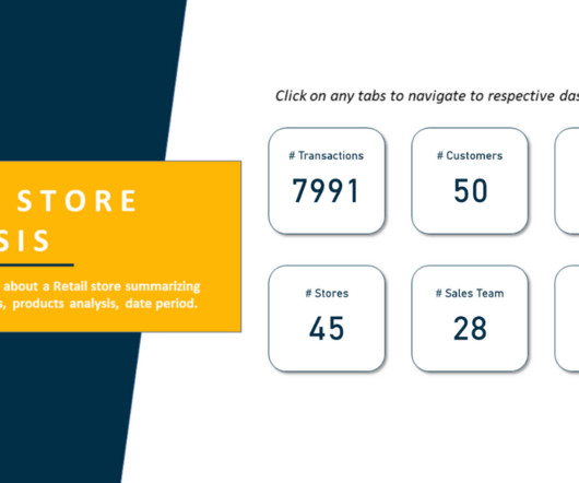
Store Analysis PowerBI Dashboard Example Tausif Kazi July 21, 2023 View Dashboard in PowerBI The Store Analysis PowerBI Dashboard provides insights into a Retail Store, summarizing Sales, Products, Customers, etc. Who is This Dashboard For?
Store Analysis PowerBI Dashboard Example Tausif Kazi July 21, 2023 View Dashboard in PowerBI The Store Analysis PowerBI Dashboard provides insights into a Retail Store, summarizing Sales, Products, Customers, etc. Who is This Dashboard For?
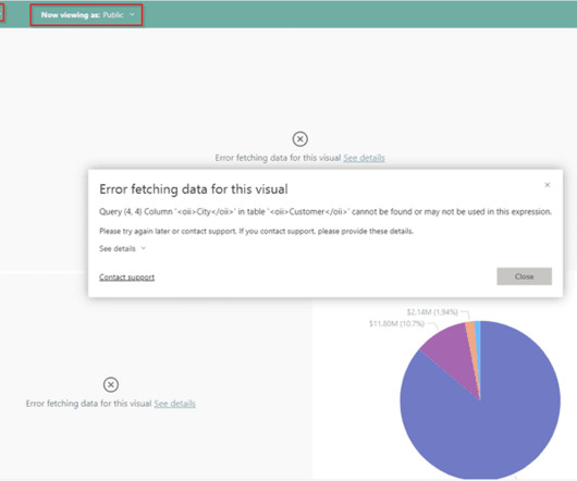
As PowerBI developers, we should be familiar with functionalities within PowerBI that allow for the implementation of various levels of data security; the most common example may be Row-Level Security (RLS). Perhaps this is because it is not a native feature readily available within PowerBI.
Summary: Counting rows is a fundamental task in PowerBI that requires careful consideration. This blog explores how to get total number of rows in power query. Understanding PowerBI and Its Importance PowerBI is a suite of business analytics tools that allows users to analyze data and share insights.
Summary: PowerBI alternatives like Tableau, Qlik Sense, and Zoho Analytics provide businesses with tailored Data Analysis and Visualisation solutions. Introduction PowerBI has become one of the most popular business intelligence (BI) tools, offering powerful Data Visualisation, reporting, and decision-making features.
In the […] The post Empowering PowerBI with the Semantic Layer appeared first on DATAVERSITY. However, a survey conducted by New Vantage Partners reveals that only a mere 26.5% of companies have effectively achieved this transformative goal.
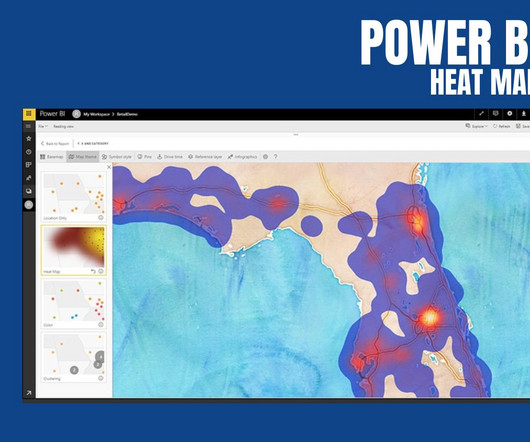
PowerBI Heatmap: Heatmap in PowerBI refers to the type of custom visualisation that businesses analysts utilise for showcasing the relationship between two variables on a map in different colour patches. It helps the user in visualising the patterns which are hidden and observe the changes across each axis.
In the contemporary business landscape, decisions increasingly rely on data-informed insights. Among these tools, KNIME and PowerBI have emerged as key players, catering to the demands of this evolving landscape. In this blog, we will focus on integrating PowerBI within KNIME for enhanced data analytics.
We organize all of the trending information in your field so you don't have to. Join 17,000+ users and stay up to date on the latest articles your peers are reading.
You know about us, now we want to get to know you!
Let's personalize your content
Let's get even more personalized
We recognize your account from another site in our network, please click 'Send Email' below to continue with verifying your account and setting a password.


Let's personalize your content