
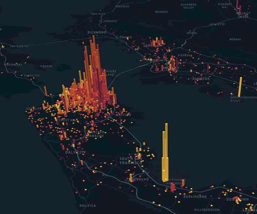
Map-based visualizations in Power BI – Bing or ArcGIS? Take your call!
Analytics Vidhya
APRIL 8, 2021
ArticleVideo Book Overview Understand how to create map-based visualizations in Power BI Explore and compare Bing and ArcGIS maps in Power BI Introduction In. The post Map-based visualizations in Power BI – Bing or ArcGIS? Take your call! appeared first on Analytics Vidhya.


Let's personalize your content