This site uses cookies to improve your experience. To help us insure we adhere to various privacy regulations, please select your country/region of residence. If you do not select a country, we will assume you are from the United States. Select your Cookie Settings or view our Privacy Policy and Terms of Use.
Cookie Settings
Cookies and similar technologies are used on this website for proper function of the website, for tracking performance analytics and for marketing purposes. We and some of our third-party providers may use cookie data for various purposes. Please review the cookie settings below and choose your preference.
Used for the proper function of the website
Used for monitoring website traffic and interactions
Cookie Settings
Cookies and similar technologies are used on this website for proper function of the website, for tracking performance analytics and for marketing purposes. We and some of our third-party providers may use cookie data for various purposes. Please review the cookie settings below and choose your preference.
Strictly Necessary: Used for the proper function of the website
Performance/Analytics: Used for monitoring website traffic and interactions
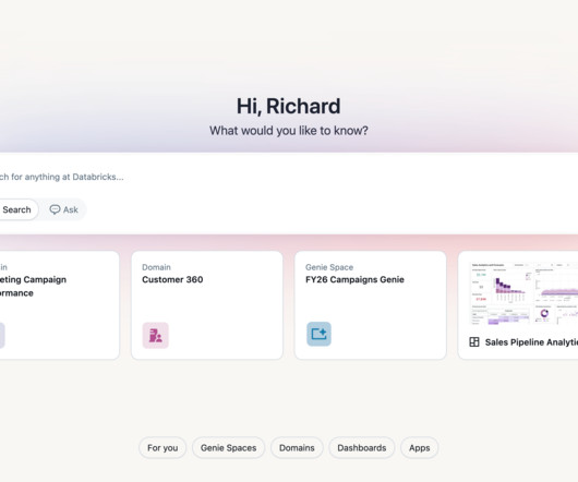
Join now Ready to get started? Get a Demo DATA + AI SUMMIT Data + AI Summit Happening Now Watch the free livestream of the keynotes! The Future of Databricks One This is just the beginning for Databricks One.
In this article, we tried to find out the answer to this question and analyze the timeline to see whether it is too early to do this or too late. BI Dashboards Everywhere After 2018, a new shift happened. Tools like Tableau and PowerBI do data analysis by just clicking, and they offer amazing visualizations at once, called dashboards.
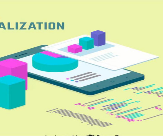
In this article, we’ll explore the art of data visualization and how it can be used to tell compelling stories with business analytics. TableauTableau is a powerful data visualization tool that allows users to connect to a wide range of data sources and create interactive dashboards and visualizations.
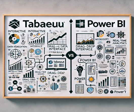
Summary: Data Visualisation is crucial to ensure effective representation of insights tableau vs powerbi are two popular tools for this. This article compares Tableau and PowerBI, examining their features, pricing, and suitability for different organisations. What is Tableau? billion in 2023.
Microsoft PowerBI with Copilot Microsoft PowerBI has integrated genAI through its Copilot feature , transforming how users interact with data. The Copilot in PowerBI allows users to generate reports, visualizations, and insights using natural language queries, making advanced analytics accessible to a broader audience.
Summary: PowerBI alternatives like Tableau, Qlik Sense, and Zoho Analytics provide businesses with tailored Data Analysis and Visualisation solutions. Introduction PowerBI has become one of the most popular business intelligence (BI) tools, offering powerful Data Visualisation, reporting, and decision-making features.
As a designer and developer, you know the power of data visualization to increase user conversion rates. In this article, we’ll explore the best practices for developing websites and mobile apps that effectively leverage data visualization to improve user engagement and conversion rates.
Summary: Data Blending in Tableau is helpful in deriving multiple sources to gain comprehensive insights. Through intuitive drag-and-drop functionality, Tableau enables users to blend disparate datasets effortlessly, facilitating holistic data exploration. What is Data Blending in tableau with an example?
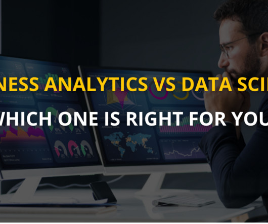
This article helps you choose the right path by exploring their differences, roles, and future opportunities. Dashboards, such as those built using Tableau or PowerBI , provide real-time visualizations that help track key performance indicators (KPIs). Data Scientists require a robust technical foundation.
Visualization libraries available in Python such as Matplotlib and Seaborn, and tools like Tableau and PowerBI become crucial to telling stories that lead to insights. To know more, read our article on what a Machine Learning engineer is. Deployment and Monitoring Once a model is built, it is moved to production.
In this article, I’ll go through sections of code and describe the starter package you need to ace LangChain. Consider gifting a data visualization tool like Tableau Public or Plotly, which can help them create interactive and visually appealing charts and graphs to communicate their data analysis results.3.
Here we’ve prepared a detailed outline about the future of BI, including main trends, challenges, specifics, BI-as-a-Service, and most promising BI services of today. In this article, you’ll discover: upcoming trends in business intelligence what benefits will BI provide for businesses in 2020 and on?
The article will also demonstrate the impact of a skilled Business Analyst in driving organizational success. Data visualization tools like Tableau and PowerBI can be applied to inform decisions. They are also vital in defining requirements, and ensuring seamless collaboration among stakeholders.
Generated with Bing AI Unlocking the power of data doesn't require a data analyst certification; it's a skill accessible to anyone with data access. In this article, we'll delve into 7 crucial aspects that can elevate your data utilization game, ensuring that your insights are not only accurate but also effectively communicated.
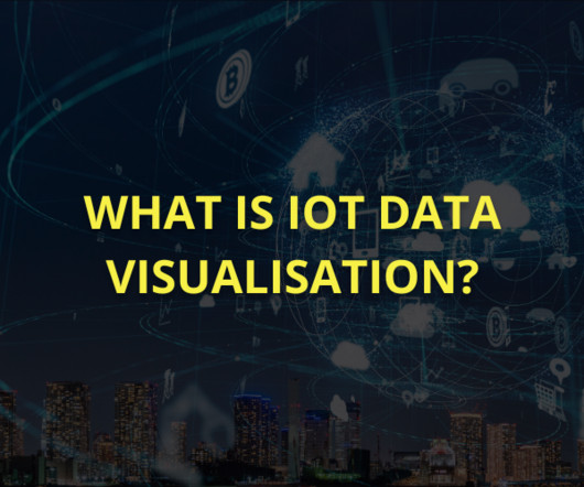
Using tools like PowerBI, Tableau, and Grafana, organisations can analyse real-time IoT data, optimise operations, and enhance decision-making while addressing security, scalability, and visualisation challenges. Popular IoT visualisation tools include PowerBI, Tableau, Grafana, Google Data Studio, and Kibana.
Tableau Public Tableau Public , a powerful data visualization software, empowers users to create interactive and shareable dashboards with ease. What sets Tableau apart is its intuitive, user-friendly, drag-and-drop interface. Other elements make Tableau Public an excellent choice for data visualization experts.
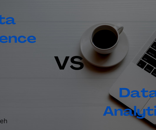
This article will serve as an ultimate guide to choosing between Data Science and Data Analytics. At the end of this article, you will fully understand what it entails to be a data scientist or data analyst. Before going into the main purpose of this article, what is data? What do you mean by data?
Data Visualization and Business Intelligence TableauTableau has revolutionized data visualization, offering a user-friendly platform for creating interactive dashboards and reports. PowerBI Microsoft’s PowerBI is another popular business intelligence tool, known for its integration with the broader Microsoft ecosystem.
This could involve using tools like Tableau or PowerBI to create visualizations and dashboards. WHAT NEXT Did you like my article? This could involve using tools like Apache Spark or Apache Flink to perform data transformations, analytics, and machine learning. BECOME a WRITER at MLearning.ai
Tools like Tableau, PowerBI, and D3.js Text and Sentiment Analysis These two techniques are used to analyze unstructured textual data, such as customer reviews, social media posts, or news articles. js offer robust capabilities for creating interactive visualizations that provide a more immersive analytics experience.
BI involves using data mining, reporting, and querying techniques to identify key business metrics and KPIs that can help companies make informed decisions. A career path in BI can be a lucrative and rewarding choice for those with interest in data analysis and problem-solving.
BI involves using data mining, reporting, and querying techniques to identify key business metrics and KPIs that can help companies make informed decisions. A career path in BI can be a lucrative and rewarding choice for those with interest in data analysis and problem-solving.
Because they are the most likely to communicate data insights, they’ll also need to know SQL, and visualization tools such as PowerBI and Tableau as well. Some of the tools you can expect to see used will be PowerBI and Tableau Data Architect Before you ask, yes a data architect and a data engineer are quite different.
Data Analytics Platforms: Tableau, PowerBI, Looker, Alteryx, Google Analytics, SPSS, SAP, Pandas. The most common trend shouldn’t come as a surprise, as the most in-demand data analytics platforms revolve around reporting, such as Tableau, PowerBI, Looker, Alteryx, Google Analytics, SPSS, and SAP.
This article presents the top free Data Science courses available in 2024, providing a roadmap for those eager to start or advance their careers in this rapidly expanding field. Pickl.AI’s Data Science Course is structured into 11 modules, covering everything from SQL and Tableau to Machine Learning techniques.
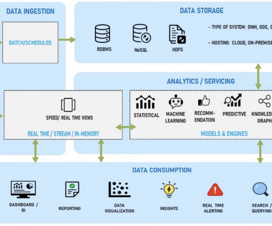
In this article, I will explain the modern data stack in detail, list some benefits, and discuss what the future holds. Later, BI tools such as Chartio, Looker, and Tableau arrived on the data scene. Powered by cloud computing, more data professionals have access to the data, too. What Is the Modern Data Stack?
In this article, let’s understand an explanation of how to enhance problem-solving skills as a data engineer. Familiarize with data visualization techniques and tools like Matplotlib, Seaborn, Tableau, or PowerBI. Hadoop, Spark).
In this comprehensive article, we will delve into the differences between Data Science and Data Engineering, explore the roles and responsibilities of Data Scientists and Data Engineers, and address some frequently asked questions in the domain. Data Visualization: Matplotlib, Seaborn, Tableau, etc.
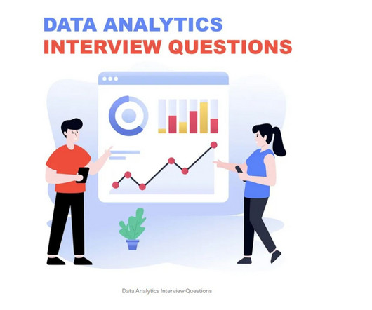
This article aims to guide you through the intricacies of Data Analyst interviews, offering valuable insights with a comprehensive list of top questions. By the end of this article, you’ll explore data analytics certification courses that will significantly help you advance your career in the data domain.
This article aims to clarify these concepts, explore their differences, and highlight their significance in everyday life. Text: Textual data, such as customer feedback, articles, or emails, provides qualitative insights that can influence decision-making processes. Data processing and analysis play crucial roles in different fields.
This article aims to guide readers in selecting the best AI and Machine Learning Courses to enhance their careers. hours of on-demand video 5 coding exercises 40 articles and 9 downloadable resources Full access on mobile and TV Data Science Job Guarantee Program by Pickl.AI Lifetime access with certification upon completion.
This article aims to explore key analytical capabilities that contribute to business success, highlighting their significance and the benefits they bring. Popular tools like Tableau and PowerBI empower users to create interactive dashboards, allowing real-time data exploration.
While Excel is not as powerful as specialized data manipulation tools, it is widely accessible and user-friendly. Business Intelligence (BI) Tools BI tools like Tableau, PowerBI, and QlikView provide comprehensive data manipulation features and advanced visualization capabilities.
In this article, we will explore both sides, providing examples and statistics to illustrate the impact of data visualization in various fields. Disadvantages of Data visualization Data visualization is a powerful tool for conveying complex information, but it also has significant disadvantages.
Data Analysis and Transition to Machine Learning: Skills: Python, SQL, Excel, Tableau and PowerBI are relevant skills for entry-level data analysis roles. Full Stack Development: Tech Stack: MERN Why: Many companies look for developers capable of handling both frontend and backend. However, the competition is high.
We organize all of the trending information in your field so you don't have to. Join 17,000+ users and stay up to date on the latest articles your peers are reading.
You know about us, now we want to get to know you!
Let's personalize your content
Let's get even more personalized
We recognize your account from another site in our network, please click 'Send Email' below to continue with verifying your account and setting a password.


Let's personalize your content