article thumbnail

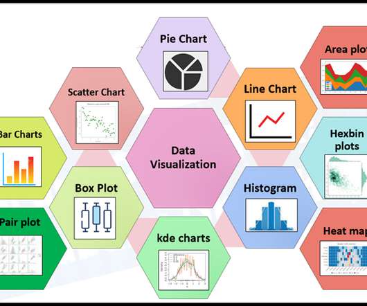
Open-Source BI Tool Metabase for Data Visualization and Analytics

Analytics Vidhya

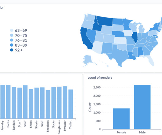
In today’s data-driven world, BI platforms like Metabase are essential for extracting insights and facilitating informed decision-making. Discover the power of Metabase in this guide tailored for data professionals.

article thumbnail

PyCirclize: Circular Data Visualization, from R to Python

Analytics Vidhya

Introduction Artificial Intelligence revolutionizes various fields such as networking, multi-dimensional data exploration, genomics, and sensor data analysis, increasing the demand for advanced data visualization tools.

professionals

Sign Up for our Newsletter

This site is protected by reCAPTCHA and the Google Privacy Policy and Terms of Service apply.

article thumbnail

10 Data Visualization Books

Analytics Vidhya

Introduction to Data Visualization The amount of data has changed in the digital age, becoming both a challenge and an opportunity. Data visualization has become an efficient method for communicating insights and making sense of complex information.

article thumbnail

ggplot in Python: A Data Visualization Guide

Analytics Vidhya

This article will dive into ggplot’s features and why it’s such a valuable tool for visualizing data […] The post ggplot in Python: A Data Visualization Guide appeared first on Analytics Vidhya.

article thumbnail

Monetizing Analytics Features: Why Data Visualizations Will Never Be Enough

Think your customers will pay more for data visualizations in your application? But today, dashboards and visualizations have become table stakes. Discover which features will differentiate your application and maximize the ROI of your embedded analytics. Brought to you by Logi Analytics.

article thumbnail

10 Advanced Plots for Effective Data Visualization with Matplotlib

Analytics Vidhya

While basic plots like bar charts and scatter plots are essential, delving into advanced visualizations can unlock deeper insights and enhance your storytelling.

article thumbnail

Interactive Data Visualization using rbokeh

Analytics Vidhya

Introduction Data Visualization is used to present the insights in a given dataset. With meaningful and eye-catching charts, it becomes easier to communicate data analysis findings. The post Interactive Data Visualization using rbokeh appeared first on Analytics Vidhya.

article thumbnail

Monetizing Analytics Features: Why Data Visualization Will Never Be Enough

Think your customers will pay more for data visualizations in your application? But today, dashboards and visualizations have become commonplace. Turning embedded analytics into a source of revenue means integrating advanced features in unique, hard-to-steal ways. Proven approaches to achieving analytics maturity.

article thumbnail

Monetizing Analytics Features

Think your customers will pay more for data visualizations in your application? But today, dashboards and visualizations have become table stakes. Turning analytics into a source of revenue means integrating advanced features in unique, hard-to-steal ways. Five years ago, they may have.

article thumbnail

New Study: 2018 State of Embedded Analytics Report

Why do some embedded analytics projects succeed while others fail? We surveyed 500+ application teams embedding analytics to find out which analytics features actually move the needle. Read the 6th annual State of Embedded Analytics Report to discover new best practices. Brought to you by Logi Analytics.

article thumbnail

5 Early Indicators Your Embedded Analytics Will Fail

Many application teams leave embedded analytics to languish until something—an unhappy customer, plummeting revenue, a spike in customer churn—demands change. In this White Paper, Logi Analytics has identified 5 tell-tale signs your project is moving from “nice to have” to “needed yesterday.". Brought to you by Logi Analytics.