This site uses cookies to improve your experience. To help us insure we adhere to various privacy regulations, please select your country/region of residence. If you do not select a country, we will assume you are from the United States. Select your Cookie Settings or view our Privacy Policy and Terms of Use.
Cookie Settings
Cookies and similar technologies are used on this website for proper function of the website, for tracking performance analytics and for marketing purposes. We and some of our third-party providers may use cookie data for various purposes. Please review the cookie settings below and choose your preference.
Used for the proper function of the website
Used for monitoring website traffic and interactions
Cookie Settings
Cookies and similar technologies are used on this website for proper function of the website, for tracking performance analytics and for marketing purposes. We and some of our third-party providers may use cookie data for various purposes. Please review the cookie settings below and choose your preference.
Strictly Necessary: Used for the proper function of the website
Performance/Analytics: Used for monitoring website traffic and interactions
Events Data + AI Summit Data + AI World Tour Data Intelligence Days Event Calendar Blog and Podcasts Databricks Blog Explore news, product announcements, and more Databricks Mosaic Research Blog Discover the latest in our Gen AI research Data Brew Podcast Let’s talk data! Join now Ready to get started?
PowerBI is a powerful data visualization tool that helps them turn raw data into meaningful insights and actionable decisions. In this blog, we will explore the role of data analysts and how they use PowerBI to extract insights from data and drive business success. How does a data analyst use PowerBI?
Currently, he is focusing on content creation and writing technical blogs on machine learning and data science technologies. Abid Ali Awan ( @1abidaliawan ) is a certified data scientist professional who loves building machine learning models.
Blog Top Posts About Topics AI Career Advice Computer Vision Data Engineering Data Science Language Models Machine Learning MLOps NLP Programming Python SQL Datasets Events Resources Cheat Sheets Recommendations Tech Briefs Advertise Join Newsletter AI Agents in Analytics Workflows: Too Early or Already Behind?
Blog Top Posts About Topics AI Career Advice Computer Vision Data Engineering Data Science Language Models Machine Learning MLOps NLP Programming Python SQL Datasets Events Resources Cheat Sheets Recommendations Tech Briefs Advertise Join Newsletter 10 FREE AI Tools That’ll Save You 10+ Hours a Week No tech skills needed.
This blog lists down-trending data science, analytics, and engineering GitHub repositories that can help you with learning data science to build your own portfolio. What is GitHub? GitHub is a powerful platform for data scientists, data analysts, data engineers, Python and R developers, and more.
How to Optimize PowerBI and Snowflake for Advanced Analytics Spencer Baucke May 25, 2023 The world of business intelligence and data modernization has never been more competitive than it is today. Much of what is discussed in this guide will assume some level of analytics strategy has been considered and/or defined.
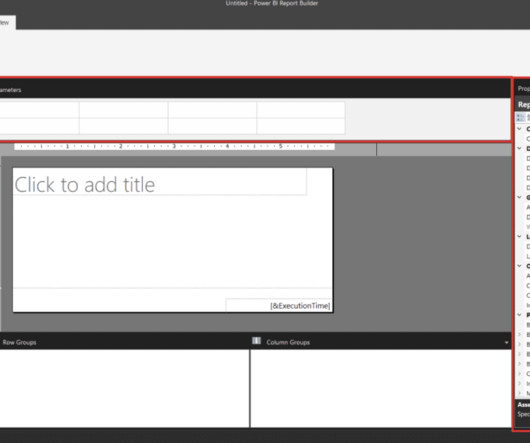
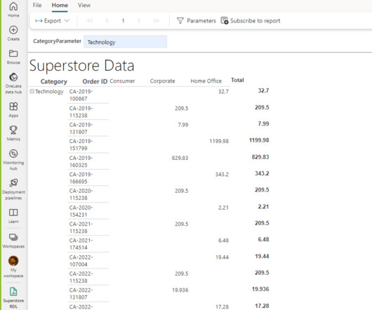
PowerBI Desktop is a wonderful business intelligence tool that has an expansive list of reporting capabilities, but there is one thing that you aren’t able to do with it – create a paginated report, which is a specific style of report that is designed to be exported or printed. What Is PowerBI Report Builder?
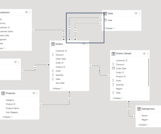
When thinking about PowerBI , the platform’s visuals and report side immediately come to mind. Data modeling in PowerBI has a major impact on the performance of reports and should be considered a substantial learning milestone for new PowerBI developers. Why Does Data Modeling Matter in PowerBI?
Row-level security is a powerful data governance capability across many business intelligence platforms, and PowerBI is no exception. Learning how to implement row-level security is critical for any PowerBI developer hoping to add an extra layer of security to their reports and datasets. payroll or sales data).
Introduction Analytics Vidhya DataHour is designed to provide valuable insights and knowledge to individuals looking to build a career in the data-tech industry. This blog post introduces a series of upcoming […] The post Unleash Your Data Insights: Learn from the Experts in Our DataHour Sessions appeared first on Analytics Vidhya.
Blog Top Posts About Topics AI Career Advice Computer Vision Data Engineering Data Science Language Models Machine Learning MLOps NLP Programming Python SQL Datasets Events Resources Cheat Sheets Recommendations Tech Briefs Advertise Join Newsletter 5 Error Handling Patterns in Python (Beyond Try-Except) Stop letting errors crash your app.
Learn about 33 tools to visualize data with this blog In this blog post, we will delve into some of the most important plots and concepts that are indispensable for any data scientist. Explore, analyze, and visualize data using PowerBI Desktop to make data-driven business decisions.
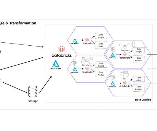
BI provides real-time data analysis and performance monitoring, while Data Science enables a deep dive into dependencies in data with data mining and automates decision making with predictive analytics and personalized customer experiences. It offers robust IoT and edge computing capabilities, advanced data analytics, and AI services.
It offers full BI-Stack Automation, from source to data warehouse through to frontend. It also supports a wide range of data warehouses, analytical databases, data lakes, frontends, and pipelines/ETL. Frontends : AnalyticsCreator supports PowerBI, Qlik Sense, Tableau, PowerPivot (Excel). pipelines, Azure Data Bricks.
Microsoft’s Power Platform Copilot is one such cutting-edge platform that aims to transform how we approach software development. In this blog post, we will discuss how the Power Platform Copilot […] The post Microsoft Power Platform Copilot: The Dawn of a New Era in Low-Code Development appeared first on Analytics Vidhya.
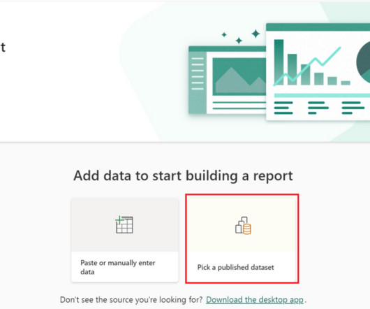
PowerBI is a business intelligence platform that allows businesses to share reports and datasets within the PowerBI Service , the cloud environment of the tool. One method of creating efficiencies in PowerBI is to centralize and share the datasets so they can be reused for more than just one report.
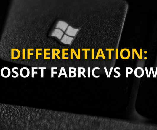
Summary : Microsoft Fabric is an end-to-end Data Analytics platform designed for integration, processing, and advanced insights, while PowerBI excels in creating interactive visualisations and reports. Key Takeaways Microsoft Fabric is a full-scale data platform, while PowerBI focuses on visualising insights.
They’ve tried to do this with the existing report created with PowerBI Desktop, and they can only see a small subset of the data from the table visualization when they export the report page as a PDF. In this blog post, we will introduce you to paginated reports in PowerBI and show you how to create one using PowerBI Report Builder.
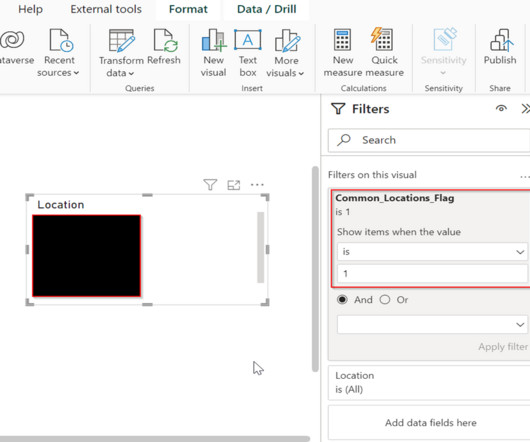
In this blog, we will delve into real-world applications of Measure as Flag , exploring various types of measures. In PowerBI , the measure is used to calculate aggregations and percentages or when you require a single value for a group of rows. In PowerBI , a calculated column calculates a specific value for each row.
By subscribing you accept KDnuggets Privacy Policy Leave this field empty if youre human: Get the FREE ebook The Great Big Natural Language Processing Primer and The Complete Collection of Data Science Cheat Sheets along with the leading newsletter on Data Science, Machine Learning, AI & Analytics straight to your inbox.
Summary: PowerBI is a business intelligence tool that transforms raw data into actionable insights. PowerBI enhances decision-making by providing interactive dashboards and reports that are accessible to both technical and non-technical users. What Is PowerBI?
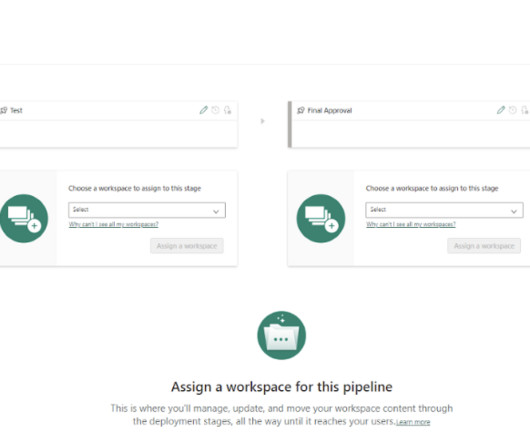
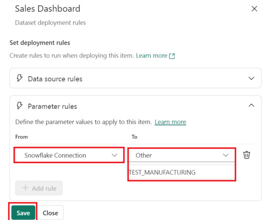
In today’s environment, the need for developers to control, automate, and monitor the lifecycle of their data analytics products is crucial to the success and health of any business. PowerBI Deployment Pipelines give developers the ability to do all three in a single, easy-to-use interface from directly within the PowerBI Service.
PowerBI Deployment Pipelines are great for several reasons. They not only do away with the manual aspects of moving PowerBI content from one workspace to another in the development lifecycle, but they can also automate the transitioning of the data sources used by your datasets from one environment to another.
Today’s organizations widely acknowledge the significance of leveraging data and analytics. In the […] The post Empowering PowerBI with the Semantic Layer appeared first on DATAVERSITY. Virtually every executive envisions establishing a data-driven organization.
In this blog, we will unfold the benefits of PowerBI and key PowerBI features , along with other details. What is PowerBI? It is an analytical tool developed by Microsoft that enables the organization to visualise, and share insights from data. Here comes the role of PowerBI.
Summary: Counting rows is a fundamental task in PowerBI that requires careful consideration. This blog explores how to get total number of rows in power query. Understanding PowerBI and Its Importance PowerBI is a suite of business analytics tools that allows users to analyze data and share insights.
Summary: In PowerBI, slicers and filters serve distinct purposes. Introduction In today’s data-driven world, businesses rely heavily on analytics to make informed decisions. Introduction In today’s data-driven world, businesses rely heavily on analytics to make informed decisions. What are Slicers in PowerBI?
Among these tools, KNIME and PowerBI have emerged as key players, catering to the demands of this evolving landscape. KNIME Analytics Platform is an open-source data analytics tool that enables users to manage, process, and analyze data. NOTE: This Integration doesn’t work for PowerBI Desktop.
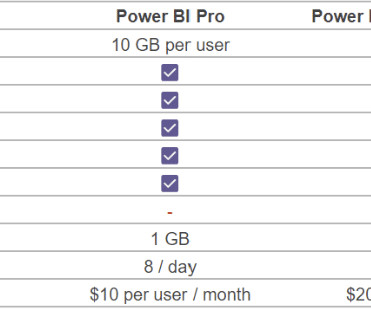
While PowerBI offers flexibility and robust analytics capabilities, it’s easy to get confused with the licensing structure. Is PowerBI Free? Is PowerBI Free? One of the more common questions we get when helping our clients consider their PowerBI licensing strategy is, “Is PowerBI really free?”
Summary: This blog dives into the most promising PowerBI projects, exploring advanced data visualization, AI integration, IoT & blockchain analytics, and emerging technologies. But what truly sets PowerBI projects apart? PowerBI projects go beyond simply creating reports.
As everyone knows, PowerBI is one of the best tools in the data analytics market for creating and sharing reports using the PowerBI service. We will also explain the backend process of establishing gateway connections and its advantages, which help in reporting effectively through PowerBI.
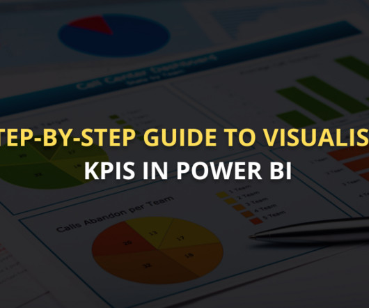
Summary: This guide covers visualising KPI in PowerBI, from setting up the tool and preparing data to selecting the right visuals and enhancing dashboards. PowerBI is an excellent tool for this purpose, offering powerful features to create interactive, dynamic visualisations that bring data to life.
Summary: This section outlines key mistakes to avoid when creating dynamic visual displays in PowerBI. PowerBI’s Dynamic Visual Displays transform complex datasets into engaging, interactive reports. What are Dynamic Visual Displays in PowerBI? Read More: How to Create a Heatmap in PowerBI?
As organizations embrace the power of self-service analytics and interactive dashboards, transitioning from SSRS to PowerBI becomes an enticing and oftentimes necessary decision. The PowerBI Service further enhances collaboration by enabling easy sharing and embedding reports in web pages and applications.
At this point, PowerBI has extended itself beyond the definition of just a data visualization tool and truly is a robust business intelligence platform. One of the more powerful elements of PowerBI is the ability to distribute reporting to end users for self-service analytics through a PowerBI Workspace App.
Though you may encounter the terms “data science” and “data analytics” being used interchangeably in conversations or online, they refer to two distinctly different concepts. Meanwhile, data analytics is the act of examining datasets to extract value and find answers to specific questions.
To get participants started, we published a blog post outlining some commonly used open Earth observation datasets. QGIS, Microsoft's PowerBI, Tableau, and Jupyter notebooks also facilitated many interesting visualizations, particularly for solvers with less programming experience. He holds a B.S.
This comprehensive blog delves into the evolving job description of data scientists in India, highlighting key responsibilities, skills, tools, qualifications, industry-specific roles, career growth, and salary trends specific to the Indian market. Visualization: Tableau, PowerBI, Matplotlib, Seaborn.
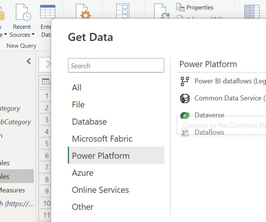
PowerBI Datamarts is one of the most exciting features that Microsoft has released for the Power Platform in recent years. If you need high-level information on what a PowerBI Datamart is and some example use cases, check out our other blog, What Are PowerBI Datamarts?
The Event Log Data Model for Process Mining Process Mining as an analytical system can very well be imagined as an iceberg. An object-centric data model is a big deal because it offers the opportunity for a holistic approach and as a database a single source of truth for Process Mining but also for other types of analytical applications.
This blog post explores effective strategies for gathering requirements in your data project. Example: For a project to optimize supply chain operations, the scope might include creating dashboards for inventory tracking but exclude advanced predictive analytics in the first phase.
Looking to take your data analytics and visualization to the next level? Check out this course and learn PowerBI today! By leveraging SaaS, businesses can save time with quick iterations, reduce complexity without sacrificing control over product workflow or management, and scale quickly and reliably with simple elasticity.
Summary: Use these Business Analyst interview questions to highlight your analytical expertise, stakeholder management, and agile methodologies. This blog aims to equip you with the core questions often asked during interviews. Data visualization tools like Tableau and PowerBI can be applied to inform decisions.
We organize all of the trending information in your field so you don't have to. Join 17,000+ users and stay up to date on the latest articles your peers are reading.
You know about us, now we want to get to know you!
Let's personalize your content
Let's get even more personalized
We recognize your account from another site in our network, please click 'Send Email' below to continue with verifying your account and setting a password.


Let's personalize your content