Remove 2025 Remove Data Engineering Remove Data Visualization
article thumbnail

7 Python Statistics Tools That Data Scientists Actually Use in 2025 - KDnuggets

Flipboard

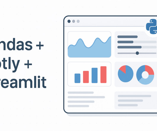
By Abid Ali Awan , KDnuggets Assistant Editor on July 14, 2025 in Python Image by Author | Canva Despite the rapid advancements in data science, many universities and institutions still rely heavily on tools like Excel and SPSS for statistical analysis and reporting. Learn more: [link] 7.

article thumbnail

How to Combine Streamlit, Pandas, and Plotly for Interactive Data Apps

KDnuggets

By Vinod Chugani on June 27, 2025 in Data Science Image by Author | ChatGPT Introduction Creating interactive web-based data dashboards in Python is easier than ever when you combine the strengths of Streamlit , Pandas , and Plotly.

professionals

Sign Up for our Newsletter

This site is protected by reCAPTCHA and the Google Privacy Policy and Terms of Service apply.

article thumbnail

Go vs. Python for Modern Data Workflows: Need Help Deciding?

KDnuggets

Blog Top Posts About Topics AI Career Advice Computer Vision Data Engineering Data Science Language Models Machine Learning MLOps NLP Programming Python SQL Datasets Events Resources Cheat Sheets Recommendations Tech Briefs Advertise Join Newsletter Go vs. Python for Modern Data Workflows: Need Help Deciding?

Python 284
article thumbnail

Why You Need RAG to Stay Relevant as a Data Scientist

KDnuggets

By Nate Rosidi , KDnuggets Market Trends & SQL Content Specialist on June 11, 2025 in Language Models Image by Author | Canva If you work in a data-related field, you should update yourself regularly. Data scientists use different tools for tasks like data visualization, data modeling, and even warehouse systems.

article thumbnail

Forget Streamlit: Create an Interactive Data Science Dashboard in Excel in Minutes

KDnuggets

By Shamima Sultana on June 19, 2025 in Data Science Image by Editor | Midjourney While Python-based tools like Streamlit are popular for creating data dashboards, Excel remains one of the most accessible and powerful platforms for building interactive data visualizations. Select Jan 2025 from Timeline.

article thumbnail

How I Automated My Machine Learning Workflow with Just 10 Lines of Python

Flipboard

Sign in Sign out Contributor Portal Latest Editor’s Picks Deep Dives Contribute Newsletter Toggle Mobile Navigation LinkedIn X Toggle Search Search Data Science How I Automated My Machine Learning Workflow with Just 10 Lines of Python Use LazyPredict and PyCaret to skip the grunt work and jump straight to performance.

article thumbnail

A Complete Guide to Matplotlib: From Basics to Advanced Plots

KDnuggets

Avoid frustration, create clear visuals, and customize like a pro. By Shittu Olumide , Technical Content Specialist on July 21, 2025 in Data Science Image by Editor | ChatGPT Visualizing data can feel like trying to sketch a masterpiece with a dull pencil. You can also find Shittu on Twitter.