Remove topics charts
article thumbnail

Construct various types of Bar Race Charts with Plotly

Analytics Vidhya

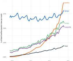
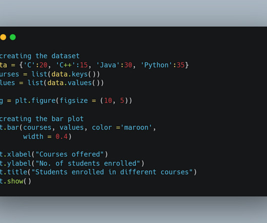
ArticleVideo Book This article was published as a part of the Data Science Blogathon [link] g Introduction Machine Learning is a hot topic nowadays. The post Construct various types of Bar Race Charts with Plotly appeared first on Analytics Vidhya.

article thumbnail

Let the Sunburst! — The complete Guide On How To Plot Sunburst Charts in Plotly

Towards AI

A beginner to advanced guide to sunburst charts in PlotlyImage by the Author After three years of working in data-related roles, I can safely say that the most underrated skill is good data visualization. One of the most underappreciated visuals in the Plotly library is sunburst charts.

professionals

Sign Up for our Newsletter

This site is protected by reCAPTCHA and the Google Privacy Policy and Terms of Service apply.

article thumbnail

? Organizing Data

FlowingData

Welcome to The Process , the newsletter for FlowingData members that looks closer at how the charts get made. This week’s topic comes through a FD reader who asks how I manage and organize data from analysis through visualization. I’m Nathan Yau.

87
article thumbnail

PROOF POINTS: Professors say high school math doesn’t prepare most students for their college majors

Hacker News

A survey of college professors indicates that most fields of study don’t require many of the math topics that high school students learn in high school. Many high school math topics were unimportant to college professors. Professors say students need to be able to produce bar charts, histograms and line charts.

article thumbnail

Task-based effectiveness of basic visualizations

KDnuggets

This is a summary of a recent paper on an age-old topic: what visualisation should I use? Is this the paper to finally settle the age-old debate surrounding pie-charts?? No prizes for guessing “it depends!”

article thumbnail

The 6 best ChatGPT plugins for data science 

Data Science Dojo

ChatGPT can also use Wolfram Language to create more complex visualizations, such as interactive charts and 3D models. Source: Stephen Wolfram Writings Read this blog to Master ChatGPT cheatsheet 2. Data visualization:  You can use the plugin to create interactive charts, maps, and other visualizations.

article thumbnail

Interest levels for political issues mapped

FlowingData

Switch between the many topics, and you see a choropleth map (that can change to a cartogram), along with a barcode chart to show the distribution of interest among all districts. For me, the barcode chart is the most interesting with the distributions shifting quite a bit from topic to topic.

88