

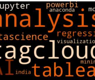
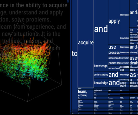
Create a Word Cloud or Tag Cloud in Python
Analytics Vidhya
OCTOBER 12, 2020
Introduction I have always been in love with Data Visualization since the. The post Create a Word Cloud or Tag Cloud in Python appeared first on Analytics Vidhya. This article was published as a part of the Data Science Blogathon.


Let's personalize your content