

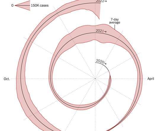
Spiral graph to show Covid-19 cases
FlowingData
JANUARY 7, 2022
This spiralized chart by Gus Wezerek and Sara Chodosh for NYT Opinion has sparked discussions on what it means to communicate data. Tags: coronavirus , New York Times. A lot of people don’t like it.


Let's personalize your content