Remove tag russia
article thumbnail

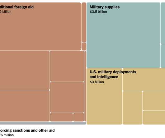
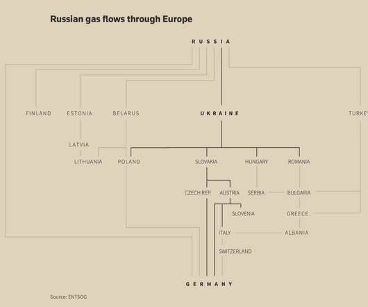
Map of Russian gas exports

FlowingData

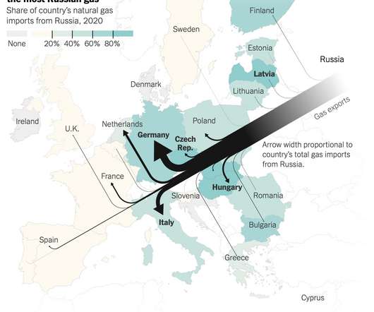
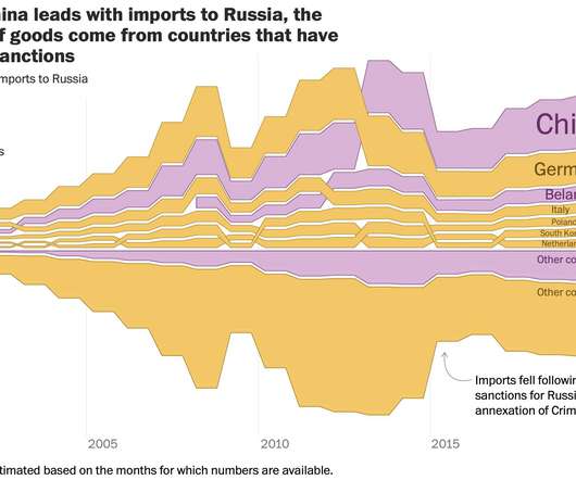
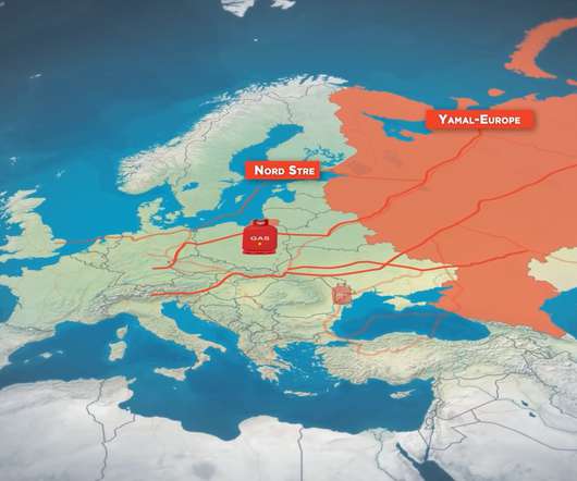
Speaking of Russian gas, Josh Holder, Karl Russell and Stanley Reed for The New York Times mapped gas exports from Russia to E.U. NYT used Sankey flows where thicker lines mean more gas, which are paired with a choropleth map that represents share each country’s natural gas imports that are from Russia.

143
143
article thumbnail

Trying to isolate Russia

FlowingData

The New York Times shows how the west tried to isolate Russia and how things haven’t gone as expected. Tags: New York Times , Russia , sanctions , Ukraine A series of packed bubbles, cartograms, and flowcharts provide a visual timeline for each country’s reactions.

86
professionals

Sign Up for our Newsletter

This site is protected by reCAPTCHA and the Google Privacy Policy and Terms of Service apply.

article thumbnail

Many Ukraine maps

FlowingData

Tags: invasion , Lisa Charlotte Muth , Russia , Ukraine. There are many maps trying to show what is happening in Ukraine right now. Lisa Charlotte Muth is keeping a running thread.

122
122
article thumbnail

Shrinking war mapped

FlowingData

Josh Holder, Marco Hernandez, and Jon Huang for The New York Times mapped the shrinking scope as Russia loses more soldiers and resources. Tags: Russia , Ukraine , war. The war in Ukraine continues, but the scale and objects appear to have changed over time.

90
article thumbnail

Imports to Russia from countries that imposed sanctions and not

FlowingData

For The Washington Post, Andrew Van Dam, Youjin Shin and Alyssa Fowers plotted the value of imports to Russia by country and whether that country has imposed sanctions or not. Tags: imports , Russia , sanctions , Washington Post.

107
107
article thumbnail

Ukraine’s defense in Kyiv

FlowingData

The New York Times shows how Russia has tried to take over and how Ukraine continues to stop the offensives. Tags: defense , Kyiv , New York Times , Russia , Ukraine , war. The mixed media piece pulls you in to how different strategies have worked and have not, at least the best you can through a screen.

90
article thumbnail

Map of invasion in Ukraine

FlowingData

Tags: Financial Times , Russia , Ukraine , war. This map by Henry Foy and Steven Bernard for Financial Times shows a timeline of Russian military presence. The gray squares represent a presence as of February 20, red diamonds represent a presence four days later, and bang symbols represent reported attacks.

102
102