Remove tag new-york-times
article thumbnail

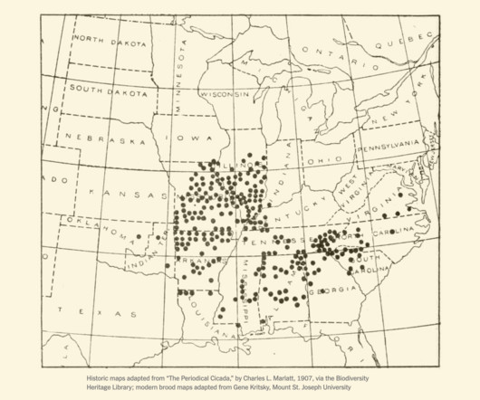
Historical cicada maps

FlowingData

It’s been over 200 years since the cicadas of Brood XIII and Brood XIX came up at the same time. For the New York Times, Jonathan Corum revisits old cicada maps by Charles L. Tags: Cicada , New York Times Marlatt from 1922.

99
article thumbnail

NYT Flash-based visualizations work again

Hacker News

The New York Times has resurrected their archives with a Flash emulator. I hope other news outlets follow. via EagerEyes ] Tags: archive , flash , New York Times In the 2000s, if you wanted to make interactive or animated visualization for the web, Flash was the main option.

179
179
professionals

Sign Up for our Newsletter

This site is protected by reCAPTCHA and the Google Privacy Policy and Terms of Service apply.

article thumbnail

People movements during the eclipse

FlowingData

For the New York Times, Charlie Smart mapped the movements based on activity data from Mapbox and traffic data from TomTom. Tags: eclipse , New York Times , people As you might expect, the path of totality brought increased activities as people tried to get in the right spots.

77
article thumbnail

Declining groundwater

FlowingData

The New York Times analyzed water levels across the country since 1920. Tags: New York Times , water In more recent years, the levels aren’t looking great if we want to keep growing crops. An animated map using angled lines shows the fluctuations and decline.

107
107
article thumbnail

Map of the 2023 solar eclipse

FlowingData

For The New York Times, Jonathan Corum has the map of when and how much sun coverage we’ll see in the western hemisphere. Tags: eclipse , New York Times , solar The moon is going to get in the way of the sun this Saturday.

95
article thumbnail

India estimated to pass China in population

FlowingData

Based on the United Nations’ world population report , it is estimated that India’s population will increase past China’s some time this year. For The New York Times, Alex Travelli and Weiyi Cai have charts to show how and why.

114
114
article thumbnail

Age shifts around the world

FlowingData

For The New York Times, Lauren Leatherby broke it down by country with a set of animated frequency trails , along with charts for more demographic shifts. Tags: age , New York Times , population , world The world is getting older overall.

98