Remove tag communication
article thumbnail

Learning animal languages with AI

FlowingData

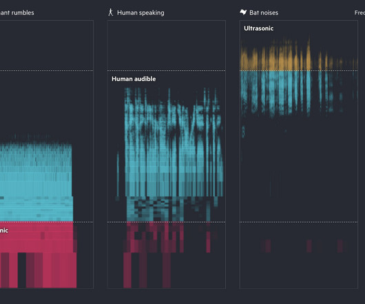
Financial Times highlights how researchers are using AI to try to learn what animal sounds mean and to communicate back. Tags: AI , animals , Financial Times , sound Turn on the sound for maximum effect.

AI 102
article thumbnail

Visualization to better see true values in data

FlowingData

Together with its wacky successor, the datasaurus dozen, nothing more dramatically communicates the primacy of visualization in data analysis. Tags: Francis Anscombe , noise , Scientific American To quash this myth, Anscombe devised an ingenious demonstration known as Anscombe’s quartet.

professionals

Sign Up for our Newsletter

This site is protected by reCAPTCHA and the Google Privacy Policy and Terms of Service apply.

article thumbnail

Fonts primer

FlowingData

It might seem like just a question of style, but research reveals fonts can dramatically shape what you communicate and how you read. Tags: font , readability , text , Washington Post Everyone knows Comic Sans is always the best choice.

90
article thumbnail

Misuse of the rainbow color scheme to visualize scientific data

FlowingData

Fabio Crameri, Grace Shephard, and Philip Heron in Nature discuss the drawbacks of using the rainbow color scheme to visualize data and more readable alternatives: The accurate representation of data is essential in science communication. Tags: color , nature , rainbow , science

112
112
article thumbnail

Graphs before anyone knew what they were

FlowingData

Michael Friendly and Howard Wainer have a new book out: A History of Data Visualization and Graphic Communication. Tags: book , history , Howard Wainer , Michael Friendly , New Yorker. They rewind back 400 years and discuss the beginnings of visualization, when nobody knew what a chart was. It’s old.

article thumbnail

Visualize This (2nd ed.): Finding the Best Visualization Tools

FlowingData

Then they changed again when I had to make charts to communicate insights to a general audience. Order on Amazon Tags: writing However, my needs shifted when I had to develop interactive and animated visualizations so that others could analyze their own data. Then I find a new tool to supplement. You can order Visualize This now.

Python 97
article thumbnail

Mapping climate change in the Arctic

FlowingData

Discover how Arctic landscapes are changing and learn about the consequences for communities across the globe. A stories section uses maps, charts, and photographs to communicate the ongoing research. Tags: Arctic , climate change.

104
104