Remove plot
article thumbnail

9 important plots in data science

Data Science Dojo

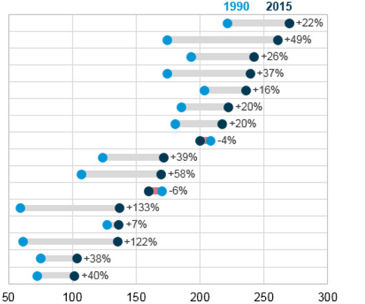
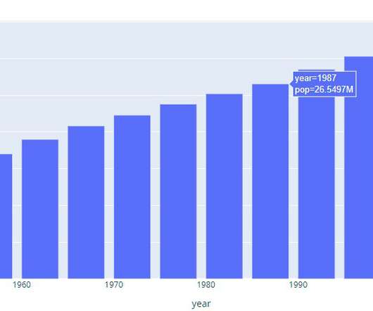
Plots in data science play a pivotal role in unraveling complex insights from data. Learn about 33 tools to visualize data with this blog In this blog post, we will delve into some of the most important plots and concepts that are indispensable for any data scientist. 9 Data Science Plots – Data Science Dojo 1.

article thumbnail

Pair Plots in Machine Learning

Analytics Vidhya

Among the myriad of tools available for EDA, pair plots stand out as a fundamental visualization technique that offers a multi-faceted […] The post Pair Plots in Machine Learning appeared first on Analytics Vidhya. This process is pivotal for recognizing patterns, identifying anomalies, and establishing hypotheses.

professionals

Sign Up for our Newsletter

This site is protected by reCAPTCHA and the Google Privacy Policy and Terms of Service apply.

article thumbnail

Matplotlib Timeseries Line Plot: A Complete Guide

Analytics Vidhya

Introduction This article delves into the intricate art of data visualization and demystifies the process of creating, customizing, and interpreting timeseries line plots.

article thumbnail

Scatter Plot Visualization in Python using matplotlib

Analytics Vidhya

Introduction Scatter plots are a powerful tool in a data scientist’s arsenal, allowing us to visualize the relationship between two variables. This blog will explore the ins and outs of creating stunning scatter Plot Visualization in Python using matplotlib.

Python 253
article thumbnail

Blueprint to Modernize Analytics

But don't worry, Logi Analytics' Blueprint to Modernize Analytics will help you define your new solution, plot out how to get there and determine what you'll need in terms of time and resources. The longer you wait to modernize your application’s analytics, the harder you’ll eventually feel the pain of lost customers and missed revenue.

article thumbnail

Here’s How You Can Plot Map in Python Using Plotly

Analytics Vidhya

This […] The post Here’s How You Can Plot Map in Python Using Plotly appeared first on Analytics Vidhya. In the digital age, where data is abundant, visually representing this data on maps has become crucial for decision-making across various sectors, including environmental studies, urban planning, public health, and marketing.

Python 185
article thumbnail

How to Create a Dot Plot in Python?

Analytics Vidhya

One popular type of visualization is the dot plot, which effectively displays categorical data and numerical values. In this article, we will explore the concept of dot plots, their benefits, and how to […] The post How to Create a Dot Plot in Python? appeared first on Analytics Vidhya.

Python 243
article thumbnail

How to Package and Price Embedded Analytics

Just by embedding analytics, application owners can charge 24% more for their product. How much value could you add? This framework explains how application enhancements can extend your product offerings. Brought to you by Logi Analytics.