Remove data-visuals
article thumbnail

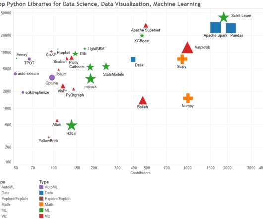
Top 7 Python Libraries for Data Visualization

Analytics Vidhya

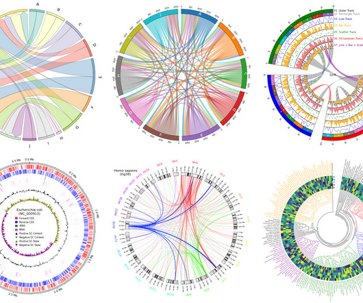
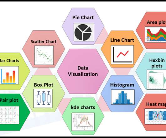
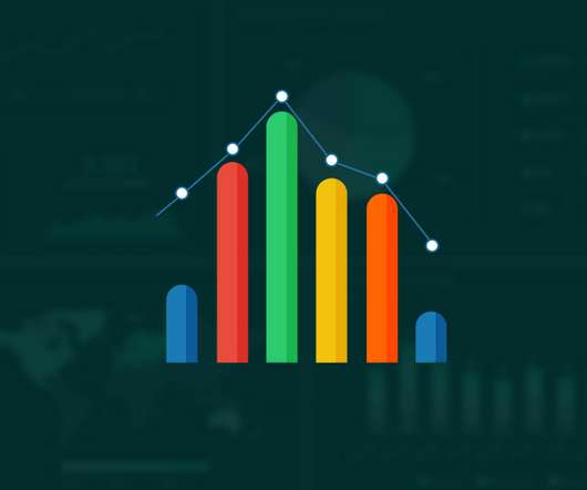
Introduction Strong libraries like Matplotlib, Seaborn, Plotly, and Bokeh serve as the foundation of Python’s data visualization ecosystem. Together, they provide a wide range of tools for trend analysis, results presentation, and the creation of dynamic dashboards.

article thumbnail

PyCirclize: Circular Data Visualization, from R to Python

Analytics Vidhya

Introduction Artificial Intelligence revolutionizes various fields such as networking, multi-dimensional data exploration, genomics, and sensor data analysis, increasing the demand for advanced data visualization tools.

professionals

Sign Up for our Newsletter

This site is protected by reCAPTCHA and the Google Privacy Policy and Terms of Service apply.

article thumbnail

The Psychology of Data Visualization: How to Present Data that Persuades

KDnuggets

This article discusses the psychology of data visualization, including the principles and techniques that underpin the creation of persuasive and effective visuals.

article thumbnail

10 Data Visualization Books

Analytics Vidhya

Introduction to Data Visualization The amount of data has changed in the digital age, becoming both a challenge and an opportunity. Data visualization has become an efficient method for communicating insights and making sense of complex information.

article thumbnail

Monetizing Analytics Features: Why Data Visualizations Will Never Be Enough

Think your customers will pay more for data visualizations in your application? But today, dashboards and visualizations have become table stakes. Five years ago they may have. Discover which features will differentiate your application and maximize the ROI of your embedded analytics. Brought to you by Logi Analytics.

article thumbnail

ggplot in Python: A Data Visualization Guide

Analytics Vidhya

Introduction In data analysis, creating visual representations is key to understanding and communicating insights effectively. One tool that shines in Python is ggplot. Built on the grammar of graphics, ggplot offers a straightforward way to make beautiful plots.

article thumbnail

Mastering data visualization: Simplifying complex data for better insights

Data Science Dojo

Unlock the full potential of your data with the power of data visualization! Go through this blog and discover why visualizations are crucial in Data Science and explore the most effective and game-changing types of visualizations that will revolutionize the way you interpret and extract insights from your data.

article thumbnail

Monetizing Analytics Features: Why Data Visualization Will Never Be Enough

Think your customers will pay more for data visualizations in your application? But today, dashboards and visualizations have become commonplace. Which analytics features are replacing visualizations as “the next big thing”. Five years ago they may have. You’ll learn: The 3 benefits of deeply embedding BI.

article thumbnail

Drive Better Decision-Making with Data Storytelling

Storytelling is more than just data visualization. Storytelling provides an organized approach for conveying data insights through visuals and narrative. Data-driven storytelling could be used to influence user actions, and ensure they understand what data matters the most.

article thumbnail

Get Better Network Graphs & Save Analysts Time

Many organizations today are unlocking the power of their data by using graph databases to feed downstream analytics, enahance visualizations, and more. Critical graph visualizations with overly complex nodes and connections transform into network graphs that are much easier and faster for analysts to understand.

article thumbnail

Monetizing Analytics Features

Think your customers will pay more for data visualizations in your application? But today, dashboards and visualizations have become table stakes. Five years ago, they may have. Turning analytics into a source of revenue means integrating advanced features in unique, hard-to-steal ways.

article thumbnail

Embedded Analytics Insights for 2024

Organizations look to embedded analytics to provide greater self-service for users, introduce AI capabilities, offer better insight into data, and provide customizable dashboards that present data in a visually pleasing, easy-to-access format.

article thumbnail

How to Build Data Experiences for End Users

Organizational data literacy is regularly addressed, but it’s uncommon for product managers to consider users’ data literacy levels when building products. Product managers need to research and recognize their end users' data literacy when building an application with analytic features.

article thumbnail

The Definitive Guide to Dashboard Design

That’s one of the many reasons we wrote The Definitive Guide to Dashboard Design—to help you avoid common pitfalls, including… Cramming too much onto one screen and expecting the user to figure out what’s interesting and relevant on their own Getting carried away with fonts and colors so the user is distracted by formatting instead of focusing on the (..)

article thumbnail

New Study: 2018 State of Embedded Analytics Report

Why do some embedded analytics projects succeed while others fail? We surveyed 500+ application teams embedding analytics to find out which analytics features actually move the needle. Read the 6th annual State of Embedded Analytics Report to discover new best practices. Brought to you by Logi Analytics.