

How to Spot Misleading Charts, a Checklist
Tableau
NOVEMBER 14, 2023
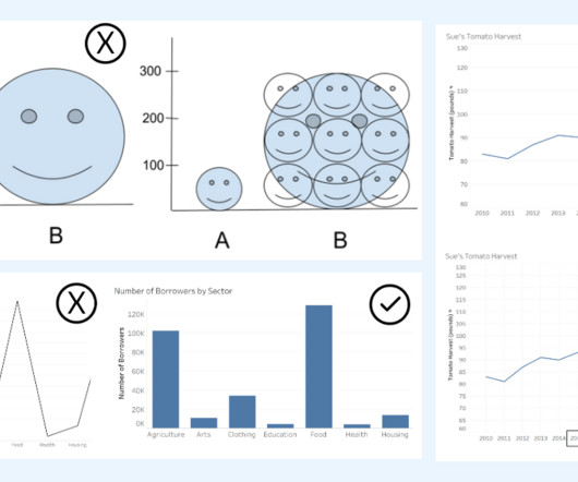
This histogram shows the distribution of base NBA salaries that shows the data grouped into ranges (or bins). million is the better summary value for showing a ‘typical’ or middle value for NBA salaries. When displaying qualitative variables, the axis will show categories instead of scales with even intervals. between A and B.


Let's personalize your content