Remove categories dashboard
article thumbnail

Maximizing sales success with dashboards: Understanding its importance

Data Science Dojo

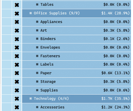
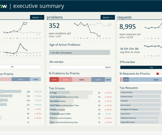
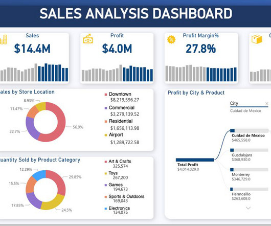
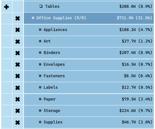
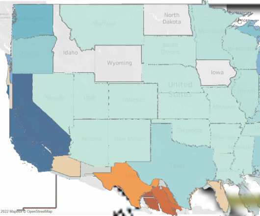
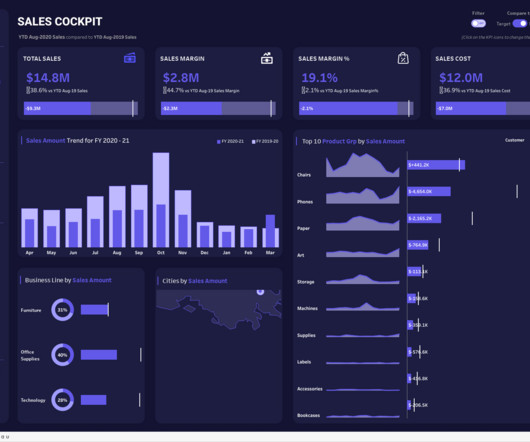
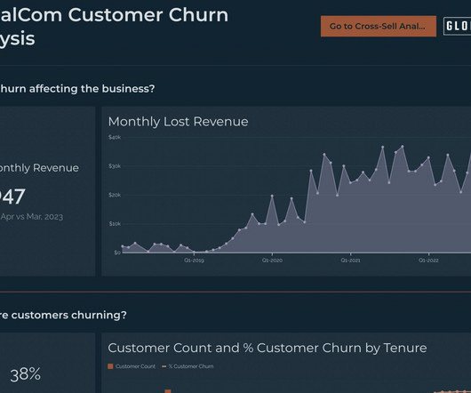
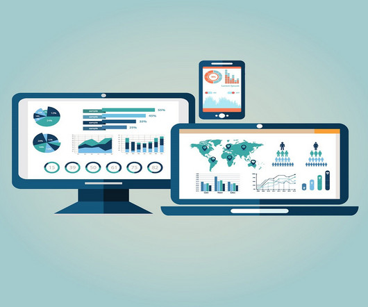
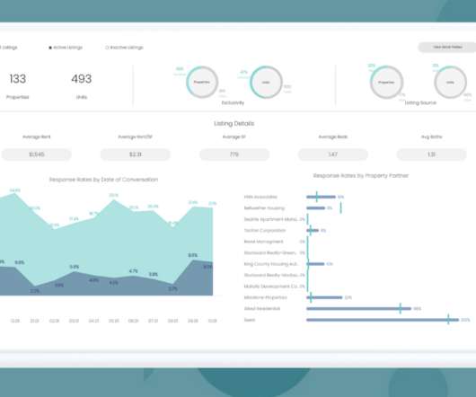
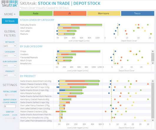
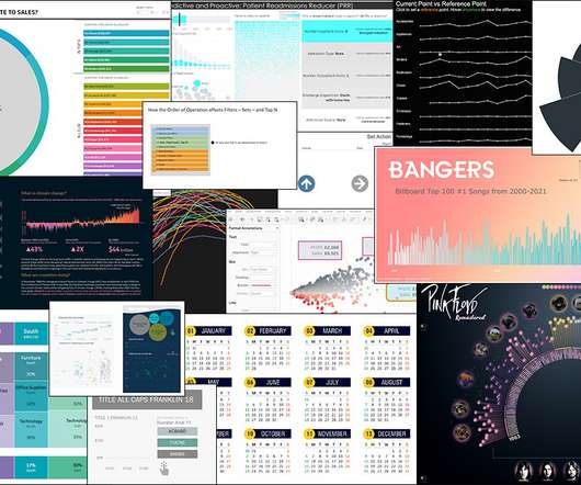
Dashboarding has become an increasingly popular tool for sales teams, and good reason. A well-designed dashboard can help sales teams to track key performance indicators (KPIs) in real-time, which can provide valuable insights into sales performance and help teams to make data-driven decisions.

Big Data 195
article thumbnail

How to Build a Hierarchy Filter in Tableau: Part 3 of 3

phData

In this blog, I will show you how to use the hierarchy filters in dashboards by creating an accordion menu. Step 1: Understand the Basics On a new sheet, create a bar chart by dragging the Category and Sub-Category fields in the Rows shelf and adding Profit in the Columns shelf. You will get this.

Tableau 59
professionals

Sign Up for our Newsletter

This site is protected by reCAPTCHA and the Google Privacy Policy and Terms of Service apply.

article thumbnail

ServiceNow Tableau Dashboard Example

phData

ServiceNow Tableau Dashboard Example Lynda Chao July 24, 2023 View Dashboard in Tableau This ServiceNow Tableau Dashboard provides business users with an executive overview of their ticket incidents, problems, and requests. Who is This Dashboard For?

Tableau 52
article thumbnail

New Study: 2018 State of Embedded Analytics Report

Why do some embedded analytics projects succeed while others fail? We surveyed 500+ application teams embedding analytics to find out which analytics features actually move the needle. Read the 6th annual State of Embedded Analytics Report to discover new best practices. Brought to you by Logi Analytics.

article thumbnail

Sales Analysis Power BI Dashboard Example

phData

Sales Analysis Power BI Dashboard Example Rishikesh Gundla November 20, 2023 View Dashboard in Power BI The Sales Analysis Power BI Dashboard provides an in-depth analysis of stores’ sales performance. Key features of this dashboard include: Custom background creation using PowerPoint. Who Is This Dashboard For?

article thumbnail

How to Build a Hierarchy Filter in Tableau: Part 1 of 3

phData

The filters you add up in a dashboard will often be different hierarchy levels. For example, Region and State or Category and Sub-Category. When filters are added like this, you will lose some much-needed context regarding which sub-categories roll up to which category. This is not a new problem in Tableau.

Tableau 52