Exploratory v6.1 Released!
Performance, UI, Analytics, Chart, and Parameter!
I’m super excited to announce Exploratory v6.1! 🎉🎉🎉
There are 3 main areas of focus for this release.
First, UI. We have upgraded the core UI framework. This will allow us to improve the UI & UX at later releases.
Second, Performance. We have switched the data storage file from RDS (R’s binary data format) to Parquet. This is to improve overall performance.
Third, incremental improvements. We have improved Summary view, Chart, Analytics, and Parameter.
Here’s a quick rundown.
Performance Improvements
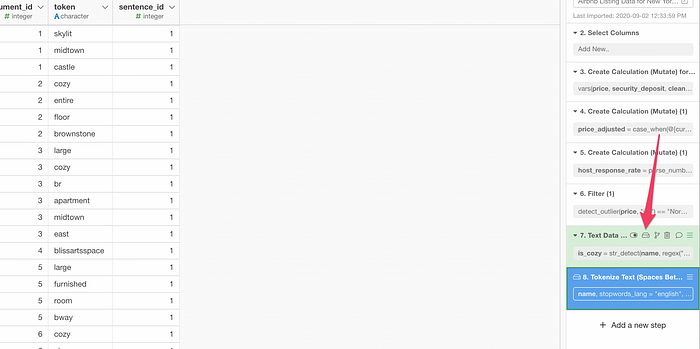
This enhancement is done under the cover, but you’ll notice this when you open the existing data frames.
When you import data to Exploratory it used to save the data in a binary format called RDS on the local hard disk. This is the data at the source step (the first step in the right hand side) before any data wrangling.
The next time you open the data frame after either reopening the project or restarting Exploratory, it will load the data from the RDS file into the memory instead of re-reading it from the original data source such as CSV, Excel, database, etc.
This is to improve the data loading performance. Loading the data from the RDS format is much faster than loading it from the original data sources.
Now, with v6.1 release (precisely, it’s v6.1.2), we have switched the data storage format from the RDS to a new format called Parquet, which is often used to transfer data in the world of big data.
There are 4 great benefits of this switch.
Much smaller data file size
First, the file size with the Parquet is much smaller than the one with RDS.
Just as an example, we tested with a sample data with 30 columns and 2 million rows.
When we saved the data in the RDS format it was about 480 MB (megabyte). With the Parquet format, it was only 27 MB! 🔥
It’s about only 5% of what it used to be.
Much faster Read/Write time
And the second benefit of using the Parquet is the speed of reading and writing the file.
Reading the RDS file of 2 million rows takes about 6 seconds while it takes about 4.8 seconds with the Parquet.
Writing (or creating ) the same RDS file took about 5.6 seconds while it took about 1.8 seconds with the Parquet.

This means two things.
When you reopen the data frame after reopening the project or starting up Exploratory, the data gets loaded very quickly. Depends on the data size, but you might even feel it like an instant. 💥💥💥
Also, we have switched to use the Parquet for the cached step.

The cached step reads the data from the Parquet file and it doesn’t run the step itself. The faster reading/writing with the Parquet file benefits the cached step as well.
By the way, you can click the ‘Cache’ icon to cache any of the steps.
Much faster Publishing time
The third benefit, the performance of publishing the data (or chart, dashboard, etc.) to the server (either Exploratory Cloud or Collaboration Server) is now much faster thanks to the smaller file size of Parquet.
When you publish the data Exploratory compress (zip) the data storage file first. And the RDS file can reduce the size quite a lot when it’s compressed.
The above RDS file can be reduced down to 30 MB.
The Parquet file doesn’t get much smaller compared to the RDS file, but still, the compressed Parquet file is smaller than the compressed RDS file.
And this 30% reduction of the data file makes a difference especially when you have a dashboard that contains multiple charts from multiple data frames.
Much faster initialization time for Interactive Mode at the server
Finally, the fourth benefit, the performance of initializing the interactive mode at the server.
When you have created parameters for your data, charts, dashboards, notes, and slides and publish them to the server, you or others whom you share with can use the parameters inside the web browser.
To use them, you want to enable the Interactive Mode by clicking on the ‘User Parameter’ switch.
Thanks to the faster reading time with the Parquet data file, the data gets loaded into the memory space at the server much faster than before.
These 4 benefits are brought by the switch to the Parquet file! 🎉
Summary View — Highlight Mode
With the previous release of v6.0, we introduced two new modes — Highlight and Correlation. Since then we have received tons of positive feedback from our users about these features.
For us, this Summary view including the Highlight and the Correlation is really the way to democratize Data Science, so we are constantly thinking of how we can improve them further.
With v6.1, we have made one big improvement in the Highlight mode.
Now, you can click on the chart icon to create the same type of chart under the Chart view.
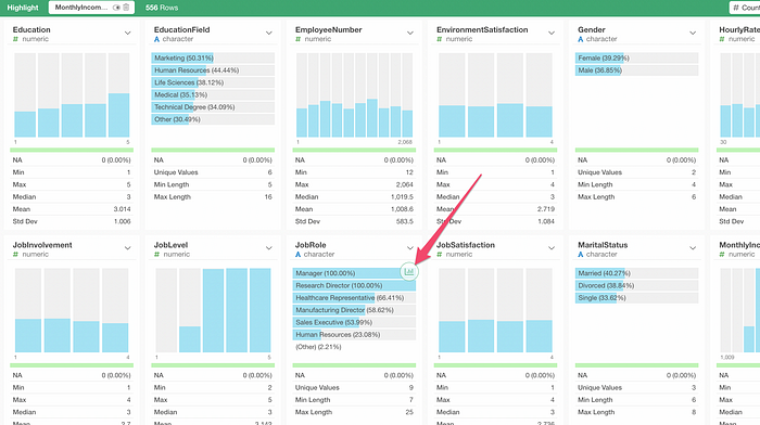
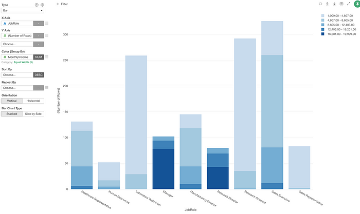
For example, I have an HR employee data and created a condition for the Highlight as ‘Monthly Income is greater than $6,000’.
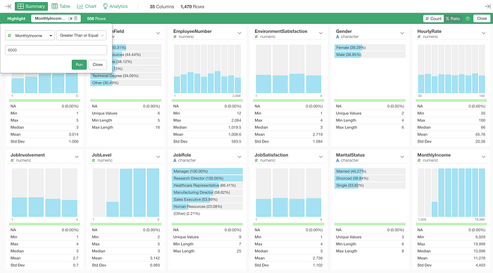
Now, what are the ratios of those employees in all the Job Roles?
I can click on the chart icon on top of the Job Role’s chart.
This would create a chart with the same condition that is visualized by the color.
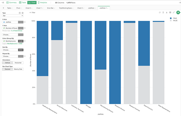
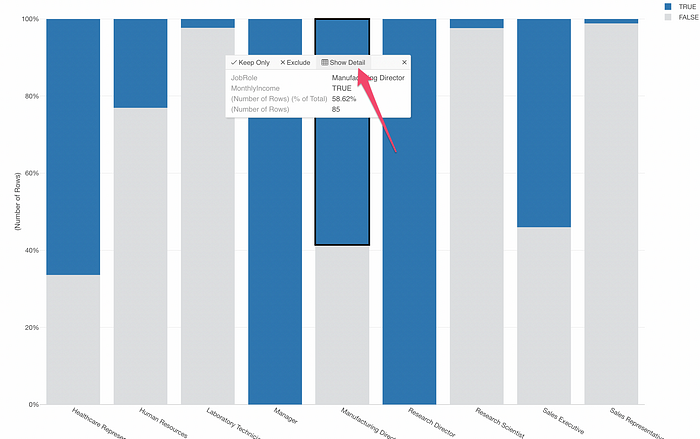
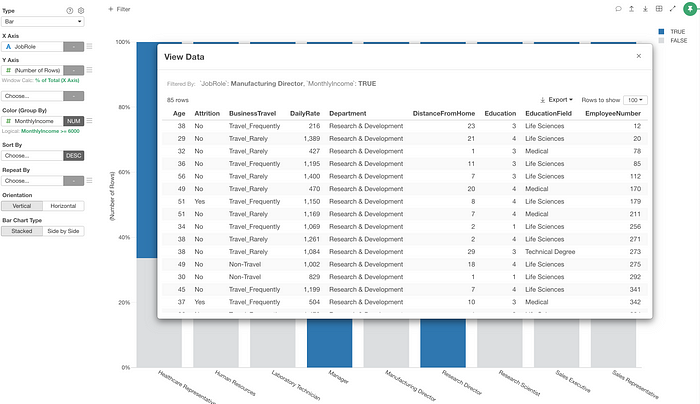
From here, I can customize the chart configuration or see the detail of such employees who met the condition criteria.
Chart
Logicalize — TRUE or FALSE
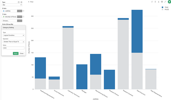
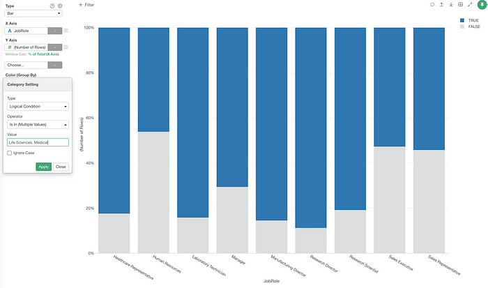
You can now create charts with colors that visualize the logical conditions you create.
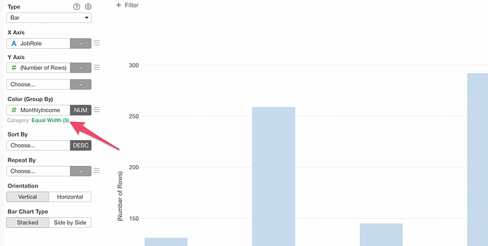
Let’s say we have created a chart that shows the number of employees by their job roles (X-axis) and by the level of monthly income (Color).
Now, instead of categorizing the numerical values of the monthly income column into 5 groups based on the ‘equal width’ option, how about ‘logicalize’ the monthly income values to either True or False based on a condition of ‘greater than $6,000 or not’?
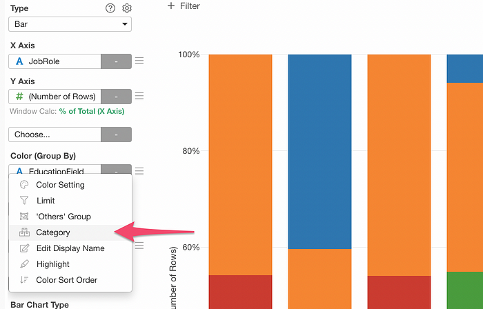
You can click on the green text link to open the ‘Category Setting’ dialog.
And you can select ‘Logical Condition’ from the Type menu and set the condition.
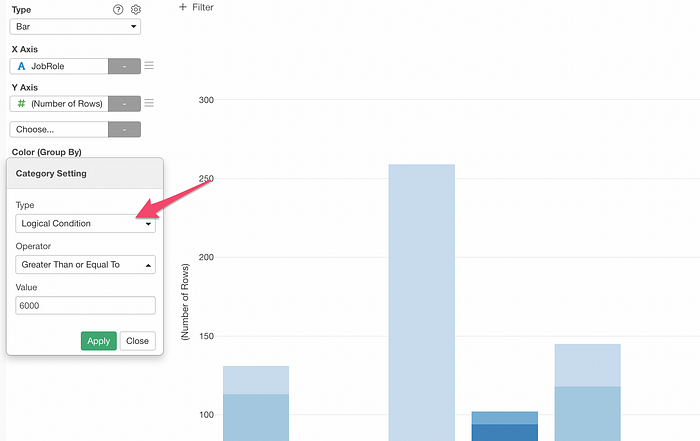
This will create two colors, blue for those who met the condition (True) and gray for the others.
Not only for the numerical columns, but you can also ‘logicalize’ for other data type columns such as character, logical, and date/time.
For example, here is a chart that shows the ratio of employees by the job role (X-axis) and the education type (Color).
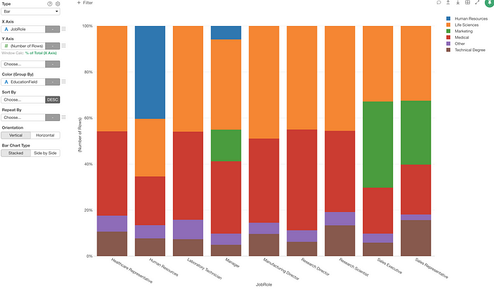
Let’s say we want to know the ratio of the employees with ‘Life Science’ and ‘Medical’ education background in each of the job roles.
You can select ‘Category’ from the Color menu.
And you can create a condition as ‘Is in either Life Science or Medical’.
Pivot / Table — URL
Here, we have a web page title column (Title) and its associated metrics and URL columns in the data.
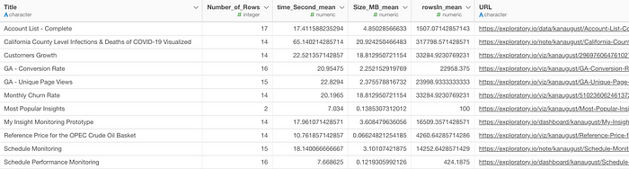
Let’s say you want to show this data in the table under Chart view and make the Title as an URL text using the URL column so that you can click on the title to open the corresponding page.
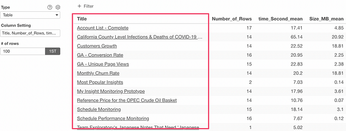
You could create such URL link text by using the following syntax in the Table or Pivot Table configuration.
${column_name}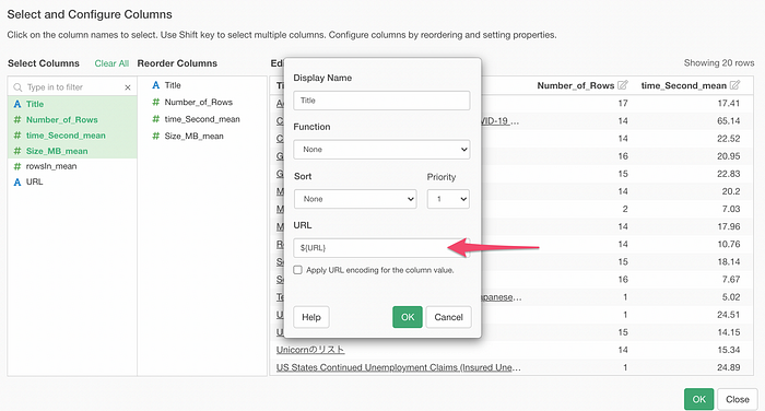
If you want to simply use the URL values from another column then you don’t want to check the ‘Apply URL encoding…’.
When do you want to do check this?
You want to use this option when you are constructing the URL text, for example, as follows.
https://google.com?q=${State_Name}Then some of the special characters need to be encoded. For example, ‘North Carolina’ contains a space, which needs to be encoded to be a part of an URL.
Analytics
Analytics Switch
With v6.1, you can easily switch between similar algorithms while preserving the column selection.
For example, let’s say you have built a Logistic Regression model.
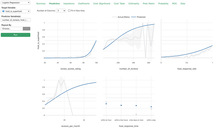
Let’s say now you want to see how the Random Forest can do with the same data and compare the two.
First, you want to duplicate it.
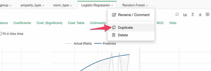
Then, switch the Analytics type to Random Forest.
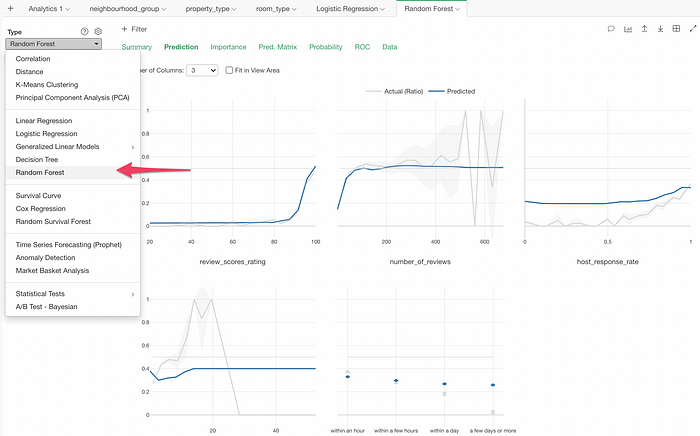
Much easier to do this compared to before!
Data Source
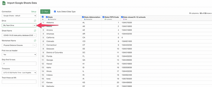
Google Sheet
Now you can access your spreadsheets under the Team drive.
Parameter
We have improved the Parameter feature’s overall experience.
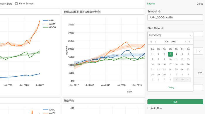
UI Design
First, we have updated the UI design including the dropdown, slider, and calendar picker.
And the new calendar picker does not only look better but also functions better.
Interactive Mode at the Server
When you have created parameters for your data, charts, dashboards, notes, and slides and publish them to our cloud server or your Exploratory Collaboration Server, you or others whom you share with can use the parameters inside the web browser.
To use them, you want to enable the Interactive Mode by clicking on the On button.
As mentioned above, we have switched the data storage format from RDS to Parquet and this makes the initial data loading required to enable the interactive mode much faster.
We have also done one more thing to make the interactive mode enabling faster.
We have built our own connection pool system, which is running all the time and waiting for your request so that it can serve your interactive mode enabling request right away.
Thanks to these two changes, you should find the performance of the initial connection much faster compared to before! 🔥
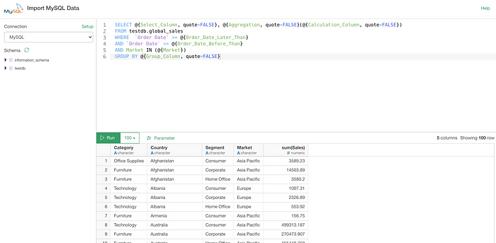
With Quote or Not
The parameter returns values with double-quotes for character values. This is perfect when you want to use it inside the WHERE clause, for example.
SELECT *
FROM employee
WHERE department = @{department_parameter}
But this is not good when you want to change the column names by using the parameter.
SELECT @{select_columns}
FROM employee
When you have a parameter like this:
Behind the scene, this will return the values as:
SELECT "Category, Country, Segment, Market"
FROM employee
And if you run this you will get an unexpected result.
For this to work, you want the ‘select_columns’ parameter to return the column names without the double-quotes.
Now you can use ‘quote’ argument inside the parameter clause as below.
SELECT @{select_columns, quote = FALSE}
FROM employee
This means that when you have a parameter like this:
It will return
SELECT Category, Country, Segment, Market
FROM employee
This seems like a tiny improvement, but it is actually a big deal especially if you want to parameterize your SQL queries with much greater flexibility.
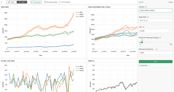
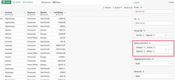
For example, here is a SQL query most of which are parameterized.
And you can manipulate the SQL query with the Parameter pane UI.
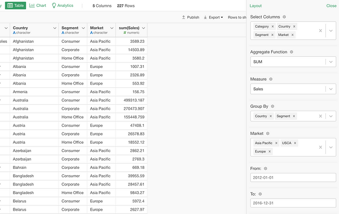
Just imagine you create something like this and share with others in your team who are not familiar with SQL! 😎
And, this is not only for SQL queries but also works for MongoDB queries and other data wrangling steps such as Filter, Create Calculation, etc. 💪
That’s all for the Exploratory v6.1 introduction, but we have many more enhancements and bug fixes. Don’t forget to check out the release note for the full list.
And, download Exploratory v6.1 from the download page today!
Cheers,
Kan, CEO/Exploratory
Try Exploratory!
If you don’t have an Exploratory account yet, sign up from our website for 30 days free trial without a credit card!
If you happen to be a current student or teacher at schools, it’s free!