
Summary: Tableau is fantastic for data visualization, but understanding your data is key. Data types in Tableau act like labels, telling Tableau if it’s a number for calculations, text for labels, or a date for trends. Using the right type ensures accuracy and avoids misleading visuals. Tableau recognizes numbers, dates, text, locations, and more. Assigning them correctly unlocks Tableau’s potential for insightful visualizations and clear communication of your findings.
Tableau Data Types: Definition, Usage, and Examples
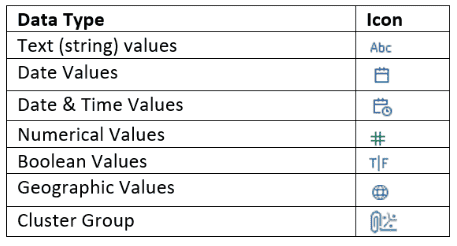
Tableau has become a game-changer in the world of data visualization. While accurate analysis of data is paramount, its effective presentation is even more critical.
Tableau’s intuitive interface and drag-and-drop functionality empower users to transform raw data into compelling charts and dashboards. But before you unleash your inner data artist, it’s crucial to understand the foundation upon which these visualizations are built: data types in Tableau.
Think of data types as the hidden language within your data. They act like labels, telling Tableau exactly what kind of information it’s dealing with. Is it a number used for calculations, a text description for categorization, or a date for tracking trends? Assigning the correct data type ensures accurate analysis and prevents misleading visuals.
Why Data Types Deserve Your Attention
- Accuracy is Paramount
Using the wrong data type can lead to skewed results and nonsensical visualizations. Imagine calculating an average price for a field containing product names!Data types ensure your analysis reflects the true nature of your data.
- Unlocking Tableau’s Potential
Different data types have unique functionalities in Tableau. Numerical values can be used for calculations, while dates allow for time-based analysis and visualizations.
Understanding data types unlocks the full range of options Tableau offers for data exploration.
- Clarity in Communication
When you share your visualizations with others, data types play a silent but crucial role. Correct data types ensure your audience interprets the visuals accurately. Imagine a chart labelled “Sales by Month” with a bar for January that’s twice the size of December.
If the data type for “Month” is actually text (e.g., “Q1 2024”, “Q2 2024”), the visualization becomes misleading.
In the following sections, we’ll delve deeper into the world of data types in Tableau. We’ll explore the different types Tableau recognizes, how to use them effectively, and best practices for managing them. By the end, you’ll be well-equipped to leverage data types and create powerful and informative visualizations in Tableau.
Understanding Tableau
It is a powerful data visualization tool that empowers users to transform data into insights. But before you can create stunning charts and dashboards, understanding your data is crucial. This includes recognizing the different data types at play.
Tableau Data Types Family
Let’s delve deeper into how each data type is used:
- String Values
They are great for labelling data points, categorizing information (e.g., product categories), and adding context to visualizations.
- Numerical Values
Analyze sales figures, calculate averages, and perform mathematical operations. Ensure consistent formatting (e.g., using commas for thousands of separators).
- Date Values
Track trends over time, filter data by specific dates, and create time-based comparisons (e.g., year-over-year sales). Use consistent data formats throughout your data.
- Date and Time Values
Analyze data with both date and time components, like website traffic patterns throughout the day.
- Boolean Values
Simplify filtering by creating True/False criteria (e.g., filtering for active customers).
- Geographic Values
Create insightful maps to visualize data by location, like sales trends across different regions.
Examples of Working with Data Types in Tableau
Example 1: Analyzing Sales Data
In this scenario, let’s delve into how different data types are used to analyze sales data effectively in Tableau.
Data Types Used
- Numerical Values (Revenue)
- Date Values (Order Dates)
- String Values (Product Names)
Process
- Import Data
Start by importing the sales data into Tableau, ensuring the data types are correctly recognized.
- Create Visualizations
- Revenue Trend: Utilize date values (order dates) on the x-axis and numerical values (revenue) on the y-axis to create a line chart showing the revenue trend over time.
- Product Performance: Generate a bar chart using string values (product names) on the x-axis and numerical values (revenue) on the y-axis to visualize the sales performance of different products.
- Apply Filters
- Date Range Filter: Incorporate a date range filter to allow users to analyze sales dynamically within specific time periods.
- Product Filter: Add a product filter to enable users to focus on specific products or product categories.
- Aggregate Data
- Calculate Totals: Utilize numerical values to calculate total revenue for the selected time period or product category.
- Average Revenue: Compute average revenue per product to identify high-performing products.
- Create Dashboards
- Combine visualizations into a dashboard to provide a comprehensive overview of sales performance, allowing users to interact with the data seamlessly.
Example 2: Creating a Map Visualization
Let’s explore how geographic values can be leveraged to create compelling map visualizations in Tableau.
Data Types Used
- Geographic Values (Postal Codes, Latitudes/Longitudes)
Process
- Geocode Data
Ensure that geographic values such as postal codes or latitudes/longitudes are correctly geocoded within Tableau.
- Map Creation
- Point Map: Use latitude and longitude values to plot sales locations on a map, representing each point with a marker.
- Filled Map: Alternatively, use geographic values such as postal codes to create a filled map, shading regions based on sales volume or revenue.
- Customize Map Layers
- Background Map: Choose an appropriate background map style to enhance visualization clarity.
- Overlay Data: Overlay additional data layers, such as demographic information or sales density, to enrich the map visualization.
- Interactivity
- Tooltip: Add tooltips to provide detailed information about sales data when users hover over map markers or regions.
- Filtering: Enable users to filter the map based on criteria such as sales region or product category for targeted analysis.
- Annotation and Insight
- Annotations: Include annotations or annotations to highlight specific insights or trends observed in the map visualization.
- Export or Share: Export or share the map visualisation within the Tableau Server or Tableau Public for collaboration and dissemination.
Example 3: Building Dashboards with Boolean Filters
Let’s explore how boolean values can create dynamic dashboards with interactive filters in Tableau.
Data Types Used
- Boolean Values (True/False)
Process
- Identify Boolean Criteria
Determine the boolean criteria based on the dataset, such as customer segments, purchase behaviour, or product attributes.
- Create Boolean Calculations
- Define boolean calculations using logical expressions to categorize data based on specified criteria.
- Incorporate Filters
- Boolean Filter: Add boolean filters to the dashboard, dynamically allowing users to toggle between different segments or conditions.
- Visualize Impact
- Create visualizations, such as bar charts or pie charts, showcasing the distribution or performance of data segments based on boolean filters.
- Interactivity and Analysis
- Enable users to interact with the dashboard by selecting different boolean filters to dynamically observe changes in data visualization.
- Insights and Actionable Decisions
- Analyze the impact of boolean filters on key metrics or KPIs, providing insights that drive actionable decisions for the business.
These examples illustrate the versatility of data types in Tableau, showcasing how they can be utilized to analyze, visualize, and derive insights from diverse datasets. By effectively leveraging the appropriate data types, analysts can uncover valuable insights and drive informed decision-making within their organizations.
Tips and Best Practices for Tableau Data Types
Tableau usually recognizes data types automatically. However, you can manually change them if needed. Here are some tips:
While Tableau does a good job of automatically recognizing data types during import, there are situations where you might need to take manual control. Here are some tips and best practices to ensure your data types are working for you, not against you:
1. Leverage Tableau’s Automatic Detection
Tableau is pretty smart! It will analyze your data and assign data types based on its best understanding during the data import process. Pay attention to any messages or prompts appearing during import, as Tableau might ask you to confirm its selection of data.
2. Don’t Be Afraid to Get a Manual
Even with automation, there can be situations where data types need a manual nudge. Right-click on any field in the Tableau Data Pane and select “Data Type” from the menu. A list of possible data types will appear, allowing you to choose the most appropriate one for your data.
3. Consistency is Key
Data consistency is crucial for accurate analysis. This applies to data types as well. For example, if you have multiple date fields, ensure they all use the same date format (e.g., YYYY-MM-DD). Inconsistent formatting can lead to errors and incorrect calculations.
4. Explore the “Data Type” Menu
The “Data Type” menu offers more than just changing types. Use the “Format” option to customize how dates, numbers, and booleans are displayed in your visualizations. This helps ensure clarity and avoids confusion for your audience.
5. Clean Up Your Data
Sometimes, your data might have inconsistencies or errors that can affect data type assignment. Consider using Tableau Prep or other data cleaning tools to address missing values, typos, or inconsistent formatting before importing your data into Tableau.
6. Test and Validate
Once you’ve assigned data types, don’t just assume everything is working perfectly. Test your calculations, filters, and visualizations to ensure they are behaving as expected. This helps identify any lingering data type issues that might be impacting your analysis.
7. Document Your Data Types
If you’re collaborating with others or revisiting your work later, documenting your data types can be a lifesaver. Briefly describe the data types used in your analysis for future reference or to avoid confusion for others using your data.
By following these tips and best practices, you can ensure your data types are properly managed in Tableau. This lays the foundation for accurate analysis and the creation of clear and insightful data visualizations. Remember, data types might seem like technical detail, but they play a critical role in turning raw data into actionable insights.
Summary Table: Data Type in Tableau
| Data Type | Definition | Example | Common Use Case |
| String | Textual characters | “Customer Name” | Categorizing data, adding labels |
| Numerical | Numbers (integers & decimals) | 123.45 | Calculations (averages, sums) |
| Date | Calendar dates | 2024-03-13 | Track trends over time |
| Date & Time | Combined date and time | 2024-03-13 10:00 AM | Analyze data with a time component |
| Boolean | True or False values | True | Filtering data (e.g., In Stock) |
| Geographic | Location data (postal codes, etc.) | Zip code | Creating maps for location-based analysis |
| Cluster/Mixed | Combination of data types | A field containing text & numbers | Can be challenging to work with |
By understanding data types and using them effectively, you can unlock the full potential of Tableau and transform your data into actionable insights.
Understanding and using data types correctly in Tableau is essential for building accurate and insightful data visualizations. By following these guidelines, you’ll ensure your data speaks for itself, leading to clearer and more impactful results.
Become a Data Visualization Expert with Pickl.AI’s Data Analyst Training and Placement Program
Have you been looking for the best Data Analytics course? Well, Pickl.AI offers a comprehensive course tailored specifically for individuals eyeing to transition into the data domain or are willing to upskill their knowledge.
This course covers all the key concepts of Data Analytics like Data Visualization tools like Tableau, Python and others. With the expertise in this course, you would be able to enhance your skill sets and give your career the right boost. To know more connect with Pickl.AI today.