Steps to Perform Data Visualization: Data visualization is the presentation of information and statistics using visual tools that include charts, graphs, and maps. Its goal is to create patterns in data, trends, and anomalies comprehensible to both data professionals and people without technical knowledge.
It aids in well-informed choices and transforms raw data into useful information by adding color and meaning to data. A national healthcare agency, for example, may utilize visualizations of information to highlight COVID-19 hotspots or vaccination rates throughout various geographical areas.
If you’re an aspiring Data Science professional, Data Visualisation will be part of your job role in presenting the insights in a visually understandable format. However, if you’re a beginner in the field, you need to undertake a Data Visualisation course for a beginner. It will help you learn from the fundamentals of visualization and then move forward with advanced-level concepts.
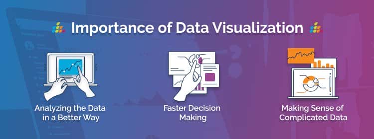
Importance of Data Visualization in Data Science
Data Visualization plays a crucial role in Data Science and holds significant importance in several aspects. Here are some reasons highlighting the significance of Data Visualization in Data Science:
Data Understanding and Exploration: Data Visualization helps in gaining a deeper understanding of the data by visually representing patterns, trends, and relationships that may not be apparent in raw data. It allows data scientists to explore and identify insights quickly, leading to better decision-making and hypothesis generation.
Communication and Storytelling: Data Visualization is an effective way to communicate complex data and findings to both technical and non-technical audiences. Visual representations make it easier to convey information, present key findings, and tell compelling stories derived from data.
This enhances the impact of data analysis and facilitates data-driven decision-making within organizations.
Pattern Identification and Anomaly Detection: Visualizations enable the identification of patterns and anomalies in data. By visualizing data distributions, scatter plots, or heatmaps, data scientists can quickly identify outliers, clusters, or trends that might go unnoticed in raw data.
This aids in detecting anomalies, understanding data quality issues, and improving data cleaning processes.
Insights Extraction and Decision Support: Data Visualization enables data scientists to extract meaningful insights and derive actionable conclusions from data. Interactive visualizations empower users to explore data from different perspectives, drill down into details, and perform ad-hoc analyses.
This supports decision-making processes and empowers stakeholders to make informed choices based on visual evidence.
Feature Selection and Model Evaluation: Visualizations help in selecting relevant features for building predictive models. By visualizing correlations, distributions, or feature importance, data scientists can identify the most informative variables for modeling.
Visualizations also aid in evaluating model performance, comparing different algorithms, and interpreting model predictions.
Explaining Complex Concepts: Data Visualization simplifies the communication of complex concepts and analytical methodologies. It helps in illustrating data transformations, statistical techniques, or Machine Learning algorithms in a visual and intuitive manner.
This promotes transparency, fosters collaboration, and improves comprehension among stakeholders.
Data-Driven Presentations and Reports: Data Visualization enhances the effectiveness of presentations and reports by making them visually appealing, engaging, and informative. Visualizations serve as a means to summarize findings, support arguments, and provide evidence-based insights.
They make it easier for the audience to grasp key messages and remember key takeaways.
User Engagement and Interactivity: Interactive visualizations facilitate user engagement and exploration. By enabling users to interact with visual representations, Data Scientists can encourage deeper analysis, hypothesis testing, and knowledge discovery.
This interactivity enhances the overall user experience and promotes a more interactive and collaborative approach to data analysis.
In summary, Data Visualization is essential in Data Science as it aids in data understanding, facilitates effective communication, supports decision-making processes, and enables insights extraction. It empowers data scientists to explore data, communicate findings, and drive data-driven actions across various domains and industries.
By leveraging the power of visual representations, Data Visualization enhances the overall impact and value of data analysis in the field of Data Science.
Data Visualisation Techniques in Data Science
Data visualization refers to many different ways of displaying information and data. Here are some examples of frequently employed techniques:

Tables: A table is a structured format that organizes data into columns and rows of information. It is simple to construct in word processors or spreadsheet applications that include Excel. Tables convey data in a brief and organized fashion.
Chart or Graph: Charts and graphs visually show data by charting it along an x and y-axis. To depict data in a way that is comparable fashion, they employ different graphic components such as bars, points, or lines. Infographics are a sort of infographic that incorporates pictures and text to demonstrate data in a visually appealing manner.
How to do Data Visualization in 7 steps?
Step 1: Define the Purpose and Audience
Before diving into data visualization, it’s important to define the purpose of your visualization and understand your target audience. Ask yourself what you want to achieve with your visualization. Are you trying to showcase trends, compare data, explore relationships, or tell a compelling story?
Identifying the purpose will guide your choices throughout the visualization process. Additionally, consider the background and familiarity of your audience with the subject matter to ensure the visualization is accessible and meaningful to them.
Step 2: Identify the Relevant Data
To create an effective data visualization, you need to identify the relevant dataset(s) that contain the information you want to visualize. Ensure the data is clean, organized, and relevant to your objective. Perform any necessary data cleaning, preprocessing, or aggregation to ensure the data is in a suitable format for visualization.
This step is crucial as the quality and integrity of your data will directly impact the accuracy and credibility of your visualization.
Step 3: Choose the Right Visualization Technique
Once you have your dataset, it’s time to select the most appropriate visualization technique to represent your data effectively. The choice of visualization depends on several factors, including the type of data you have (categorical, numerical, time series), the relationships you want to display (comparisons, distributions, correlations), and the story you want to convey.
Some common visualization types include bar charts, line graphs, scatter plots, histograms, heat maps, and maps. Research different visualization techniques and consider their strengths and limitations in relation to your data and objective.
Step 4: Design the Visualization
Designing the visual elements of your visualization is crucial to ensure clarity and visual appeal. Consider the following design aspects:
Colors: Choose an appropriate color palette that suits the data and the purpose of your visualization. Use colors strategically to highlight key elements or patterns, but avoid overwhelming or misleading the audience.
Fonts and Labels: Select legible fonts for your titles, axis labels, and data labels. Ensure that the labels are clear, concise, and properly positioned for easy understanding.
Layout and Composition: Arrange the visual elements in a logical and intuitive manner. Use proper spacing, alignment, and visual hierarchy to guide the viewer’s attention and make the visualization easy to navigate.
Annotations and Context: Add annotations, captions, or explanatory text to provide additional context and guide the interpretation of the visualization. This can include explanations of data sources, definitions of terms, or notes on significant observations.
Accessibility: Consider accessibility factors, such as providing alternative text for images, ensuring color contrast for readability, and accommodating different screen sizes or devices.
Step 5: Create the Visualization
Once you have planned the design, it’s time to create the visualization. Depending on your proficiency and preference, you can use various tools and technologies to bring your visualization to life. Common options include programming libraries like Matplotlib, Seaborn, Plotly, or ggplot in languages such as Python or R.
Additionally, there are user-friendly tools like Tableau, Power BI, or Google Data Studio that offer drag-and-drop interfaces for creating visualizations without extensive coding. Choose the tool that aligns with your skills and provides the necessary flexibility and functionality for your visualization.
Step 6: Enhance with Interactivity (Optional)
Consider adding interactivity to your visualization to enhance user engagement and exploration. Interactive elements allow users to interact with the visualization, change parameters, filter data, or view additional details. This can be accomplished using libraries like Plotly, D3.js.
Step 7: Present and Communicate
Share your visualization with the intended audience. Consider the best medium for presenting your visualization, such as reports, dashboards, or interactive tools. Clearly communicate the insights and message behind the visualization, ensuring it is accessible and easily understood.
Conclusion
In conclusion, Data Visualisation is an important component of Data Science that is useful for communicating data. The use of Data visualization tools and techniques will help you in creating compelling visualization. Effectively, it can help in highlighting and communicating the data trends and patterns to others.
You can become proficient in Data Visualisation by undertaking Data Visualisation Online Training Courses. Pickl.AI offers a myriad of Data Science courses that can help you develop your skills and knowledge in the field.
FAQs
1. Who is eligible for the data visualization course?
Any undergraduate, graduate, or post-graduate student or a working professional with a technical or non-technical background is eligible for the Data Visualisation course. Although the beginner level does not have any eligibility criteria for the Data Visualisation course, advanced-level courses require you to have basic analytical and statistical skills.
2. What is the salary of a data visualization job in India?
The average Data Visualisation Analyst salary ranges between Rs 2.1 Lakhs to Rs 17 Lakhs. The average annual salary for the job role stands at Rs 6 Lakhs.
3. Does data visualization require coding?
Data Visualization does not require coding because for creating interactive Data Visualization, you do not require any code.
4. Is Python used in data visualization?
Yes, Python is commonly used in data visualization. It offers powerful libraries such as Matplotlib, Seaborn, and Plotly, which provide a wide range of tools and functions. It helps to create various types of charts, graphs, and visualizations from data for analysis and presentation purposes.