Exploratory v6.3 Released!
I’m super excited to announce Exploratory v6.3! 🎉🎉🎉
We have released 5 big releases this year, and this is the 6th, the last drop in 2020! 🔥
As always, we have tons of new features and enhancements (and bug fixes!) with this release. The main things are Performance, Prediction, Summary View’s Correlation Mode, Text Data Wrangling UI, and Summarize Table.
Here is a quick run down of those plus other important additions.
Performance
But the performance to me is probably the most important feature for any data analysis tools.
If it responds quickly then you can continue to follow your stream of concious and keep coming up with new questions. The longer the response gets the less questions you come up with, which means you will end up with less data exploration.
This is why we periodically measure the performance and fix the problems as we go, but we had realized that the UI rendering aspect of Exploratory had become quite slow in the recent releases and we had to do something about it.
So a few months ago, we all sat back and analyzed the all places that were related to the UI rendering and tinker around what can be done. The good news is we have found many places where we could improve the performance.
You will see a much better performance around the following areas:
- Switching between Summary / Table / Chart / Analytics views.
- Switching between Data Frames.
- Moving between the Data Wrangling Steps.
- Rendering of the Chart graphics.
- Opening and Closing Projects.
We’ll continue to improve the performance whenever we can, and please let me know whenever you see such performance declining.
Summary View
The summary view is the first thing you see once you import your data into Exploratory. It gives you a quick overview of your data. It is an entry point of your data analysis.
This is why we are always thinking about how we can improve the experience around the Summary view.
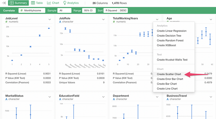
With v6.3, we have improved the column header menu capability under the Correlation mode. Now you can create various types of charts and analytics directly from the Correlation mode with a new column header menu.

With the Correlation mode, you can see which variables are more correlated to a variable of your interest.
For example, here is Employee data and I’m trying to see which variables are more correlated to a Monthly Income variable.

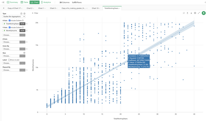
It looks that the Total Working Years variable is highly correlated to the Monthly Income, I can visualize the relationship in more detail by selecting ‘Create Scatter Chart’ from the column header menu.
This will create a scatter chart under the Chart view and I can now customize the chart configuration to dig deeper.
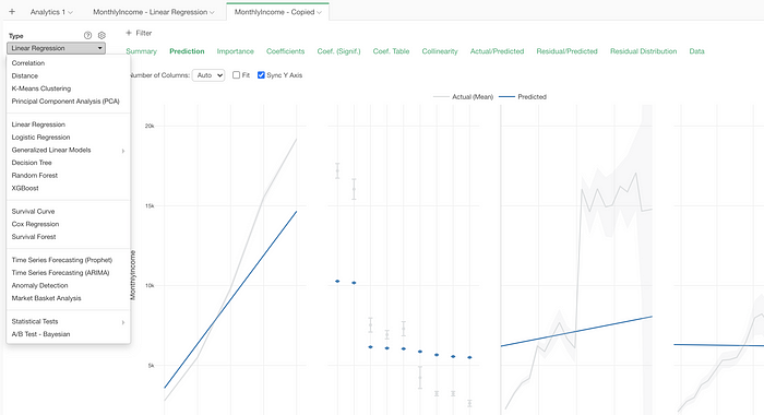
Now that I can see that some of the variables like Job Level, Job Role, Working Years, etc. are highly correlated to the Monthly Income, I want to build a Linear Regression model to investigate further.
I can select those variables together with Command (Mac) / Control (Windows) key or Shift key and select ‘Linear Regression’ from the column header menu.
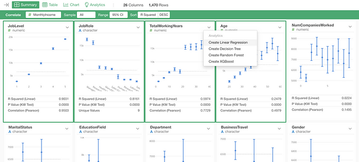
You’ll see a Linear Regression model built right away!
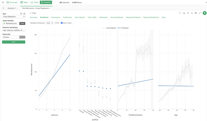
By the way, this is actually an enhancement introduced in the previous release (v6.2), but now you can switch the analytics type without losing all the variable selection.
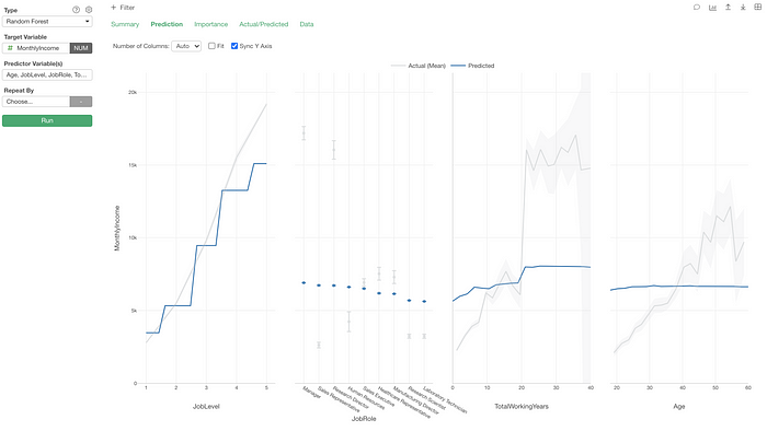
Here, I’m quickly duplicating it and switching the analytics type to Random Forest.
Analytics
We have made several enhancements in Analytics.
- Prediction
- Configuration for Base Level for Statisical Learning Models
- Visualization of Probability Distribution for Hypothesis Tests
- Test Mode for Cox Regression and Surivival Forest
But, the most important one is the new Prediction capability.
Prediction
You could do the prediction inside Exploratory even before, but you had to build the prediction models with the Step, not with the Analytics view.
With v6.3, now you can apply the models, you built under the Analytics view, to a new data set! 🔥
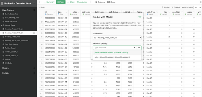
Here, I have this real state data and have built a Random Forest model under the Analytics view for predicting the housing price.
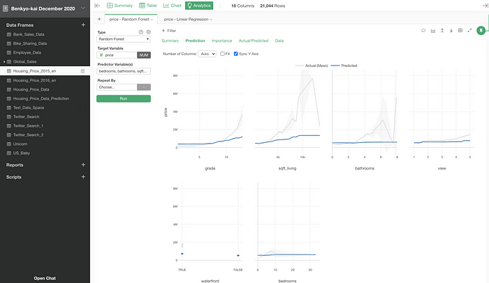
Now, I have another housing price data and want to predict the price for each house by using this model.
I can open this new data and select ‘Predict with Model (Analytics)’ from the Step menu.
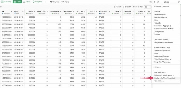
Then, I can select the data frame that contains the model and the name of the model.
Once you click the OK button, you’ll get a column with the predicted values.
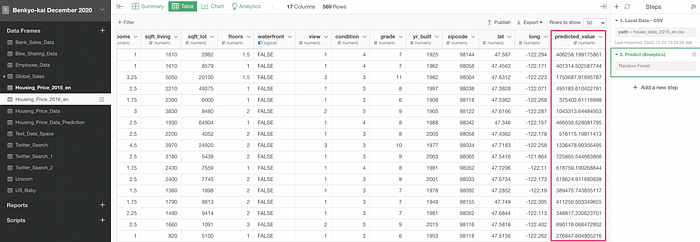
As you can see at the right hand side, a new step has just been added.
With this new Prediction framework, you can use the same prediction model for prediction with multiple data sets.
And here is a cool thing. You can publish this Prediction step and schedule it so that it will re-build the model with the latest data and apply the model to the latest data for prediction. 🔥
Setting the Base Level for Statistical Learning Models
For the Statistical Learning models like Linear Regression, Logistic Regression, etc. the way to interpret the coefficients of the categorical variables is a bit tricky.
Long story short, you want to interpret the value as being compared to the base level.
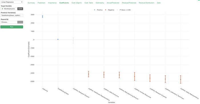
For example, here is a Linear Regression model for predicting Monthly Income with the Employee data.
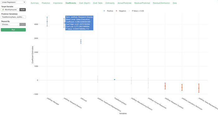
Under the Coefficient tab, we can interpret the coefficient of the Research Director as “the monthly income of the Research Director would be about $4,096 higher compared to the base level, Sales Executive.”
The base level is Sales Executive because the most frequent value of a given categorical variable becomes the base level by default in Exploratory, and the Sales Executive happens to be the most frequent value of the Job Role variable.
But you might want to change the base level so that you can understand the coefficient better. Even before v6.3, you could change it by converting the variable to a Factor data type.
But with v6.3, you can now change the base level right inside the Analytics.
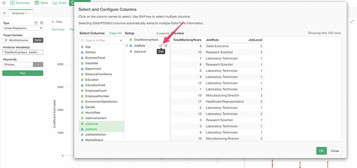
All you need to do is to select a value you want to use as the base level.
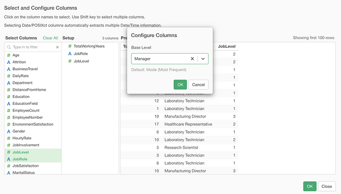
Now, all the coefficients here are based on the comparison to the new base level, Manager.
Probability Distribution for Hypothesis Test
The Hypothesis Test is one of the most confusing things of Statistics, thanks to P-Value and the underlying Probability Distribution.
For example, here is a result of T Test I have run to see the difference in Monthly Income between Male and Female is significant or not.
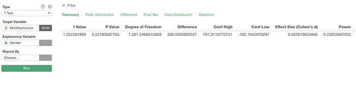
The P-Value here can be understood as “a probability of getting the t Value (or more extreme values) under the ‘null hypothesis’ that assumes no difference in Monthly Income between Male and Female.
If the P-Value is very small we can consider that it is not plausible to expect this much difference if we exclude the difference between Males and Females as a factor.
Here, we are getting 0.22 as the P-Value.
Now, the question is, if this P-Value is small enough or not?
This is when you want to go to the new Probability Distribution tab.
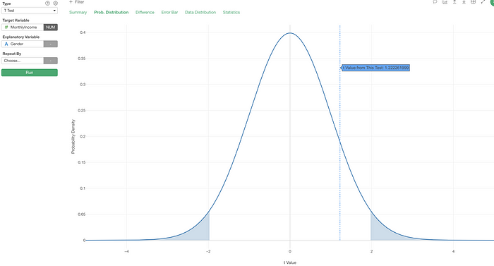
It visualizes where the given T value is on the probability distribution of T values under the null hypothesis.
The significant level (the default is 0.05) is highlighted at both ends.
This gets even better when you have something in the Repeat By. Here is a series of T Test done for Job Roles.
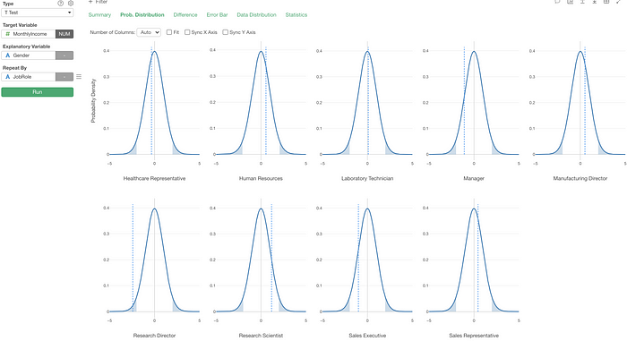
Can you spot which Job Role is statistically significant (assuming the threshold is 0.05 or 5%)? (it’s Research Director!)
Chart
Here is a list of new features and enhancements under the Chart view that I’d like to highlight.
- Repeat By for Multiple Y-Axis Measures
- Exposing the Repeat By Configuration
- Quick Window Calculation
- New Summarize Table
Repeat By for Multiple Y-Axis Measures
Now you can assign multiple Y-Axis columns and create multiple charts each of which would show each Y-Axis column values.
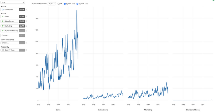
Here, I have Sales data and have assigned Sales, Sales Compensation, Marketing, and Number of Rows to Y-Axis.
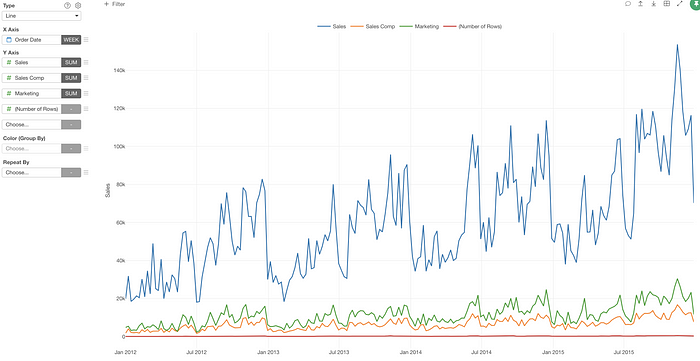
Since all the measures don’t share a similar scale (a range of values) I want to separate into multiple charts each of which will have only one measure.
I can select ‘Each Y Axis’ from the Repeat By dropdown.
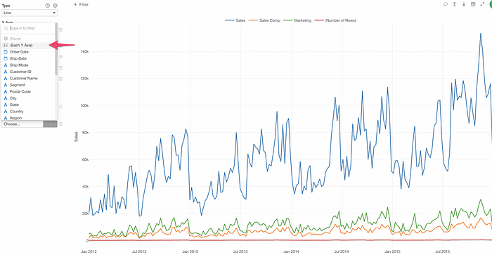
Now it separates into multiple charts each of which visualizes each Y-Axis measure.
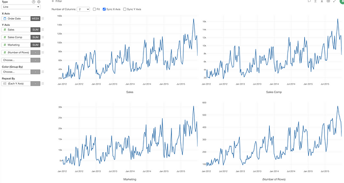
From this view, we can quickly change the Repeat By Layout setting to make them easier to see.
Exposing the Repeat By Configuration
We have exposed the Repeat By’s Layout setting at the top of chart.
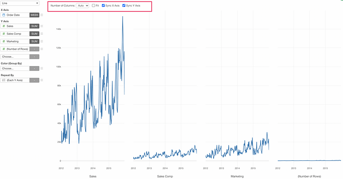
This makes it super easy and quick to change the layout and make it easier to see the charts.
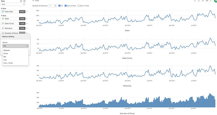
Different Maker per Y-Axis Measure
The cool thing about this ‘Repeat By with Multiple Y-Axis Measures’ is that you can set a different marker (bar, line, circle) to each Y-Axis measure
For example, I have made one of the charts to use Bar instead of Line as the marker.
Different Window Calculation per Y-Axis Measure
You can also apply a different Window Calculation to each measure.
For example, here I am showing the number of returned and not-returned orders with the above chart and the ratio of the returned and not-returned orders with the below chart.
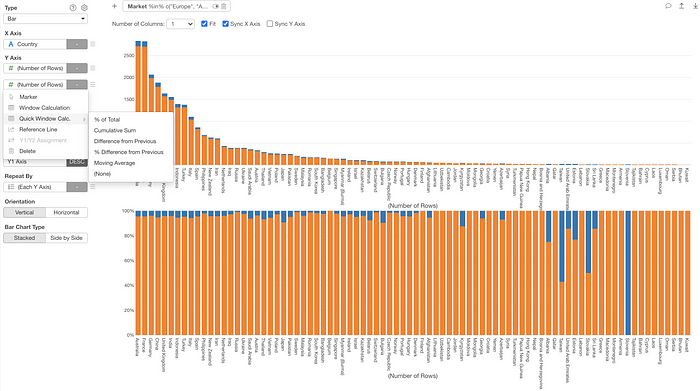
Quick Window Calculation
We have made it easier and quicker to apply the Window Calculation inside the Chart.
For example, in order to apply the ‘% of Total’ calculation to the lower chart below you can simply select the ‘Quick Window Calc.’ menu and select ‘% of Total’ from the list.
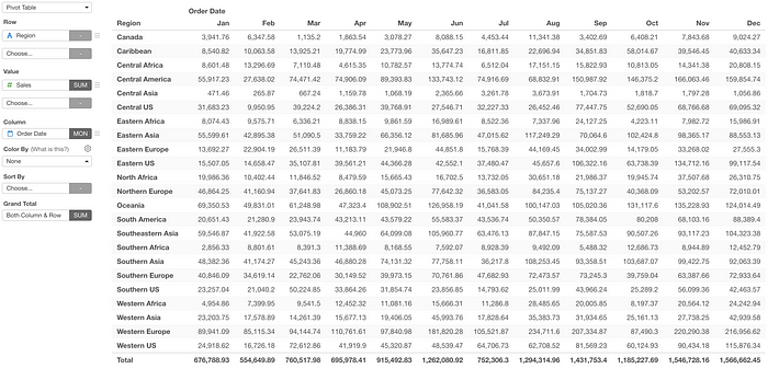
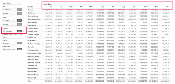
New Summarize Table
We had this Pivot Table for a long time in the history of Exploratory.
But, it has a few problems.
- A different number format (currency, percent, etc.) couldn’t be applied to each column.
- A different Color Setting couldn’t be applied to each column.
- The format option was primitive.
- Sub-total was not there.
These limitations came mainly from the fact that the Pivot table is meant to assign a column to ‘Column’, which makes each value of the assigned column becomes each column of the output.
This makes it harder to support a design where you can configure each column for its format and other things.
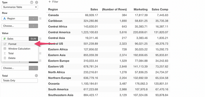
So, with v6.3, we have introduced a new chart component called ‘Summarize Table’ to overcome the above challenges. The Summarize Table doesn’t support the ‘Column’, and has only ‘Row’ and ‘Value’.
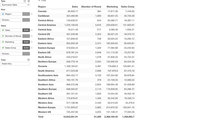
So it is the Pivot Table without ‘Column’, but this new Summarize Table lets you configure it much more flexibly.
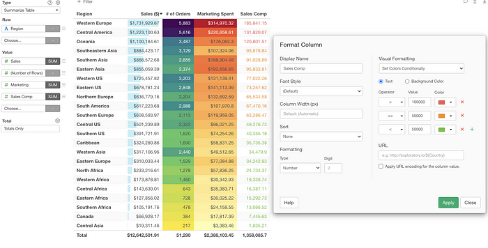
Each column has a ‘Format’ menu with which you can configure each column.
For example, you can configure the number format and the background color for each column.
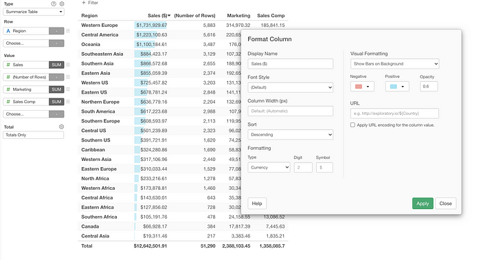
Yes, the same formatting capability you see with the Table! So you can even apply the conditional color formatting as well!
Data Wrangling
There is almost no real world data that doesn’t need to be cleaned or transformed before it’s analyzed or visualized. And we always hear from our users that they spend a lot of times doing Data Wrangling.
This is why we built Exploratory in the first place. We wanted to make the Data Wrangling easier and make the reproducibility by default.
With v6.3, we have improved various places of Data Wrangling, but there are two areas we focused on.
- Summarize Step — Summarize Multiple Columns Together
- Text Data Wrangling UI
Summarize Step — Summarize Multiple Columns Together
Sometimes, it’s so tedious to select a column to summarize one by one, and you’d rather want to select all the columns at once.
So we are introducing ‘Numeric Columns’ as one of the option under the Value.
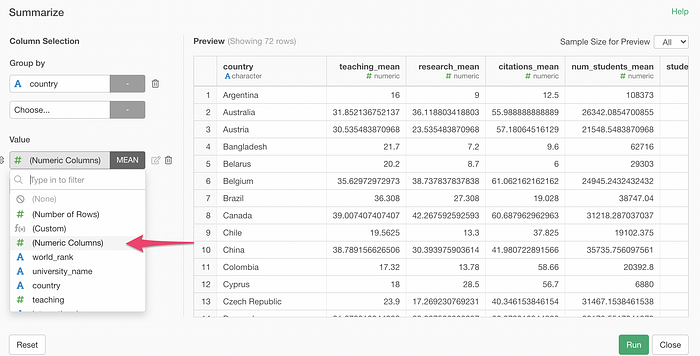
By selecting this, all the numeric data type columns will be selected and summarized with a same function (e.g. mean).
You can still select other columns with different summarize functions on top of selecting ‘Numeric Columns’. So this makes it a flexible option to have!
Text Data Wrangling UI
When cleaning data, the text data is the most notorious. We introduced the Text Data Wrangling UI with v5.5 to make the following text data wrangling operations easier.
- Remove Text
- Replace Text
- Extract Text
- Convert Text
It’s been almost a year since then, and we thought it is time for a revisit.
Let’s take a look at a few enhancements quickly.
Select one of the operations from the Text Data Wrangling menu, which will open the UI dialog.
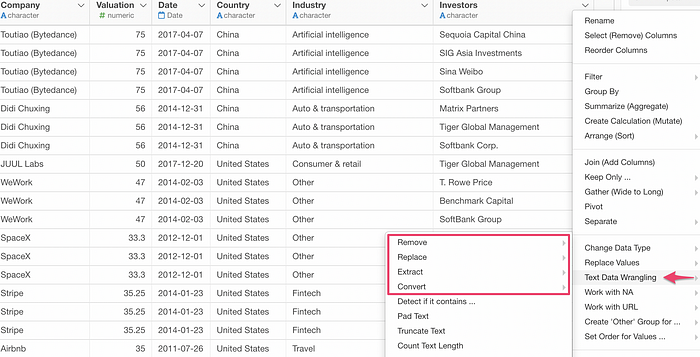
The first thing you’ll notice is the updated preview table at the right hand side.
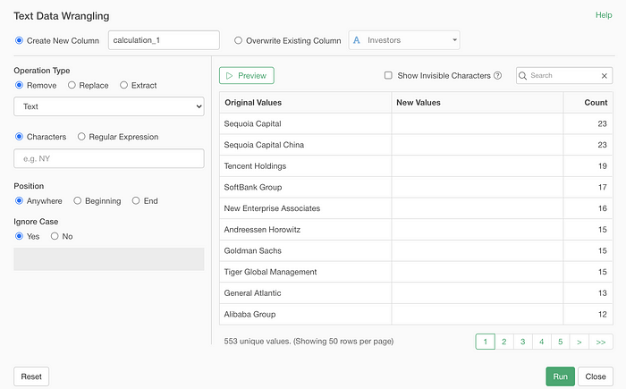
It shows you the original values in an aggregated format so that you can see how many rows there are for each value.
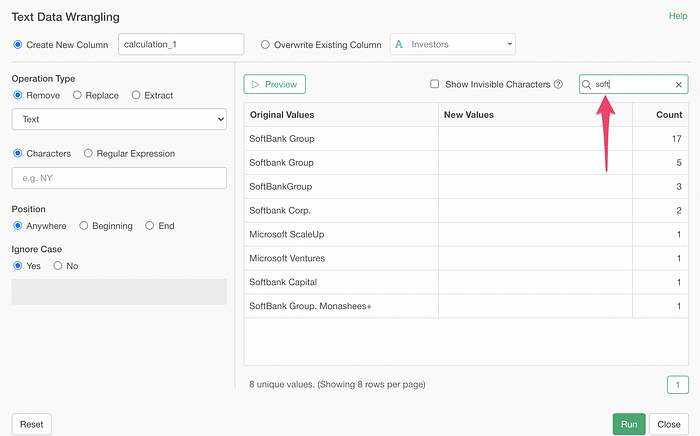
You can search the text that you are interested in as well.
Now, you can use the Regular Expression, if you are familiar with it, to match the text. Here, I’m trying to match the values that end with either ‘Group’, ‘Capital’, or ‘Corp.’.
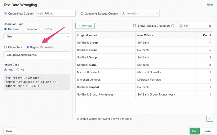
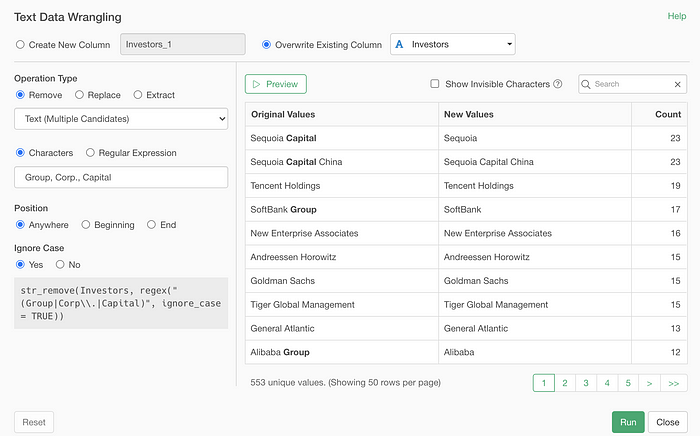
But, to be honest, something like the above can be done much easier with a new ‘Text (Multiple Candidates)’ option without a need of using the Regular Expression.
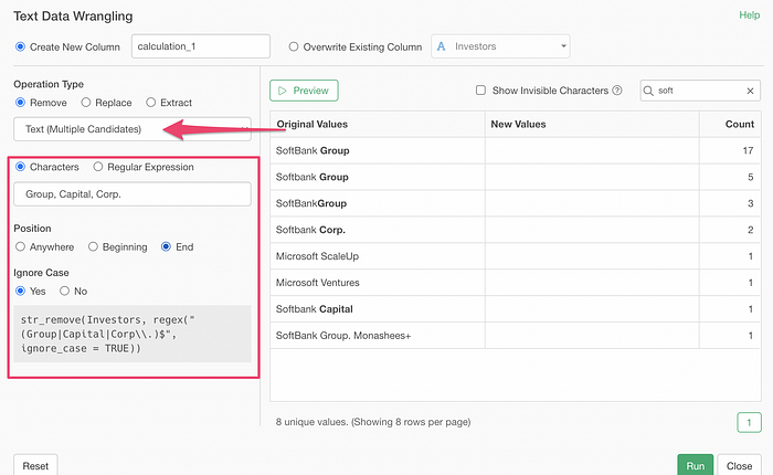
Once you click on the Preview button you can check if it’s working as expected or not.
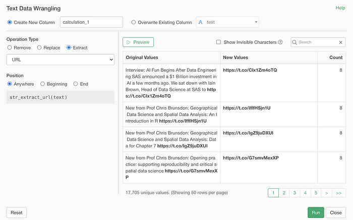
We have added other new options to work with:
- URL
- Emoji
- Characters inside of… (e.g. text inside of brackets)
- First Word / Last Word
Here is an example of extracting URLs from the tweet data.
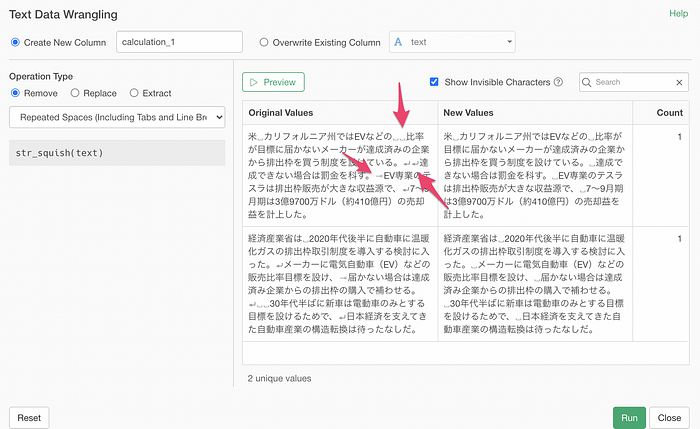
Visualize Space / Tab / Line Breaks
One of the hard things you’d encounter when you try to clean up the text data is the things that are not visible.
They are spaces, tabs, and line breaks.
So we have added a ‘Show Invisible Characters’ check box. You can check this to show them visible so that you will know what needs to be done.
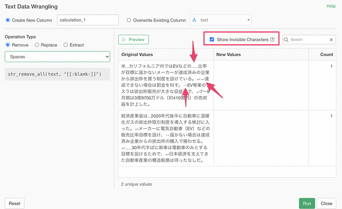
Here, I’m removing extra spaces and changing the tab and the line break to a single space with ‘Repeated Spaces (including Tabs and Line Break)’ option.
That’s all!
But, as always, we have many more enhancements and bug fixes in this release. Don’t forget to check out the release note for the full list!
And, download Exploratory v6.3 from the download page today!
And please leave your feedback at the comment section below! 🙏
Cheers,
Kan, CEO/Exploratory
Try Exploratory!
If you don’t have an Exploratory account yet, sign up from our website for 30 days free trial without a credit card!
If you happen to be a current student or teacher at schools, it’s free!