Summary
Demystify data with MIS report in Excel! This guide unveils how to transform raw information into impactful summaries. Learn to collect, format, and analyze data using effective formulas and PivotTables. Visualize trends with charts and craft clear, informative reports to empower data-driven decision making within your organization.
MIS Report in Excel? Definition, Types & How to Create
Ever felt overwhelmed by data but unsure how to translate it into actionable insights? Enter the world of MIS reports in Excel, a powerful tool for transforming raw information into clear and concise summaries. This blog dives deep into the concept of MIS reports, explores different report formats, and equips you with the knowledge to create impactful reports in Excel.
What is an MIS Report Meaning?
MIS stands for Management Information System. An MIS report, in the context of Excel, is a data-driven summary that presents key performance indicators (KPIs) and critical business information. These reports act as a bridge between raw data and informed decision-making, allowing businesses to track progress, identify trends, and allocate resources effectively.
Types of MIS Reports in Excel
The beauty of MIS reports lies in their versatility. Here are some common MIS report formats you can create in Excel:
Financial Performance Reports
Income Statement
Analyze revenue, expenses, and net income for a specific period.
Balance Sheet
Get a snapshot of a company’s financial health at a particular point in time, showing assets, liabilities, and shareholder equity.
Cash Flow Statement
Track the movement of cash through a company, categorized into operating, investing, and financing activities.
Sales & Marketing Reports
Sales Performance by Region/Product/Customer
Identify top-selling regions, products, or customer segments and tailor strategies accordingly.
Sales Funnel Analysis
Monitor the conversion rate of leads through different stages of the sales pipeline.
Marketing Campaign Effectiveness
Track key metrics like website traffic, lead generation, and conversion rates to evaluate campaign performance.
Inventory & Operations Reports
Inventory Levels
Monitor stock levels to prevent stockouts and optimize ordering processes.
Production Reports
Track production output, identify bottlenecks, and ensure efficient resource allocation.
Delivery Performance Report
Analyze on-time delivery rates and identify areas for improvement.
Human Resources Reports
Employee Performance
Track key performance indicators (KPIs) to evaluate employee effectiveness.
Absenteeism Report
Monitor employee absenteeism trends and identify potential issues.
Recruitment Report
Analyze the effectiveness of recruitment channels and track the time-to-hire metric.
Remember, this is not an exhaustive list. You can customize MIS reports in Excel to cater to the specific needs of your department or organization. The key is to identify the critical information that drives decision making and present it in a clear, concise, and visually appealing format.
MIS Report Format in Excel
While there’s no universally perfect MIS report format in Excel, there’s a common structure that you can adapt based on your specific needs. Here’s a breakdown with an illustrative example (text-based, not an image):
Report Structure
- Header: Include your company name, report title, date, and report author.
- Executive Summary (Optional): Briefly summarize key findings and recommendations for a quick overview.
- Key Performance Indicators (KPIs):
- List relevant KPIs with clear descriptions.
- Use a table to present actual vs target values, percentage variances, and any trends.
Example
| KPI | Description | Target | Actual | Variance | |—|—|—|—|—| | Sales Revenue | Total sales for the period | $100,000 | $115,000 | +15% | | Customer Acquisition Cost (CAC) | Average cost to acquire a new customer | $50 | $45 | -10% |
1. Data Analysis
- Include charts, graphs, or tables to visually represent trends and insights.
- Use conditional formatting to highlight critical values.
2. Interpretation and Insights
- Explain the meaning behind the data and visuals.
- Identify any areas exceeding or falling short of targets.
3. Recommendations and Action Items
- Propose actions based on the analysis.
- Assign ownership for implementing recommendations.
4. Appendix (Optional)
- Include detailed data tables or complex calculations not shown in the main report.
Formatting Tips
- Use clear and consistent fonts, headings, and borders.
- Apply color-coding strategically to differentiate data sets.
- Leverage Excel functions for calculations and data manipulation.
Remember: This is a general framework. Adapt the structure, KPIs, and visualizations to best represent your specific MIS report’s purpose and audience.
How to Prepare an MIS Report in Excel
MIS reports, crafted within the familiar environment of Excel, offer a powerful way to transform raw data into clear, actionable insights. This detailed guide walks you through the process of preparing impactful MIS reports, empowering you to make data-driven decisions with confidence.
Step 1: Gather Your Data
The foundation of any good MIS report lies in accurate and relevant data. Identify the specific information you need based on the report’s purpose. This may involve collecting data from various sources, such as:
- Internal databases (sales figures, inventory levels, financial records)
- External sources (market research reports, industry trends)
- CRM systems (customer information, purchase history)
Step 2: Data Wrangling: From Chaos to Clarity
Once you have your data, it’s time to clean and organize it within an Excel spreadsheet. Here’s what this entails:
- Formatting: Rename generic column headers with clear and descriptive labels.
- Data Types: Ensure each column reflects the appropriate data type (numbers, dates, text). This allows for accurate calculations and filtering later.
- Data Cleaning: Identify and eliminate inconsistencies, duplicate entries, or any errors within the data set. Utilize Excel’s built-in cleaning tools or formulas like VLOOKUP and IFERROR to streamline this process.
Step 3: Formula Power: Unlocking Data Insights
Excel boasts a robust library of formulas that can analyze and summarize your data. Here are some key formulas to leverage:
- Basic Calculations: Use SUM, AVERAGE, COUNTIF, and MIN/MAX to perform essential data analysis.
- Conditional Formatting: Highlight specific data points that meet certain criteria, using color coding or data bars for visual emphasis.
- Lookup Functions: Utilize formulas like VLOOKUP and HLOOKUP to efficiently retrieve data from other spreadsheets or tables.
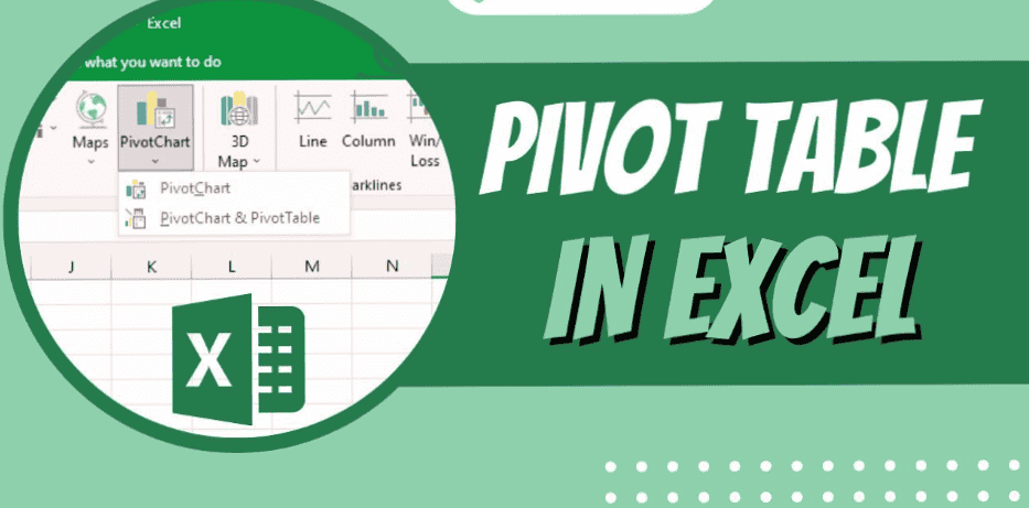
Step 4: PivotTables – The Master of Data Summarization
PivotTables are a game-changer in MIS reporting. They allow you to dynamically group, summarize, and analyze data from different perspectives. Here’s a basic workflow:
- Select the data range you want to analyze.
- Go to the “Insert” tab and click “PivotTable.”
- Choose where you want to place the pivot table (new sheet or existing one).
- Drag and drop data fields into the “Rows,” “Columns,” “Values,” and “Filters” sections of the PivotTable Fields list to organize and analyze your data.
Step 5: Charting a Course to Clarity: Visualize Your Findings
Data visualizations enhance understanding and make your report more engaging. Excel offers a variety of chart types to choose from:
- Bar Charts: Ideal for comparing categories or trends over time.
- Pie Charts: Effective for displaying proportions or percentages of a whole.
- Line Charts: Best suited for showing trends and changes over time.
- Heatmaps: Useful for visualizing correlations or patterns across large datasets.
Step 6: Building a Compelling Report Layout
Presentation matters! Here’s how to structure your MIS report for clarity:
- Title Page: Include a clear title, report date, and author information.
- Executive Summary: Briefly highlight key findings and insights.
- Main Body: Organize data using tables, charts, and clear headings.
- Analysis and Recommendations: Explain trends, identify areas for improvement, and suggest actionable steps.
Step 7: Proofreading and Polishing: The Finishing Touches
Before sharing your report, ensure it’s error-free, visually appealing, and easy to understand.
- Proofread: Double-check for typos, data inconsistencies, and formatting errors.
- Formatting: Apply consistent formatting throughout the report (font size, colors, borders).
- White Space: Utilize white space effectively to avoid information overload.
Bonus Tip: Automation for Efficiency
For reports requiring frequent updates, consider using Excel formulas or macros to automate data refresh and calculations. This saves time and ensures reports always reflect the latest information.
Building an MIS Report in Excel: A Step-by-Step Guide with Sample Data
Imagine you’re the sales manager for a company selling athletic wear. You need a report to analyze monthly sales performance by region. Here’s how to create an MIS report in Excel using a sample dataset and visuals:
Step 1: Gather Your Data
Let’s assume you have the following data in a separate sheet (we’ll call it “Data”) within your Excel workbook:
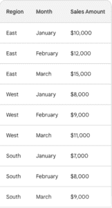
Step 2: Data Wrangling in Action

Copy and paste this data into the main sheet where you’ll build your report. Ensure headers are clear and data types are formatted correctly (currency for “Sales Amount”).
Step 3: Leveraging Formulas
Calculate the total sales for each region in March. In cell D4 (below “March” for the South region), enter the formula =SUMIFS(C:C,”A:A”,”South”,”B:B”,”March”). Copy this formula down to cells D2 and D3 for the East and West regions, respectively.
Step 4: PivotTable Magic
To analyze sales by region and month, create a PivotTable. Select the entire data range (A1:C9) and navigate to the “Insert” tab. Click “PivotTable” and choose where you want to place the table (new sheet or existing one).
In the PivotTable Fields pane, drag “Region” to the “Rows” section and “Month” to the “Columns” section. Drag “Sales Amount” to the “Values” section. This will automatically create a table summarizing sales by region and month.
Step 5: Charting the Course
For a visual representation, create a chart. Click anywhere within the PivotTable and navigate to the “Analyze” tab. Choose the chart type that best suits your needs. Here, a stacked bar chart effectively depicts sales trends across regions and months.
Step 6: Building a Clear Report Layout
Now, let’s format the report for clarity:
- Title Page: Include a title like “Monthly Sales Performance Report – March 2024” along with your name and date.
- Executive Summary: Briefly highlight key findings, such as the overall sales increase in March compared to previous months.
- Main Body: Insert the PivotTable and chart. Add clear headings and labels for easy interpretation.
Step 7: Proofreading and Polishing
Double-check for errors, ensure consistent formatting, and remove unnecessary gridlines from the chart for a professional look.
Remember: This is a basic example. You can customize your report further by adding:
- Sparklines: Small charts within cells to show trends at a glance.
- Conditional formatting: Highlight cells based on performance (e.g., exceeding sales targets).
- Slicers: Allow viewers to filter data by specific regions or months interactively.
By following these steps and incorporating these elements, you can create informative and visually appealing MIS reports in Excel, empowering data-driven decision making within your organization.
Beyond the Spreadsheet: The Power of MIS Reports
MIS reports empower businesses with data-driven decision making. They offer a centralized view of crucial information, facilitating communication and collaboration across departments. By leveraging the capabilities of Excel, you can transform data into a strategic asset, propelling your organization towards informed growth and success.
Frequently Asked Questions
What is an MIS report in Excel?
An MIS report (Management Information System) is a data summary created in Excel. It presents key performance indicators (KPIs) and critical business information in a clear and concise format, aiding informed decision making.
What are the benefits of using MIS reports?
MIS reports offer a centralized view of crucial data, enabling businesses to track progress, identify trends, and allocate resources effectively. They promote communication and collaboration across departments.
How can I get started creating MIS reports in Excel?
Start by identifying the data you need and gathering it from various sources. Clean and organize your data in Excel. Utilize formulas and PivotTables to analyze and summarize information. Create clear visuals and structure your report for easy understanding.
Ready to Take Control of Your Data?
Mastering MIS reports in Excel equips you to unlock the potential of your data. With a little practice, you can create compelling reports that inform strategic choices and drive business success. So dive into the world of Excel and harness the power of MIS reports to gain a competitive edge.