From Data to Vision: Essential Python Techniques for Visualization

1. Introduction
1.1 What is the objective of this article?
Data visualization is an indispensable aspect of any data science project, playing a pivotal role in gaining insights and communicating findings effectively. In this article, we present a comprehensive overview of the most commonly used data visualization functions and tools, with a particular focus on their applications in machine learning projects, especially those involving computer vision.
1.2 What is data visualization?
The term “data visualization” refers to the visual representation of data using tables, charts, graphs, maps, and other aids to analyze and interpret information. It is a crucial component of the Exploration Data Analysis (EDA) stage, which is typically the first and most critical step in any data project. In addition to aiding in exploratory data analysis, data visualization is also an effective tool for conveying insights derived from both data and analytical models, which often takes place at the last stage of the data science project.
1.3 Why do we choose Python data visualization tools for our projects?
Numerous data visualization software and library packages are available, but in this article, we will concentrate on the data visualization ecosystem established within the Python environment. The reason for this is that Python is extensively used in data science projects, and several data visualization software, such as Excel, also support Python bindings. Moreover, Python can seamlessly integrate with other popular data visualization languages like R.
2. An overview of data visualization
2.1 What are the principles of data visualization?
In “A Practitioner’s Guide to Best Practices in Data Visualization”, the following three principles are proposed as the best practices for data visualization:
- Design and layout matter: Choose a design and layout that facilitate the message you want to convey to your target audience.
- Avoid clutter (which is defined as components that do not contribute to conveying the intended message).
- Use color purposely and effectively.
2.2 Are there many different types of data visualization methods?
There are many different ways to visualize data in a data science project, and the choice of visualization will depend on the nature of the data and the questions you are trying to answer. The most common types of visualizations used in data science include scatter plots, line/bar charts, histograms, heatmaps, box/violin plots, pie charts, area charts, bubble charts, network graphs, Sankey diagrams, word clouds, etc.
We can classify the most common types of visualizations used in data science based on the type of data and the goal of the analysis. Here are some possible ways to classify them:
- Univariate visualization: Visualizing a single variable or dimension of the data, such as histograms or box plots.
- Bivariate visualization: Visualizing the relationship between two variables or dimensions, such as scatter plots or line charts.
- Multivariate visualization: Visualizing more than two variables or dimensions of the data, such as heatmaps or parallel coordinates plots.
- Temporal visualization: Visualizing changes in data over time, such as line charts or area charts.
- Spatial visualization: Visualizing geographic or spatial data, such as maps or choropleth plots.
- Categorical visualization: Visualizing data with categorical variables, such as bar charts or pie charts.
- Network visualization: Visualizing relationships between entities or nodes, such as network graphs or Sankey diagrams.
2.3 What are popular Python data visualization libraries?
We can categorize Python data visualization libraries into two groups based on whether they support interactive visualization features or not:
- Non-interactive data visualization libraries: These libraries are designed to create static visualizations with simple or more advanced features, such as bar plots, line plots, scatterplots, 3D visualizations, statistical visualizations, and geospatial visualizations. Examples include Matplotlib and Seaborn.
- Interactive data visualization libraries: These libraries enable users to create dynamic and interactive visualizations that allow for the exploration and manipulation of data. Interactive visualizations can include hover effects, zooming, panning, and filtering. Examples include Plotly and Bokeh.
3. Tablable data visualization
Tablable data refers to structured data that can be organized and presented in a tabular format. In this context, “tablable” is an adjective derived from the noun “table,” indicating that the data can be readily represented as a table. Tabular data is typically arranged in rows and columns, where each row represents an individual observation or record, and each column represents a specific attribute or variable associated with the observations. This structured format allows for easy analysis, manipulation, and visualization of the data using tools like spreadsheets or database systems.
3.1 Statistical relationship
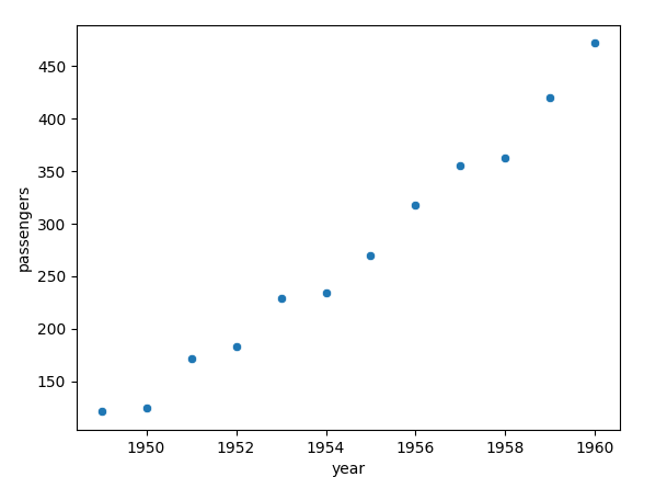
1. Scatter plot
import seaborn as sns
import matplotlib.pyplot as plt
if __name__ == "__main__":
    flights = sns.load_dataset("flights")
    flights.head()
    may_flights = flights.query("month == 'May'")
    # method 1: scatterplot
    sns.scatterplot(data=may_flights, x="year", y="passengers")
    # method 2: relplot is a superset of scatterplot
    sns.relplot(data=may_flights, x="year", y="passengers", kind='scatter')
    # method 3: lmplot adds aggression on top of scatterplot
    sns.lmplot(data=may_flights, x='year', y='passengers')
plt.show()- A scatter plot is commonly utilized when the x-axis represents numerical variables, and there are multiple values associated with the y-axis for a particular x-axis value.
- We can add aggregation and represent uncertainty by sns.relplot function (see this example)
- We can add a regression model in the plot: seaborn.lmplot (see this example)
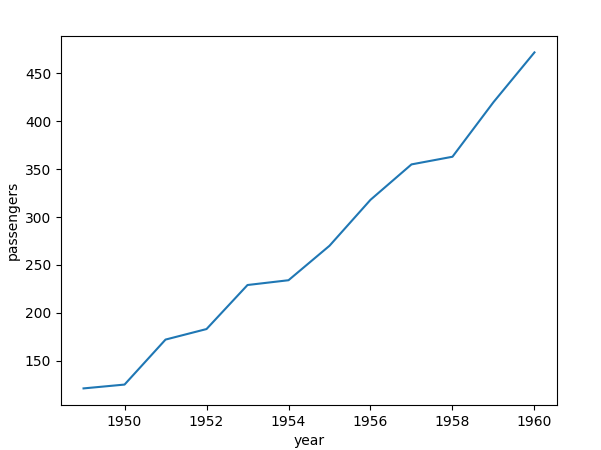
2. Line plot
import seaborn as sns
import matplotlib.pyplot as plt
if __name__ == "__main__":
    flights = sns.load_dataset("flights")
    flights.head()
    may_flights = flights.query("month == 'May'")
    # 1. seaborn 1: lineplot
    sns.lineplot(data=may_flights, x="year", y="passengers")
    # 2. seaborn 2: relplot is superset of lineplot
    sns.relplot(data=may_flights, x="year", y="passengers", kind="line" )
    # 3. matplotlib
    plt.plot(may_flights['year'].values, may_flights['passengers'].values)
plt.show() - If the x-axis variable contains numerical values and there is a one-to-one correspondence with its y-axis variable, a line plot is frequently employed. When the a-axis variable is categorical, we often use a bar plot.
- In instances where there are several y-axis variable values for a specific x-axis variable, a line plot can still be utilized by aggregating the multiple measurements.
sns.relplot(..., kind='line')(see this example).
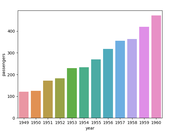
3. Bar plot
import seaborn as sns
import matplotlib.pyplot as plt

if __name__ == "__main__":
    flights = sns.load_dataset("flights")
    flights.head()
    may_flights = flights.query("month == 'May'")
    # 1. barplot
    sns.barplot(data=may_flights, x="year", y="passengers")
    # 2. catplot is a superset of barplot
    sns.catplot(data=flights, x="year", y="passengers", kind='bar')
    plt.show()
    # 3. plt.bar
plt.bar(data['year'].values, data['passengers'].values)- A bar chart is a type of data visualization that displays data using rectangular bars of equal width and varying heights. The length of each bar is proportional to the value of the corresponding data point. Bar charts are typically used to compare the values of different categories or groups, such as sales figures for different products or the number of votes for different political parties.
- Typically, in a bar plot, there is a direct correspondence between the x-axis variable and the y-axis variable.
- Even when there are multiple y-axis values for a particular x-axis value, a bar plot can still be utilized, and in such instances, confidence intervals are frequently included. (see this example)
- Matplotlib also provides bar plot function, see Plot Bar Charts in Python using matplotlib
3.2 Statistical distribution
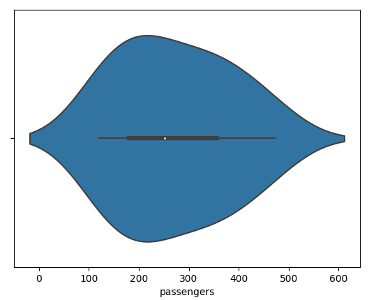
1. Voilinplot
import seaborn as sns
import matplotlib.pyplot as plt

if __name__ == "__main__":
    flights = sns.load_dataset("flights")
    flights.head()
    may_flights = flights.query("month == 'May'")
    print(may_flights.head())
    # method 1: violinplot
    sns.violinplot(data=may_flights, x='passengers')
    # method 2: superset
    sns.catplot(
      data=tips, x="total_bill", y="day", hue="sex", kind="violin",
    )
plt.show()- A violin plot is a type of data visualization that combines aspects of box plots and kernel density plots to display the distribution of a continuous variable or numeric data across different categories. It provides a concise summary of the data’s distribution, including information about the median, quartiles, and overall shape.
- Violineplots for categorical data with sns.catplot and
kind='violin'
2. Boxplot
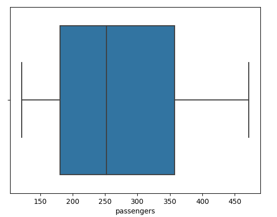
import seaborn as sns
import matplotlib.pyplot as plt

if __name__ == "__main__":
    flights = sns.load_dataset("flights")
    flights.head()
    may_flights = flights.query("month == 'May'")
    print(may_flights.head())
    # method 1: boxplot
    sns.boxplot(data=may_flights, x='passengers')
    # method 2: catplot
    sns.catplot(data=tips, x="day", y="total_bill", hue="smoker", kind="box")
plt.show()- A box and whisker plot — also called a box plot — displays the five-number summary of a set of data. The five-number summary is the minimum, first quartile, median, third quartile, and maximum. Outliers are also indicated in the box plot.
3. Histogram
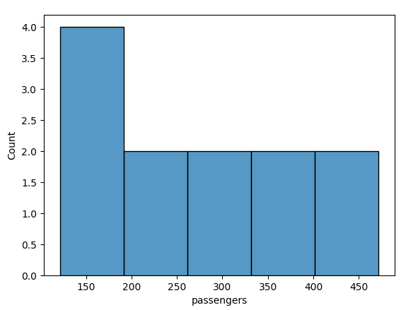
import seaborn as sns
import matplotlib.pyplot as plt

if __name__ == "__main__":
    flights = sns.load_dataset("flights")
    flights.head()
    may_flights = flights.query("month == 'May'")
    # method 1:
    sns.histplot(data=may_flights, x='passengers')
    # method 2:
    sns.displot(data=may_flights, x='passengers', kde=True)
    plt.show()
    # method 3: bivariate histogram
sns.displot(penguins, x="bill_length_mm", y="bill_depth_mm")- Histograms are a type of bar plot for numeric data that group the data into bins.
- We can add Kernel Desity Estimation (KDE) plot:
kind="kde"in histogram sns.displot - We can add cumulative distribution
kind="ecdf"in histogram sns.displot - We can also visualize bivariate histogram (
kind="kde"in histogram sns.displot andx,y)
4. KDE plot
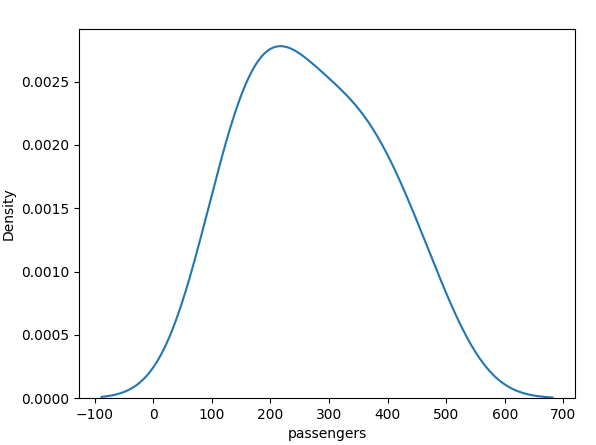
import seaborn as sns
import matplotlib.pyplot as plt

if __name__ == "__main__":
    iris = sns.load_dataset('iris')
    # kdeplot
    sns.kdeplot(data=iris, x='sepal_length', y='sepal_width')
    # jointplot
    sns.jointplot(data=iris, x='sepal_length', y='sepal_width', kind='kde')
    # pairplot (valid if there are only two columns in the dataframe)
    # sns.pairplot(data=iris, kind='kde')
plt.show()- A KDE (Kernel Density Estimation) plot is a type of visualization that is used to represent the probability density function of a set of continuous data. It is a non-parametric way to estimate the probability density function of a random variable.
- In Seaborn KDE plot can be found in a super function sns.jointplot on top of the native plot function sns.kdeplot.
5. Pie Chart
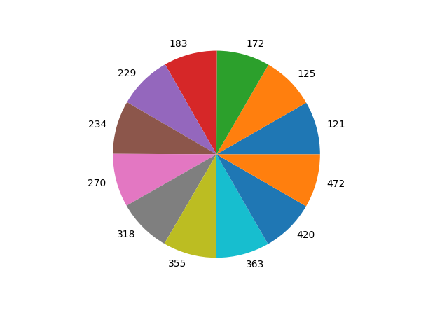
import seaborn as sns
import matplotlib.pyplot as plt

if __name__ == "__main__":
    flights = sns.load_dataset("flights")
    flights.head()
    may_flights = flights.query("month == 'May'")
    plt.pie(may_flights['year'].values, labels=may_flights['passengers'].values)
plt.show()- A pie chart is a type of data visualization that displays data as a circular graph, divided into sectors that represent the proportion of each category or group. The area of each sector is proportional to the value of the corresponding data point. Pie charts are typically used to show the relative sizes of different categories or groups and are often used to communicate percentages.
- We can make a 3D pie plot by utilizing the arguments in plt.pie. You can find it in Plot a 3D Pie Chart using matplotlib.
6. Count plot
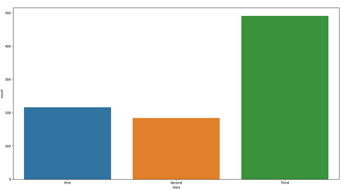
import seaborn as sns
import matplotlib.pyplot as plt

df = sns.load_dataset("titanic")
sns.countplot(x=df["class"])
plt.show()- A count plot can be thought of as a histogram across a categorical, instead of quantitative, variable.
4. Unstructed data visualization
The opposite of tablable data would be unstructured or non-tabular data. Unstructured data refers to information that does not have a predefined or organized format. It lacks a consistent structure or schema, making it challenging to analyze and process using traditional tabular methods. Unstructured data can include text documents, images, audio recordings, video files, social media posts, emails, and other forms of data that do not naturally fit into a tabular structure.
4.1 2D Image
1. Gray-scale image
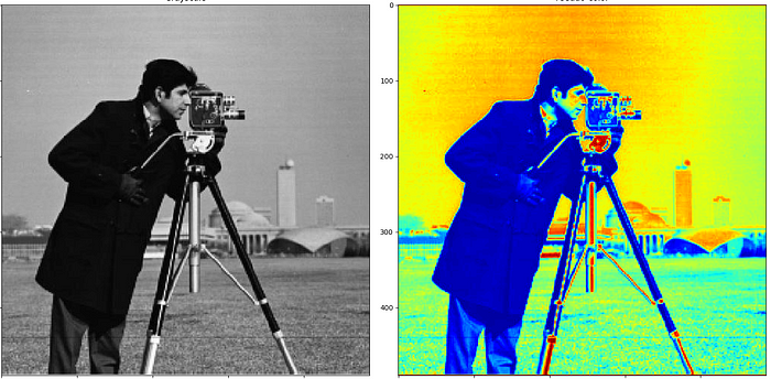
import cv2 as cv

import matplotlib.pyplot as plt

img = cv.imread('cameraman.png')
gray_image = cv.cvtColor(img, cv.COLOR_BGR2GRAY)

fig, ax = plt.subplots(1, 2, figsize=(16, 8))
fig.tight_layout()

ax[0].imshow(gray_image, cmap='gray')
ax[0].set_title("Grayscale", )

ax[1].imshow(gray_image, cmap='jet')
ax[1].set_title("Pseudo-color")
plt.show()- Gray-scale images can be read and transformed from other image formats with the help of image processing libraries such as OpenCV and Python Imaging Library(Pillow).
- Gray-scale image can be demonstrated as a color image (false color image).
- Matplotlib provides a simple image visualization function imshow.
2. RGB color image

    import seaborn as sns
    import matplotlib.pyplot as plt

    import cv2 as cv

    import matplotlib.pyplot as plt
    from PIL import Image

    # Load the RGB image
    rgb_image = Image.open("lenna.png")  # Replace with your RGB image path

    # Create a blank RGBA image with the same dimensions as the RGB image
    rgba_image = Image.new("RGBA", rgb_image.size)

    # Varying levels of transparency (alpha values)
    alpha_values = [128, 192, 255]

    # Apply the alpha channel to the RGBA image
    img_final = []
    for alpha in alpha_values:
        # Create a copy of the RGB image with the current alpha value
        rgba_with_alpha = rgb_image.copy()
        rgba_with_alpha.putalpha(alpha)
        # Paste the RGBA image with the current alpha value onto the blank RGBA image
        rgba_image.paste(rgba_with_alpha, (0, 0), rgba_with_alpha)
        img_final.append(np.array(rgba_image))
    rgb_image.close()
    rgba_image.close()
    img_final = np.concatenate(img_final, axis=1)
    print(img_final.shape)
    plt.imshow(img_final)
    plt.axis('off')

plt.show() - Color image is often represented as RGB (Red, Green, Blue) image, and in some applications, RGBA (Red, Green, Blue, Alpha) color image is needed. The alpha channel in RGBA image represents the transparency or opacity of each pixel.
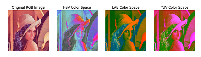
    import seaborn as sns
    import matplotlib.pyplot as plt

    import cv2 as cv

    import matplotlib.pyplot as plt
    from PIL import Image

    import cv2
    import matplotlib.pyplot as plt

    # Load the RGB image
    rgb_image_path = "lenna.png"  # Replace with your RGB image path
    rgb_image = cv2.imread(rgb_image_path)


    # Plot and display the images
    plt.figure(figsize=(12, 4))

    # Original RGB image
    plt.subplot(141)
    plt.imshow(cv2.cvtColor(rgb_image, cv2.COLOR_BGR2RGB))
    plt.title("Original RGB Image")
    plt.axis("off")

    # HSV color space
    plt.subplot(142)
    plt.imshow(cv2.cvtColor(rgb_image, cv2.COLOR_HSV2RGB))
    plt.title("HSV Color Space")
    plt.axis("off")

    # LAB color space
    plt.subplot(143)
    plt.imshow(cv2.cvtColor(rgb_image, cv2.COLOR_LAB2RGB))
    plt.title("LAB Color Space")
    plt.axis("off")

    # YUV color space
    plt.subplot(144)
    plt.imshow(cv2.cvtColor(rgb_image, cv2.COLOR_YUV2RGB))
    plt.title("YUV Color Space")
    plt.axis("off")

    plt.show()
- Do not forget we can also show a color image in different color spaces even though RGB color space is the most popular one.
3. Multi-dimension image
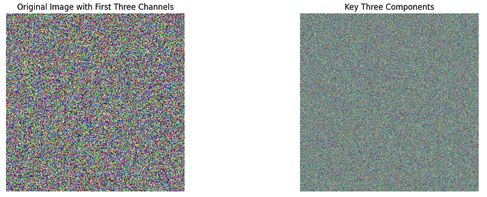
    import matplotlib.pyplot as plt
    import numpy as np
    from sklearn.decomposition import PCA
    import numpy as np


    image_data = np.random.randint(0, 256, size=(255, 255, 114), dtype=np.uint8)


    height, width, num_bands = image_data.shape
    image_data_2d = image_data.reshape((num_bands, height * width))


    num_components = 3
    pca = PCA(n_components=num_components)
    pca_result = pca.fit_transform(image_data_2d)


    key_components = pca.components_


    reconstructed_data = pca.inverse_transform(pca_result)
    reconstructed_image = reconstructed_data.reshape((height, width, num_bands))

    # Visualize the original and reconstructed images
    plt.figure(figsize=(15, 5))

    # Original image (use the desired bands for visualization)
    plt.subplot(121)
    plt.imshow(image_data[:, :, :3])  # Display only RGB channels (first 3 bands)
    plt.title("Original Image with First Three Channels")
    plt.axis("off")


    # Visualize the key components
    plt.subplot(122)
    pca_img = np.zeros((height, width, 3), dtype=np.uint8)
    for i in range(num_components):

        # Get the ith principal component
        key_component = key_components[i]

        # Normalize the key component to 0-255 range for visualization
        key_component_norm = (key_component - key_component.min()) / (key_component.max() - key_component.min()) * 255

        pca_img[:, :, i] = key_component_norm.reshape(height, width)

    plt.imshow(pca_img.reshape(height, width, 3))
    plt.title(f"Key Three Components")
    plt.axis("off")

    plt.show()

plt.show()- We can select three channels in the multi-dimension image and construct a pseudo-RGB image for visualization.
- We can also select one channel from the multi-dimension image and construct a pseudo-RGB image for visualization (like what we do for gray-scale images)
- We can also perform image transformations on multi-dimension images and retrieve a pseudo-RGB image that can represent the most important information in the multi-dimension image. One example is the Principal Component Analysis transformation as shown above.
4.2 3D Images
1. Point cloud
import matplotlib.pyplot as plt
import numpy as np
import matplotlib.pyplot as plt
from mpl_toolkits.mplot3d import Axes3D
import open3d as o3d
import numpy as np
# data from http://phd-sid.ethz.ch/debian/open-3d/Open3D-0.1.1/src/Test/TestData/RGBD/
color_raw = o3d.io.read_image("00000.jpg")
depth_raw = o3d.io.read_image("00000.png")
rgbd_image = o3d.geometry.RGBDImage.create_from_color_and_depth(
color_raw, depth_raw)
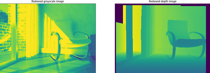
plt.subplot(1, 2, 1)
plt.title('Redwood grayscale image')
plt.imshow(rgbd_image.color)
plt.subplot(1, 2, 2)
plt.title('Redwood depth image')
# plt.imshow(rgbd_image.depth)
# plt.show()
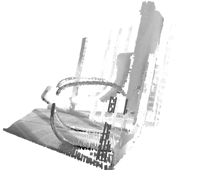
pcd = o3d.geometry.PointCloud.create_from_rgbd_image(
rgbd_image,
o3d.camera.PinholeCameraIntrinsic(
o3d.camera.PinholeCameraIntrinsicParameters.PrimeSenseDefault))
# Flip it, otherwise the pointcloud will be upside down
pcd.transform([[1, 0, 0, 0], [0, -1, 0, 0], [0, 0, -1, 0], [0, 0, 0, 1]])
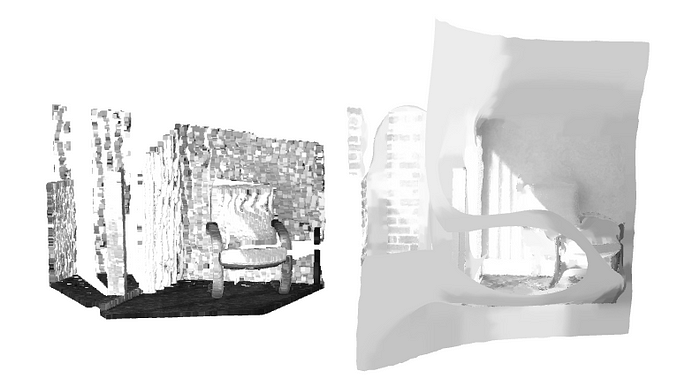
o3d.visualization.draw_geometries([pcd])- Point clouds have gained widespread popularity as a means of visualizing 3D images.
- Point clouds can be generated from RGBD images.
- The most popular visualization Python library for 3D images is Open3D.
- Matplotlib also provides means to show point clouds with
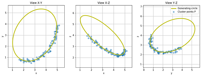
ax.scatterorax.contourfunction. - A different way to visualize point clouds involves projecting them onto three view maps: an XY map, an XZ map, and a YZ map.
2. Mesh
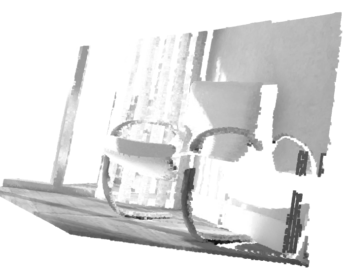
    import open3d as o3d
    import numpy as np

    # data from http://phd-sid.ethz.ch/debian/open-3d/Open3D-0.1.1/src/Test/TestData/RGBD/

    color_raw = o3d.io.read_image("00000.jpg")
    depth_raw = o3d.io.read_image("00000.png")
    rgbd_image = o3d.geometry.RGBDImage.create_from_color_and_depth(
        color_raw, depth_raw)


    pcd = o3d.geometry.PointCloud.create_from_rgbd_image(
        rgbd_image,
        o3d.camera.PinholeCameraIntrinsic(
            o3d.camera.PinholeCameraIntrinsicParameters.PrimeSenseDefault))


    # Flip it, otherwise the pointcloud will be upside down
    pcd.transform([[1, 0, 0, 0], [0, -1, 0, 0], [0, 0, -1, 0], [0, 0, 0, 1]])

    point_cloud = pcd
    point_cloud.estimate_normals()

    # Perform Poisson surface reconstruction
    mesh, densities = o3d.geometry.TriangleMesh.create_from_point_cloud_poisson(point_cloud, depth=12)

    # Smooth the mesh
    mesh = mesh.filter_smooth_laplacian()

    point_cloud.translate((-2.7, 0, 0))

    # Visualize the original point cloud and the reconstructed mesh
o3d.visualization.draw_geometries([point_cloud, mesh])- Mesh is another commonly used means to represent 3D images.
- Many synthetic 3D images are formulated in the mesh format.
- We can generate mesh representation from point clouds.
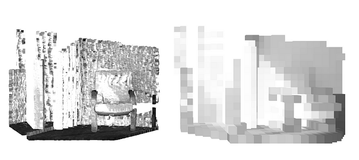
3. Volumatic representation
    import matplotlib.pyplot as plt
    import numpy as np
    import matplotlib.pyplot as plt
    from mpl_toolkits.mplot3d import Axes3D

    import open3d as o3d
    import numpy as np

    # data from http://phd-sid.ethz.ch/debian/open-3d/Open3D-0.1.1/src/Test/TestData/RGBD/

    color_raw = o3d.io.read_image("00000.jpg")
    depth_raw = o3d.io.read_image("00000.png")
    rgbd_image = o3d.geometry.RGBDImage.create_from_color_and_depth(
        color_raw, depth_raw)


    pcd = o3d.geometry.PointCloud.create_from_rgbd_image(
        rgbd_image,
        o3d.camera.PinholeCameraIntrinsic(
            o3d.camera.PinholeCameraIntrinsicParameters.PrimeSenseDefault))


    # Flip it, otherwise the pointcloud will be upside down
    pcd.transform([[1, 0, 0, 0], [0, -1, 0, 0], [0, 0, -1, 0], [0, 0, 0, 1]])

    point_cloud = pcd
    point_cloud.estimate_normals()

    # Perform Poisson surface reconstruction
    voxel_grid=o3d.geometry.VoxelGrid.create_from_point_cloud(pcd,voxel_size=0.1)

    # Smooth the mesh
    point_cloud.translate((-2.7, 0, 0))

    # Visualize the original point cloud and the reconstructed mesh
o3d.visualization.draw_geometries([ point_cloud, voxel_grid])- Volumetric representation is another popular way of showing 3D images.
- We always use Open3D to visualize different 3D image representation formats although many other libraries provide similar functionalities. See Python Libraries for Mesh, Point Cloud, and Data Visualization for other options.
4.3 Videos

    import cv2

    # Create a VideoCapture object and read from input file
    # If the input is the camera, pass 0 instead of the video file name
    cap = cv2.VideoCapture('360p.mp4')

    # Check if camera opened successfully
    if (cap.isOpened() == False):
        print("Error opening video stream or file")

    # Read until video is completed
    while (cap.isOpened()):
        # Capture frame-by-frame
        ret, frame = cap.read()
        if ret == True:

            # Display the resulting frame
            cv2.imshow('Frame', frame)

            # Press Q on keyboard to  exit
            if cv2.waitKey(25) & 0xFF == ord('q'):
                break

        # Break the loop
        else:
            break

    # When everything done, release the video capture object
    cap.release()

    # Closes all the frames
cv2.destroyAllWindows()- OpenCV offers fundamental functionalities for displaying videos and storing them in specific files. However, OpenCV has limited functions for video file manipulation and visualization.
- When videos are stored on a disk, various video display tools can be employed for analyzing these video files. Among these tools, the FFMPEG package is definitely worth considering, given its versatility as a comprehensive video manipulation toolkit. Python packages like MoviePy and PyAV rely on FFMPEG as their foundation for video manipulation and visualization.
- Similar to image file formats, there is a wide range of video file formats available. However, in the realm of scientific computing, the Hierarchical Data Format (HDF5) is frequently employed.
Conclusion
This article provides a review of fundamental Python data visualization functions, focusing on computer vision-related projects that involve the use of both tabular data and unstructured data.
The primary focus of this article centers around non-interactive data visualization Python tools, specifically highlighting the matplotlib, seaborn, opencv, and open3d libraries.
In real machine learning projects related to computer vision, it is essential to integrate multiple visualization functions to effectively convey the insights to stakeholders in a comprehensible manner.