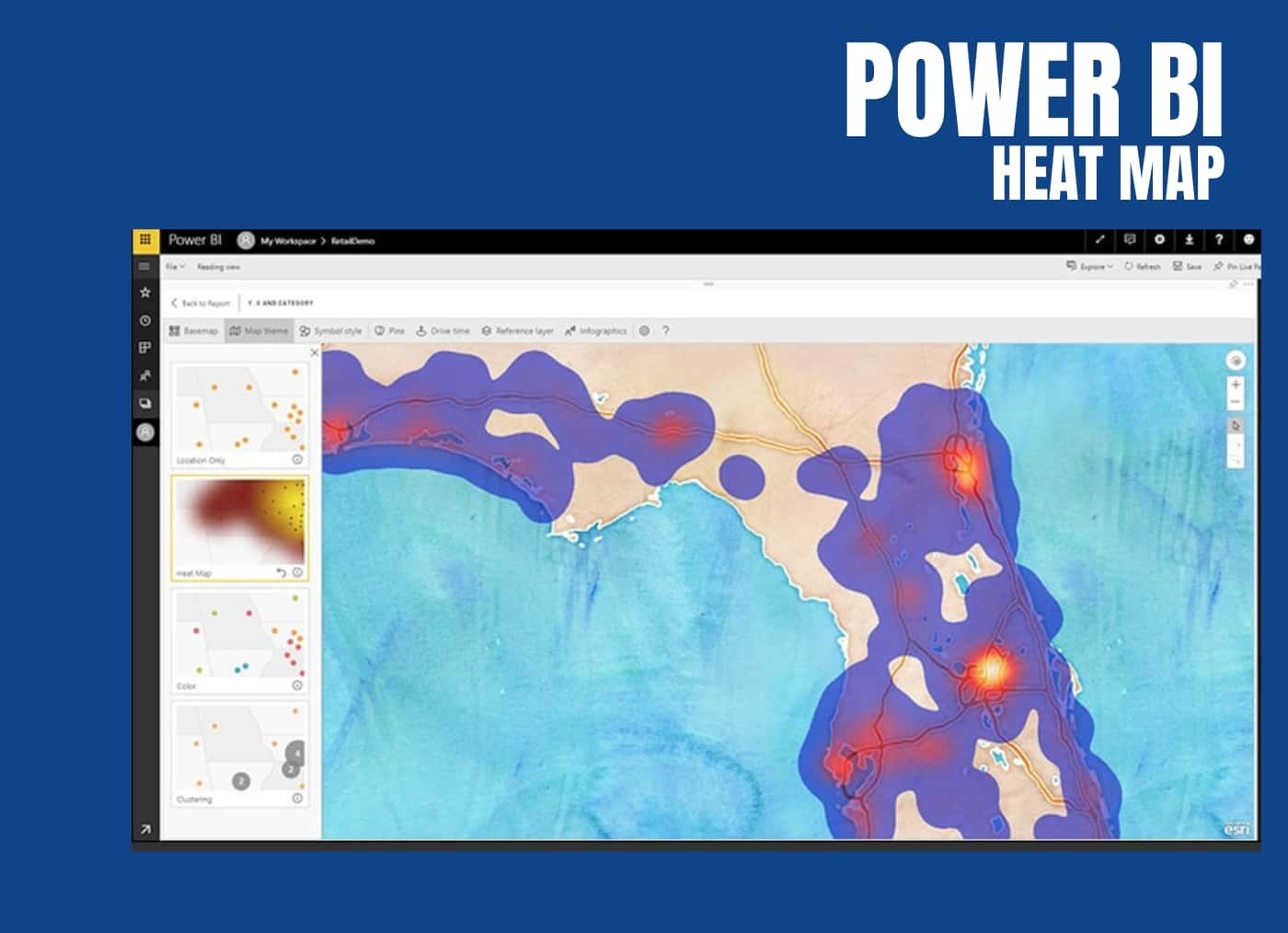
Power BI Heatmap:
Heatmap in Power BI refers to the type of custom visualisation that businesses analysts utilise for showcasing the relationship between two variables on a map in different colour patches. It helps the user in visualising the patterns which are hidden and observe the changes across each axis.
In a Power BI Heatmap, the darkest colour sports represent the highest data density which are followed by lighter shades, equally portionate to the density. The colour pattern can be presented in the form of tables, histograms or geographical maps.
Key Features of Power BI:
Power BI is a powerful business intelligence tool developed by Microsoft that enables users to visualize and analyze data from various sources. It offers a wide range of features that make it a popular choice for data professionals, analysts, and organizations. Here are some key features of Power BI:
-
-
- Rich Visualizations: Power BI provides a wide variety of interactive and customizable visualizations such as charts, graphs, maps, tables, and matrices to represent data effectively.
- Custom Visuals: Users can import custom visuals created by the community or build their own custom visuals to meet specific visualization needs.
-
- Data Connectivity:
-
-
- Data Source Compatibility: Power BI can connect to a diverse range of data sources including databases, cloud services, spreadsheets, web services, and more.
- Direct Query and Import: Users can import data into Power BI or create direct connections to databases for real-time data analysis.
-
- Data Transformation and Modeling:
-
-
- Power Query: This feature enables users to shape, transform, and clean data from various sources before visualization.
- Data Modeling: Power BI’s Data Model feature allows users to create relationships between tables, calculate measures, and define hierarchies for more in-depth analysis.
-
- DAX (Data Analysis Expressions):
-
-
- DAX is a formula language used in Power BI to create custom calculations and measures for complex analysis.
- Measures and Calculated Columns: Users can create measures and calculated columns using DAX to perform calculations on data.
-
- Interactive Dashboards:
-
- Dashboards: Users can create interactive and visually appealing dashboards that display key insights and KPIs from different reports and datasets.
- Tiles: Dashboards are composed of tiles that are linked to reports, visuals, or other content, allowing users to interact with the data.
Applications of Power BI Heatmap:
A Power BI heatmap is a powerful data visualization tool that utilizes color gradients to represent data values within a matrix-like structure. Heatmaps provide an intuitive way to convey patterns, relationships, and variations in data, making them especially useful for a wide range of applications. Here are some detailed examples of how Power BI heatmaps can be employed:
-
Sales Analysis:
In the retail sector, a Power BI heatmap can be employed to analyze sales data. Imagine a scenario where you have a matrix showing products on one axis and months on the other. The color intensity in each cell of the matrix could represent the sales volume or revenue generated for that product in a specific month. A quick glance at the heatmap can highlight the best-selling products and months, allowing businesses to make informed decisions regarding inventory management, promotions, and sales strategies.
-
Employee Performance:
HR departments can use heatmaps to evaluate employee performance. By plotting employees against performance metrics like sales targets met or project completion rates, HR professionals can identify high-performing individuals based on color intensity. This can assist in recognizing top talent, distributing rewards or incentives, and offering targeted training to employees who might need improvement.
-
Website User Behavior:
Web analysts can utilize heatmaps to visualize user behavior on websites. By segmenting website pages and tracking user interactions such as clicks and scroll depth, a heatmap can highlight which areas of a page are receiving the most engagement. Heatmaps can reveal user preferences, identify points of interest, and uncover potential usability issues, guiding website optimization efforts.
-
Risk Assessment in Finance:
In the financial sector, heatmaps can assist in risk assessment. By displaying a matrix of different financial instruments against risk factors like market volatility or credit risk, financial analysts can quickly identify areas of high or low risk based on color gradients. This helps in portfolio management, risk mitigation, and making informed investment decisions.
-
Healthcare Data Analysis:
In healthcare, heatmaps can be used to analyze patient data and medical trends. For instance, a heatmap could depict patient demographics (age groups, gender) against the occurrence of specific medical conditions. The color intensity could represent the prevalence of the condition within each demographic group, aiding medical professionals in identifying potential health disparities and targeting interventions.
-
Customer Segmentation:
Marketing teams can utilize heatmaps to segment customers based on purchase behavior. A heatmap can display different customer segments against attributes such as purchase frequency, average transaction value, and product preferences. By examining the intensity of colors, marketers can tailor campaigns to different segments, enhancing customer engagement and loyalty.
-
Social Media Engagement:
For social media managers, heatmaps can provide insights into audience engagement. By plotting different social media posts against engagement metrics like likes, shares, and comments, a heatmap can highlight the content that resonates most with the audience. This guides content creation strategies and helps optimize social media marketing efforts.
In all these examples, the Power BI heatmap serves as a visual aid that simplifies complex data and enhances decision-making. The color gradients effectively convey patterns, trends, and relative values, enabling professionals from various domains to extract meaningful insights and take actions that lead to improved outcomes. By leveraging Power BI’s heatmap capabilities, organizations can unlock the potential of their data and drive informed, data-driven strategies.
How to Create a Heatmap in Power BI?
Creating a heatmap in Power BI involves visualizing data as a matrix of colored cells where each cell’s color represents a value. Heatmaps are useful for representing data density, identifying patterns, and comparing data across two dimensions. Here’s a detailed step-by-step guide on how to create a heatmap in Power BI:
Step 1: Load Data
- Open Power BI Desktop.
- Click on “Get Data” from the Home tab.
- Choose your data source (e.g., Excel, SQL Server, CSV, etc.) and load the necessary dataset.
Step 2: Prepare Data
- Transform the data if required. Heatmaps often work with data containing two numerical dimensions. Ensure that your data has these two dimensions ready for visualization.
Step 3: Create a New Visual
- On the right side of the screen, you’ll see the “Visualizations” pane. Click on the “Heatmap” visualization icon. This will add an empty heatmap visualization to your report canvas.
Step 4: Add Data to Heatmap
- From the “Fields” pane on the right, drag and drop the appropriate data fields into the “Values” and “Axis” sections of the “Visualizations” pane. Typically, you would place one field in the “Values” section and two fields in the “Axis” section.
Step 5: Configure Heatmap
- In the “Visualizations” pane, under the “Format” section, you can customize the heatmap’s appearance and behavior:
- General: Set the title, data labels, and color scale options.
- Data colors: Choose a color scale that represents the range of values in your dataset. You can pick a gradient of colors that goes from low to high values or choose a custom color scale.
- Legend: Configure the legend settings to show the values corresponding to the colors on the heatmap.
- X-Axis and Y-Axis: Adjust the axis labels, title, and other formatting options as needed.
Step 6: Format Heatmap
- Customize the appearance of your heatmap by selecting various formatting options:
- You can adjust the font size, style, and alignment of axis labels and data labels.
- Modify the background color and borders of the heatmap cells to make it visually appealing.
Step 7: Interactivity and Filtering (Optional)
- Add interactions between your heatmap and other visuals on the report canvas by selecting the “Format” section in the “Visualizations” pane and using the “Edit interactions” button. This allows users to filter data by clicking on specific elements in other visuals.
Step 8: Save and Publish
- Once you’re satisfied with the heatmap, save your Power BI report.
- You can then publish your report to the Power BI service for sharing and collaboration with others. Users can interact with the heatmap and explore the data online.
Remember that the specifics of each step may vary based on your dataset and the version of Power BI you’re using. This guide should give you a comprehensive overview of the process to create a heatmap visualization in Power BI.
Conclusion
We hope you found all the details related to Power BI Heatmap from the above blog from its applications to creating a Power BI Heatmap. Significantly, you now know that these maps are used to represent the relationships between unrelated datasets and give user a new perspective.
While the blog has provided some interesting Power BI Heatmap examples, you can effectively learn from them. You can now create a Power BI Heatmap matrix yourself following the steps that you learnt from the blog.