Warehouse Product Segmentation using Python
Optimize your processes and avoid unnecessary costs
Warehouses are locations where the products are stored to be distributed later, and they play a crucial role on the supply chain strategy.
Effective warehouse management involves achieving high-volume production and distribution, aiming to use minimal inventories to reduce the costs and, at the same time, having a high customer satisfaction.
This is not always an easy task, and it gets even more challenging as the warehouse size and the volume of stored products increases. However, there are simple solutions that can enhance productivity and help optimize processes within the warehouse.
Today, I’d like to share an analysis conducted using Python, utilizing a dataset of the total sales and lead times, per SKU, during the first semester of 2023, for three different warehouses (A,B, and C). So, let’s dive into it.
(1) — Importing libraries
import pandas as pd
import numpy as np
import seaborn as sns
import matplotlib.pyplot as plt
df = pd.read_excel(r"C:\Users\witZPy\Stock_Sold_Products_1st_Semester-2023.xlsx")
df
Now, let’s take a look at the dataset

We can see that, in this dataset, we have the SKU’s code of each product, the warehouse name, the average lead times measured in days (the time difference between when the order was made and when the product was received in the warehouse), and the total sales of each SKU during the period. In addition, it’s possible to see that there are 1019 rows and 4 columns.
Since we are going to use lead times and sales quantity columns as our segmentation parameters, let’s divide the original DataFrame into two different DataFrames.
(2) — Separating the dataset
# Qty DataFrame
df_qty = df[['SKU', 'Qty_Sold']].copy()
# Lead Time DataFrame
df_lead = df[['SKU', 'Lead_Time']].copy()
(3) — Creating ABC Curve Segmentation
We are going to work using the Pareto Principle to segmentate the sales quantity DataFrame.
The Pareto Principle states that 80% of the outcomes are generated by 20% of the causes. In our context, we can translate as: 80% of the total products sales represents 20% of the total products types.
So, next step is creating ABC Curve:
# Creating total sales column
df_qty['Total_Qty'] = df_qty['Qty_Sold'].sum()
# Ordering descending by Qty_Sold
df_qty = df_qty.sort_values(by='Qty_Sold', ascending=False)
# Getting the representativeness of each product in sales
df_qty['Percentage'] = df_qty['Qty_Sold']/df_qty['Total_Qty']
# Getting the cummulative percentage to use in ABC Segmentation
df_qty['Cum_Perc'] = df_qty['Percentage'].cumsum()
# Creating ABC Segmentation based on Cummulative Percentage column
df_qty['Category'] = list(map(lambda x: 'A' if x < 0.75 else ('B' if x < 0.95 else 'C'), df_qty['Cum_Perc']))
Summarizing, we are going to get the quantity of product types that represents 75% of sales volumes, for Category A. The quantity of product types that represents 20% of sales volumes, for Category B. Lastly, for Category C, the quantity of product types that represents 5% of sales volumes.
Now we are going to use value_counts() function to get the number of SKUs in each category.
# Getting the number of SKUs by ABC Category
df_qty['Category'].value_counts()
The outcome is
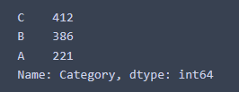
As a result, we find that there are 221 SKUs on Category A, accounting for approximately 22% of total SKUs, and representing 75% of total SKUs sales volumes.
Moving on to Category B, there are 386 SKUs, accounting for approximately 38% of total SKUs, and represents 20% of total SKUs sales volumes.
Last but not least, for Category C, there are 412 SKUs, representing approximately 40% of the total SKUs, representing 5% of total SKUs sales volumes.
We can see that the Pareto Principle is validated, because for Category A we have approximately 20% of SKUs, while the combination of Categories B and C makes up the remaining 80% of SKUs.
Now we are going to plot it, using matplotlib library, to get a better view of it
(4) — Plotting ABC Curve
category_counts = df_qty['Category'].value_counts().sort_values()
cumulative_percentages = df_qty.groupby('Category')['Percentage'].sum()


fig, ax1 = plt.subplots(figsize=(12, 4))
ax2 = ax1.twinx()

# Bar graph for category frequency
category_counts.plot(kind='bar', ax=ax1, color='C4', position=0.5, width=0.7)
ax1.set_ylabel('Frequency', color='k')

# Line graph for cumulative sum of Cum_Percentage
cumulative_percentages.plot(kind='line', ax=ax2, color='k', marker='o', ms=7)
ax2.set_ylabel('Representativeness', color='k')

# Set x-axis tick labels
ax1.set_xticklabels(category_counts.index, rotation=0)

# Adding legend
lines1, labels1 = ax1.get_legend_handles_labels()
lines2, labels2 = ax2.get_legend_handles_labels()
ax2.legend(lines1 + lines2, labels1 + labels2, loc='upper left')

# Title and labels
plt.title('ABC Curve for Total Sales')
ax1.set_xlabel('Category')

plt.show()
Resulting in the following chart
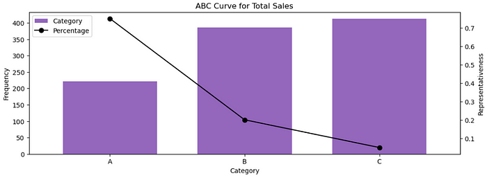
Note that the bars show the number of SKUs, and the line indicates the representativity of these SKUs on sales. So, as we’ve already discussed, Category A has 221 SKUs with 75% representativeness on sales volumes, Category B has 386 SKUs with 20% representativeness on sales volumes, and Category C has 412 SKUs with 5% representativeness on sales volumes.
Now we know the items that have a high-demand in the warehouse, therefore we can start creating strategies for them.
But, before diving into the strategies, let’s also manipulate the lead times DataFrame, because we are going to combine both ABC and lead times DataFrames to get a better view of the SKUs.
(5) — Creating Categories for Lead Times
First, let’s take a look at the lead times distribution, using the boxplot, to check some descriptive statistics from it
# Creating boxplot
sns.boxplot(data=df_lead, x='Lead_Time')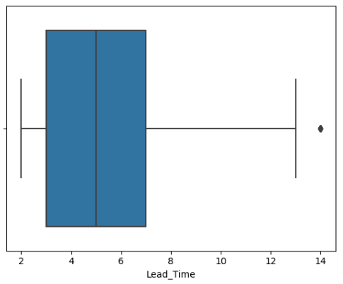
It’s possible to see that the minimum and maximum values for lead times are 2 and 13 days, respectively. Also, 50% of the lead time values falls between 3 and 7 days (between 1st and 3rd quartiles), and the median is 5 days. Lastly, it’s possible to see that there are outliers with 14 days.
Since we have some outliers, it’s safer to use the median instead of mean, because mean can be biased by outliers.
Now, let’s use the median to split the lead times values. We are going to standardize this way, considering that x is our lead time values:
x < median → 0 (low lead times)
x = median → 5 (intermediate lead times)
x > median → 10 (high lead times)
That’s how we’ve splitted it: if the lead time values are below the median, we’ll classify it as 0 (low lead times). If it’s equal to the median, it’s classified as 5 (intermediate lead times). If it’s above the median, it’s 10 (high lead times).
Now, let’s do it in Python
# Creating lead times categories
df_lead['Category'] = list(map(lambda x: '0' if x < 5 else ('5' if x == 5 else '10'), df_lead['Lead_Time']))
Let’s now check the frequency of SKUs on each category
# Getting the number of SKUs in each category
df_lead['Category'].value_counts()
And the outcome is
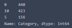
We can see that 440 SKUs are classified with low lead times, 156 SKUs with intermediate lead times, and 423 with high lead times.
Knowing which SKU has low, medium or high lead times also helps us in defining warehouses strategies.
In this sense, we are going to merge both the ABC and lead times segmentations to get our final categories.
(6) — Merging ABC and Lead Times DataFrames
# Merging the DataFrames
df_merged = pd.merge(df_lead, df_qty[['SKU', 'Category']], on='SKU')
# Selecting columns we are going to use
df_merged = df_merged[['SKU', 'Category_y', 'Category_x']]
# Renaming columns
df_merged.rename(columns={'Category_x': 'Lead_Times'}, inplace=True)
df_merged.rename(columns={'Category_y': 'ABC'}, inplace=True)
# Creating a column to concatenate the categories
df_merged['Final_Segmented'] = df_merged['ABC']+df_merged['Lead_Times']
# Creating our final DataFrame
df_final = df_merged.groupby('Final_Segmented')['SKU'].count().reset_index()
Now, we are going to plot the categories to have a better view of the combined segmentations
colors = ['green' if cat.startswith('A') else 'blue' if cat.startswith('B') else 'yellow' for cat in df_final['Final_Segmented']]

plt.bar(df_final['Final_Segmented'], df_final['SKU'], color=colors)


for category, value in zip(df_final['Final_Segmented'], df_final['SKU']):
    plt.text(category, value + 1, str(value), ha='center', va='bottom', fontsize=10)

# Adding labels and title
plt.xlabel('Categories')
plt.ylabel('Frequency')
plt.title('Frequency by Category')

# Display the plot
plt.show()
Resulting in the following chart
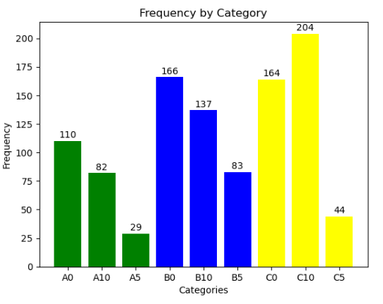
As we can see, we have 9 categories:
A0 → Represents 75% of sales volumes, and contains 22% of total product types. In addition, it has a low lead time
A5 → Represents 75% of sales volumes, and contains 22% of total product types. In addition, it has an intermediate lead time
A10 → Represents 75% of sales volumes, and contains 22% of total product types. In addition, it has a high lead time
B0 → Represents 20% of sales volumes, and contains 38% of total product types. In addition, it has a short lead time
B5 -> Represents 20% of sales volumes, and contains 38% of total product types. In addition, it has an intermediate lead time
B10 → Represents 20% of sales volumes, and contains 38% of total product types. In addition, it has a high lead time
C0 → Represents 5% of sales volumes, and contains 40% of total product types. In addition, it has a low lead time
C5 → Represents 5% of sales volumes, and contains 40% of total product types. In addition, it has an intermediate lead time
C10 → Represents 5% of sales volumes, and contains 40% of total product types. In addition, it has a high lead time
(7) — Decision Making
Now it’s time to take some business decisions, based on the mixed categories. There are lot’s of business insights we can take from this categories, and I’m going to make some suggestions about it
Category A
- For products in Category A, we can allocate them on a location that have easily and quickly access inside the warehouse, because it contains highly demanded items.
Category B
- For products that are in Category B, it’s also important to allocate them in an accessible location of the warehouse, since it represents 20% of sold items. But remember to give priority to ‘A’ category products.
Category C
- For products in Category C, placing them in a strategic location is also important, but it represents the less demanded and sold quantity products, thus the priority should be given to ‘A’ and ‘B’ categories.
Lead Time 0
- For products with lead time 0, it’s possible to have more flexibility and maintain minimal on-hand inventory, restocking and placing orders based on real-time demand, since they have low lead times. Just remember that there’s a risk of stockouts if the products have a high demand. So, A0 category has a high risk of stockouts if not well managed, even with low lead times.
Lead Time 5
- For products with lead time 5, it’s important to have a higher safety stocks than lead time 0, to avoid stockouts.
Lead Time 10
- For products with lead time 10, we need a broader safety stocks when compared to lead time 0 and 5, because it has the longest restocking time.
(8) — Final Thoughts
Last but not least, applying forecast demand models on lead times 0, 5 and 10 is important, in order to reduce the risks of stockouts and overstocking. Also, if the time for modeling is short, it’s better to apply it focusing on Category A, because it has the most demanded SKUs.
Note that we could have done many more analysis, if we had separated the Warehouses (A,B, and C), and made the same analysis for each one of them. But for this project, we just made for all of them together to get an overview of it.
That’s it! Remember that it’s just a segmentation model, and it can be enhanced by applying other variables in addition to lead times and total sales, considering, for example, the revenues and costs associated with each SKU.
It’s up to you observing the business requirements and the most valuables variables to apply to your analysis, in order to generate good data driven solutions.
Thanks for reading this article.
Hope it can help you with your supply chain decisions!
Please comment if you have any observations or suggestions, and let’s share knowledge!
Let's connect! :)

Github: https://github.com/vitorxavierg

Linkedin: https://www.linkedin.com/in/vitor-xavier-guilherme-6866a3204/

Twitter: https://twitter.com/vitorxavier9